The Practice of Oil Painting and of Drawing as Associated with It
Solomon J. Solomon (1860–1927) · 31 chapters · 80 figures · public domain · plain text
A Royal Academician’s practical course in oil painting: drawing the shapes, laying the background and middle tones, modelling while the paint is wet, and finishing with glazes and scumbles. Complete, with its eighty illustrations.
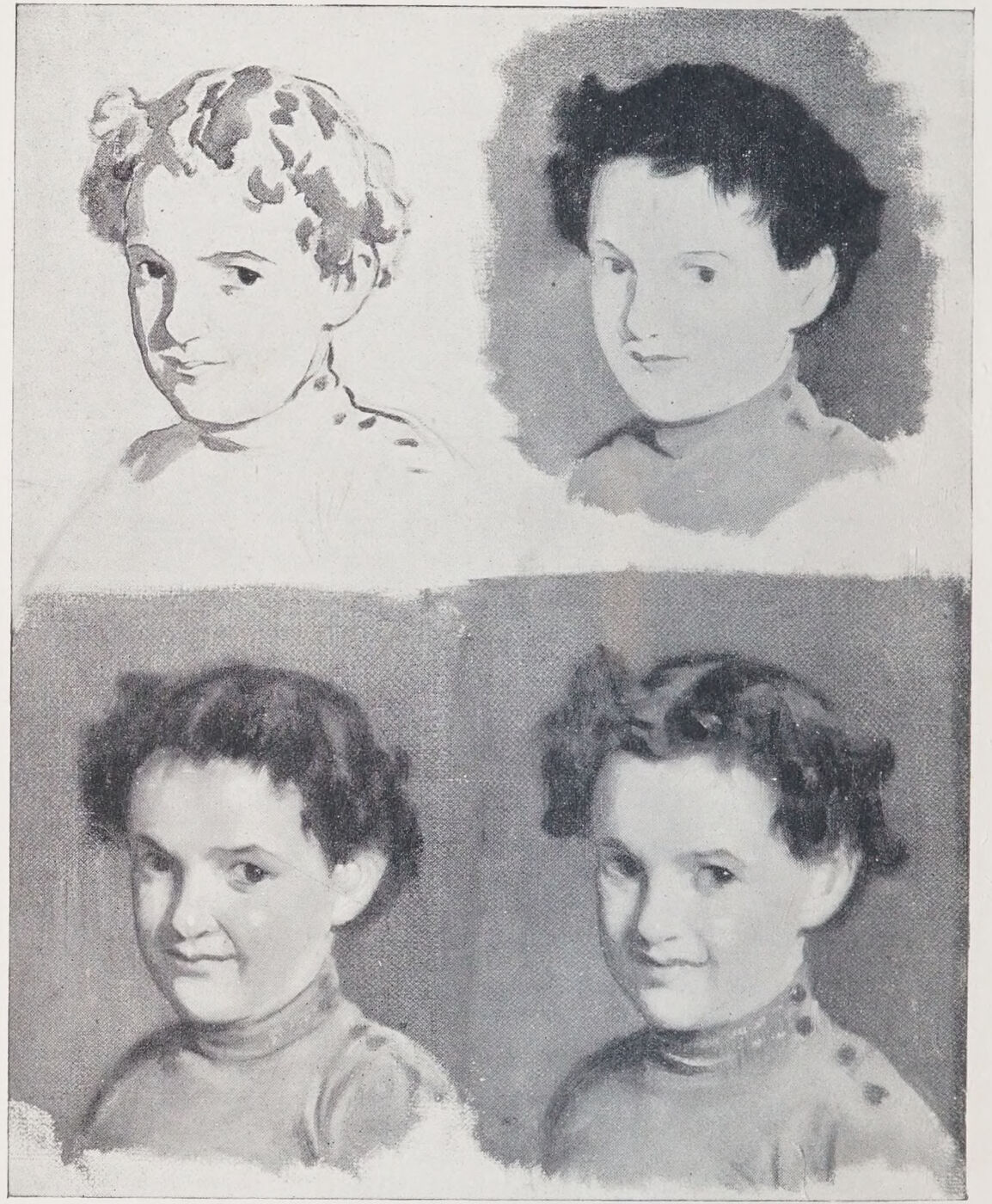
Frontispiece. A Method of Painting for Grisaille Preparation or for Direct Colour. See Chapters XIII.–XV. 1. The outline brushed in. 2. The middle tones. 3. Higher lights and shadows added while wet. 4. The whole brushed together, broadened, and completed with a full brush.
This book is primarily intended for the use of Art Students, but it may also be found helpful to Art Teachers who have not yet reduced their teaching to a system. I have rarely in my experience found drawing systematically taught. The master corrects the student’s errors, but does not show him with sufficient clearness how he might discover them for himself, and so become in time, as he must aim at becoming, independent of assistance.
The second part of the volume is devoted to an examination of the methods of painting used in the production of works that have stood the test of time. I hope that from what I have said on this subject the student may be able to gather material on which to base a sound and workman-like method. This is especially necessary in these days when works of art are produced which, in my opinion, cannot possibly stand the severe test of age. The whole object of this volume is to combat the careless craftsmanship which is too common, and is detrimental to the work of any painter, however gifted.
The lover of pictures who has had no technical training may also be helped by a perusal of this second part to discover for himself some of those qualities in a picture that are most attractive to a painter. No one can be said to understand a painting who is ignorant of the principles on which it is executed. The average painter’s interest is centred, perhaps too exclusively, in its technique, and many a picture would have little charm for him if it were not for the surface qualities it displays. But some of this special enjoyment may be shared by the amateur if he will take the pains to examine pictures in the same way as the professional artist. I hope that not these chapters only, but also the preceding lessons in practical painting and drawing, may awaken a new interest by enabling the amateur and picture-lover to gain some insight into the mysteries of the craft, and some understanding of the purely technical means of expression employed by the painter.
In the manual which I have written with the object of aiding the Art Student in acquiring some knowledge of his craft, I have endeavoured to pass on to him some of the lessons I have received at the hands of my masters; and to these lessons I have added the outcome of my own experience and observation, both as a worker and teacher.
I am aware of the difficulty of expressing lucidly on the printed page what could be far more easily imparted by word of mouth, but I must beg the reader, after having perused the manual as a whole, to refer carefully to the instructions contained in each successive lesson, and whenever possible to practise, on the lines suggested, drawing and painting subjects similar to those given by way of demonstration, from the cast or from the living model.
With this object in view I have divided the work into a series of separate lessons or chapters, beginning with a method of drawing which is not, I believe, usually taught, but which my own students have found useful as an additional aid to the knowledge they had already acquired.
I have then dealt with the points which I hope may be of some service in assisting the student to construct the human figure, and have endeavoured to draw his attention to Principles by which he may more readily grasp the subtleties of detailed form.
The next chapters are devoted to a study of tone values. It is only when the student has mastered these introductory lessons, and not till then, that I should advise him to use his palette; for without a thorough knowledge of the human form or of form generally, and of the principles underlying the reproducing of tone (which includes a painter’s modelling), no painting worthy of the name can be done with satisfaction either to the exigent student or to those to whom the painter makes his appeal.
For the sake of greater clearness, I shall imagine my reader to be in the position of a pupil with whom I am conversing and whom I am teaching. He will, I trust, pardon the apparent familiarity of this method and the occasional use of colloquialisms, for I feel that it will assist him to understand more clearly the points I desire him to master.
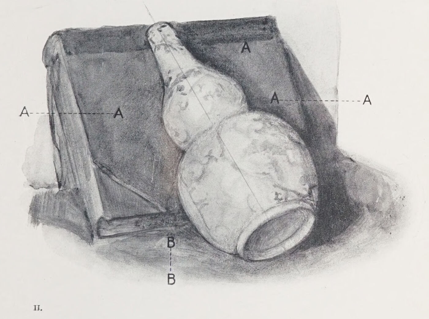
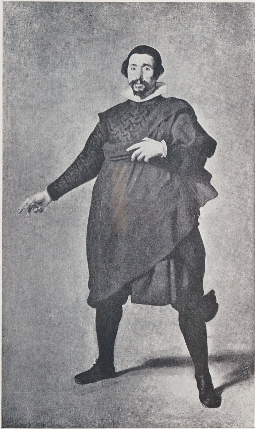
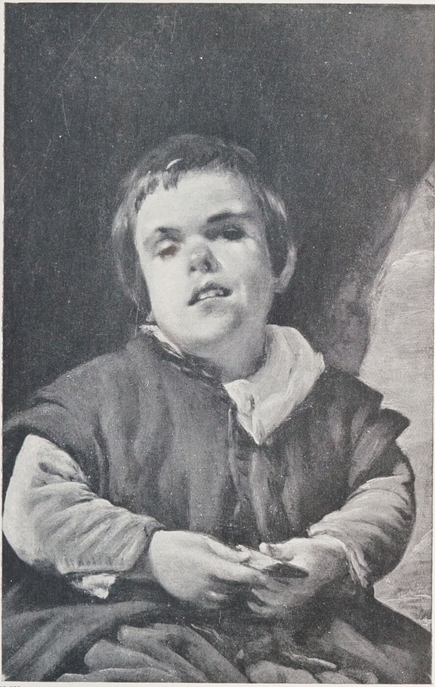
Plate I. A Method by which a Round Object can be Reduced to the Flat in Drawing.Fig. 1.Fig. 2.Fig. 3.Plate II. “Shapes Left.” Represented at A and B.Plate III. Shapes Contained between the Solid Forms. To illustrate the method of drawing shapes contained between the solid forms, so reducing the round object to the flat, by which means foreshortening is simplified.Plate IV. An Actor. By Velazquez.
Let me say at once that I thoroughly disapprove of what is understood by the “blocking in” of the whole figure or object that is commonly practised.
The followers of this method begin by putting a series of hurried lines on the paper, with the object of seizing the pose and suggesting the proportions of the model.
Nothing could be more unsound, especially in the case of the beginner. The moral influence of our first stated impressions, hurried and ill-considered as they thus must be, is so great that we never entirely free ourselves from it, and the student who begins his work without due deliberation spends most of his time at the subsequent sittings in correcting the faults of his first hurried sketch.
Practise your hand to reproduce what your eye sees without any deviation from the facts. Do not attempt any idealising in your studies, whatever you may do independently, either in form, light and shade, or colour. In proportion as you deviate from your model, you court a weakening of the results.
The question of pure æsthetics is another story, which does not enter into our present programme. Now we are concerned with the learning of the elements of our craft.
I do not mean to infer that you must reproduce every hair or wrinkle, but that every factor in your work should have its counterpart in fact.
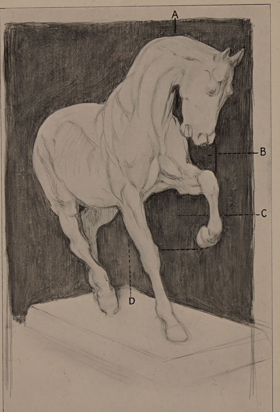
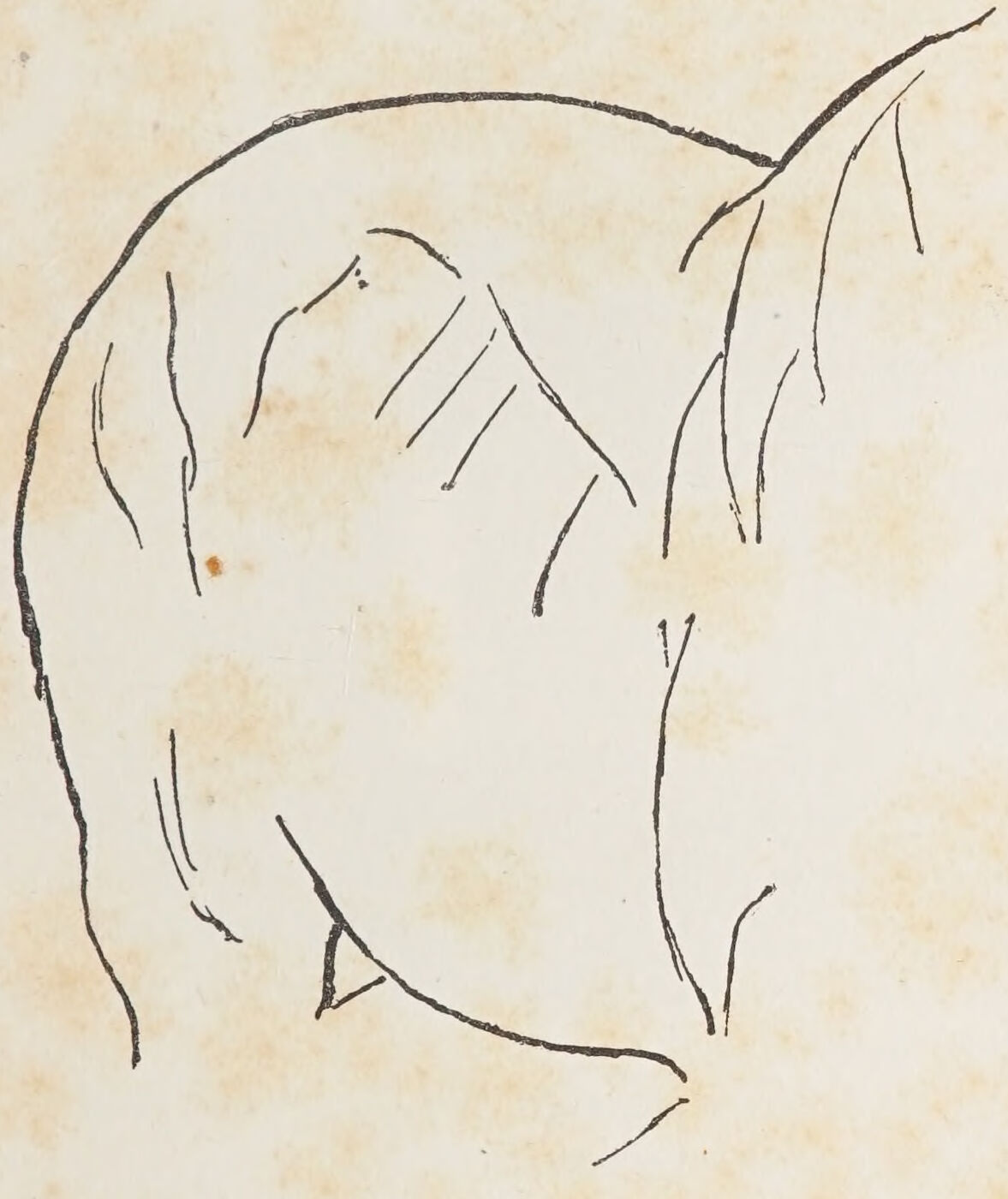
Let me tell you how I should go about, and how I really did set about, the drawing from the cast of the Rosa Bonheur anatomised horse.
I foreshortened it expressly. Foreshortening is difficult, but most of the real difficulties are removed by the system I want you to use. I placed behind the cast of the horse a flat square object, indicated by the toned passages in Plate II.
I remembered that this cast, like every other object, covers a definite space on its background from any one given point of view.
I had to settle, as you will always have to, before starting, the scale of the drawing.
I looked at the cast, my eyes almost closed, and then drew the space, under A, lying between the neck and the jaw, a little island of black, treating the shape of it as I would a freehand drawing. I had by this created my Standard of Measurement.
Proceeding upon this basis, I did not ask myself yet whether I was drawing a head or legs or body, because I knew that if I drew the patterns left by the white cast on the background, in proportion with the passage already indicated, my subject would be evolved.
My eyes remained always nearly closed. I was reducing the round object to the flat—that is to say, to the spaces occupied by its parts on the background.
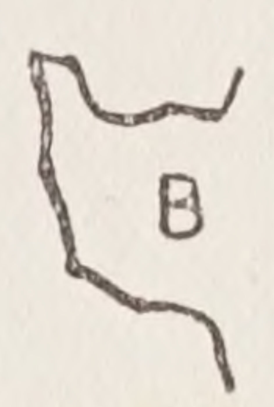
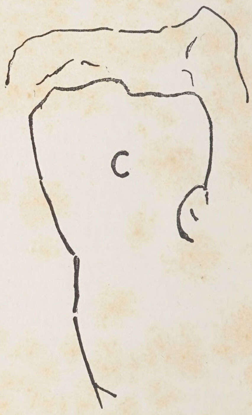
I had to be careful, when I came to that particular point, to keep the raised knee in its exact relative position under the nostrils, and to imitate the bay (B) left between the nostrils, the chest, and forearm. Then as I came to it, I had to consider that the raised hoof should be latitudinally opposite the point of the knee of the standing leg, and to imitate the harbour-like form at C enclosed between these legs. And in the same way I had to fix the shape between the off hind and standing leg, in its proportion and relative position to the harbour (C).
I looked up and down the cast continually to make each “point” fall into its place under or over another already indicated, and then laterally across it with a similar object.
I compared the slanting lines with the set square of the book behind, and so on, and saw by the aid of a hand-glass—which is absolutely indispensable to the draughtsman—that the proportion of my black masses, the direction of my lines, and in fact the whole drawing, tallied fairly with the cast.
These are just a few of the things upon which I had to fix my attention, but at the same time and almost unconsciously, my eye was taking in all the internal drawing. I knew that every part must fit and, by indicating the various masses contained within the outline of the horse, prove the accuracy of the whole.
Herein lies the true secret of draughtsmanship.
When we would do serious drawing we must concentrate our attention not upon the outlines only, but upon the mass contained within these outlines. This advice may sound like a commonplace. In theory perhaps it is so; but the student will have learnt an invaluable lesson when he has thoroughly realised this commonplace and knows how to put it into practice.
It embodies the meaning of the phrase which he is always hearing from the master, but which he rarely seems to grasp—Draw by the masses!
When he has grasped this piece of instruction, and can at a glance realise the shapes in their just proportions made by the shadow, half-tone, and light masses—that is to say, all the main incidents of the internal drawing of his subject—he may take a holiday.
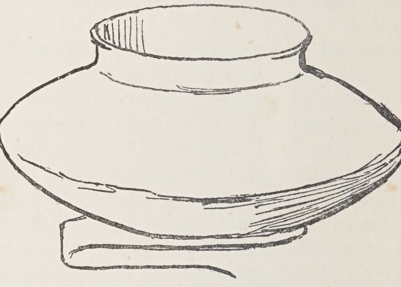
Now let us place a vase against a book so that it appears slightly foreshortened.
The subtle curves of the vase will be more easily realised if the shapes left by the outline of the vase and that of the book are first drawn.
First the masses A, on either side of the object, should be drawn in relation to each other.
Then note down the shape B contained within the lower edge of the book and the lower left side of the vase, and the mass of the cast shadow on the lower right side. This will remove the initial difficulties.
A line drawn through the centre will help us to secure a proper balance.
Every possible aid, either imaginary, such as this ruled centre line, or real, such as existing uprights, or angular spaces around the object, must be pressed into service; and no point should be neglected that can possibly serve our purpose, or help us in the extremely difficult task of drawing with accuracy, exacting, as it does, the cultivation of abundant resourcefulness and unflagging attention.
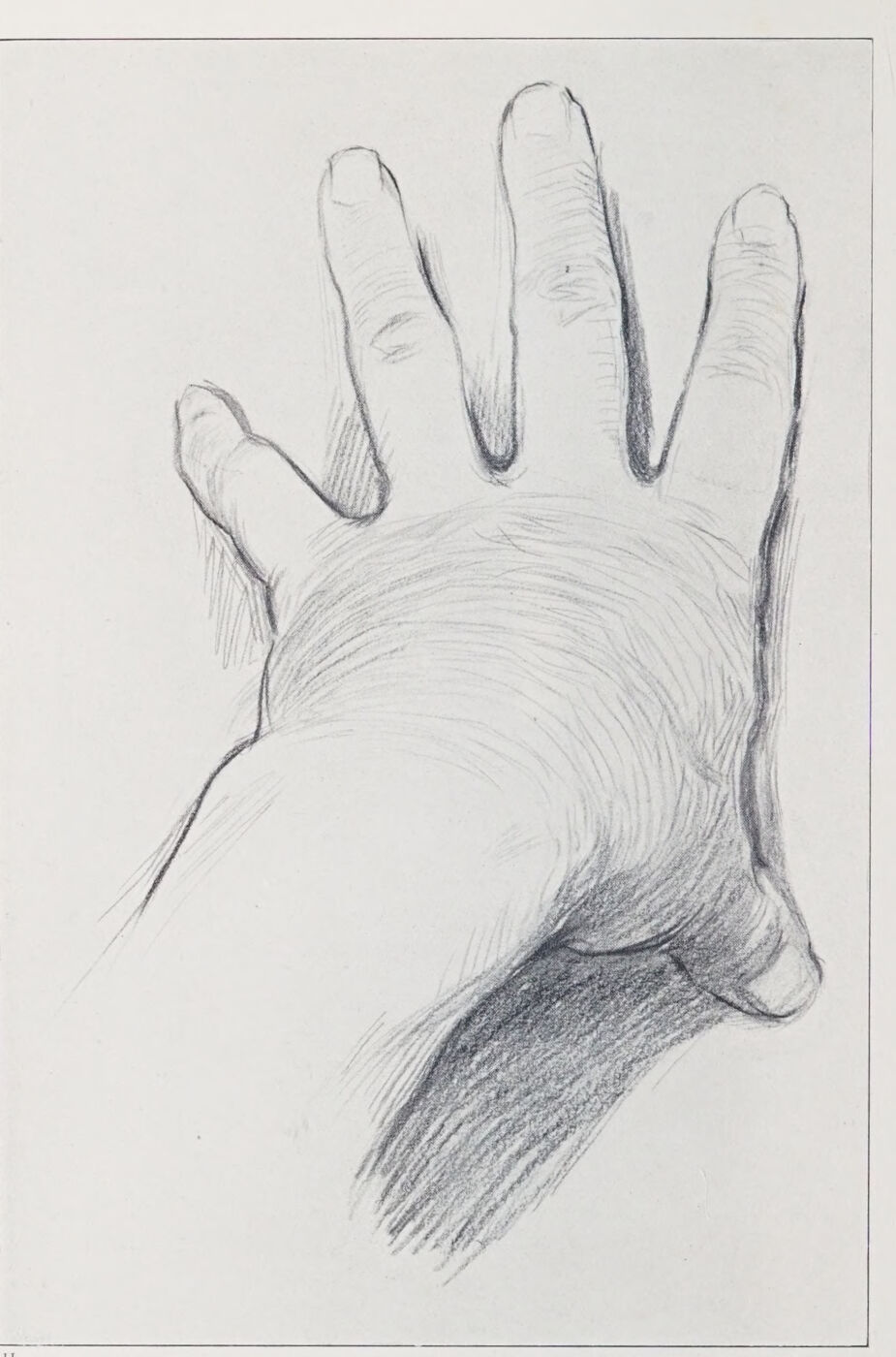
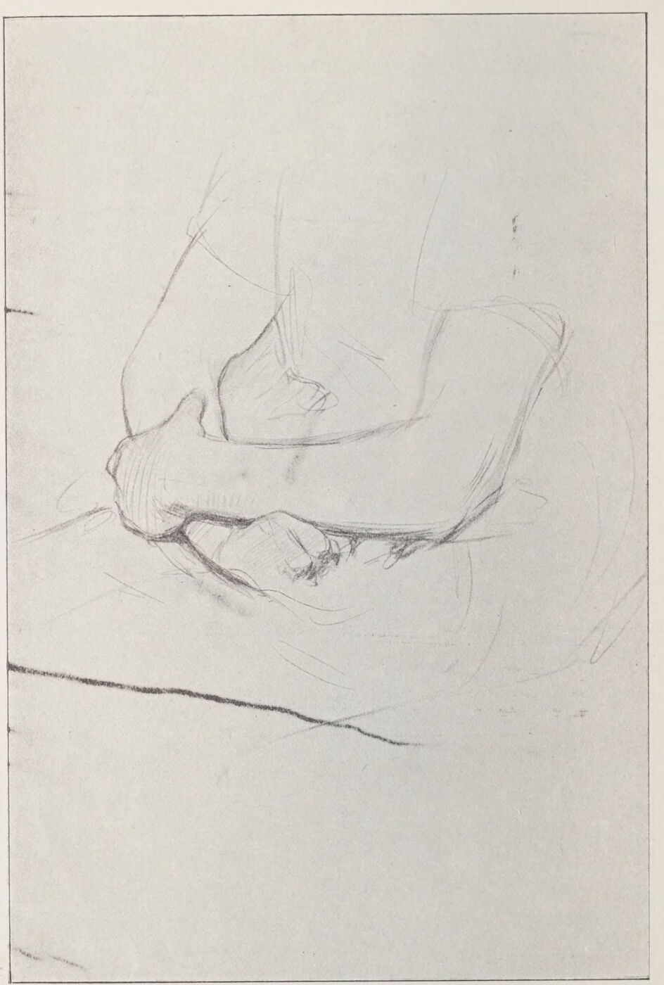
To demonstrate still further the utility of drawing by the “spaces left,” I now ask you to place your hand as I have done in the accompanying Plate, the points of the fingers and thumbs touching the seat of a chair; the wrist raised.
Nearly close the eyes, and draw the “shapes left” between the fingers; the wrist and thumb; the left side of the wrist and little finger, taking care to suggest the curve made by the base of the fingers, and noting under which point of the fingers the angle formed by the meeting of the wrist with the ball of the thumb plumbs; the relative lateral positions of the finger-tips, the knuckles, and every other salient feature.
This exercise should demonstrate most clearly the use of “left spaces” in enabling you to realise all the subtleties of form and characterisation. If done well, in the way I have pointed out, your hand, not a hand, will be evolved.
You will be materially assisted by subdividing the back of the hand in accordance with the shapes of the shadows, half-tones, &c., &c., so that they fit into their respective places.
I have a firm belief in the subdivision of large spaces. Without such aid the eye is unable to grasp the proportion of the bigger masses.
As shown in the drawing, shading lines as they occur in the hand, curving with the modelling, are roughly indicated. They assist the sense of foreshortening. Brushwork in painting around the foreshortened curved surfaces is equally effective.
Some of my readers will no doubt see their way to adopting in a measure, if not at first absolutely, the method I have so far been advocating. Prejudice may possibly exist against an unwonted system with others. But the art student is a reasonable being—let me essay to convince him that the principle here advanced is logically sound.
He will, I am sure, follow me when I ask him if, having drawn the south coast of England and the north coast of France, he cannot readily prove the correctness of the relative positions of these coasts by assuring himself that the shape of the English Channel lying between them is correct? And if not correct, whether he has not here a means of at once discovering where his fault lies?
Similarly, when he has drawn from his model an arm akimbo, and finds that the shape of the passage left between the inner lines of the arm and the body is at any point dissimilar to that passage in nature, can he not equally well by this means diagnose either an error in the outline or the relative position of the parts? It is clear that if the one be wrong the other is necessarily wrong also.
I contend that this is a reliable way of proving the correctness or faultiness of the work, and I can add to this, by way of advice, that should the student draw at the outset in a way to which he is accustomed, he would do well, at least, to refer to the spaces left, as he proceeds, for confirmation of the justness of his observations.
The use of this method has other and important advantages. It will enable the student to reduce his outline to its greatest simplicity. A common fault is to exaggerate depressions and convexities, and to mistake the shaded parts of the outline for concavities which a careful examination, with his eyes nearly closed, of the background shapes, will prove to be non- or hardly existent.
The ever-present source of confusion to the inexperienced eye is, that lines, particularly when they are foreshortened, appear to take a direction contrary to that towards which in reality they lean. It is a fault to which I constantly have to refer in teaching whole classes of students, few of whom are inexperienced.
If the student will only take the trouble to reduce, by the means I have suggested, the round object to the “flat,” comparing the direction of his line at the same time with the upright or horizontal lines which are nearly always to be found within his range of vision, that difficulty, at least, will be dispelled. Foreshortening can hardly be done scientifically by any other means.
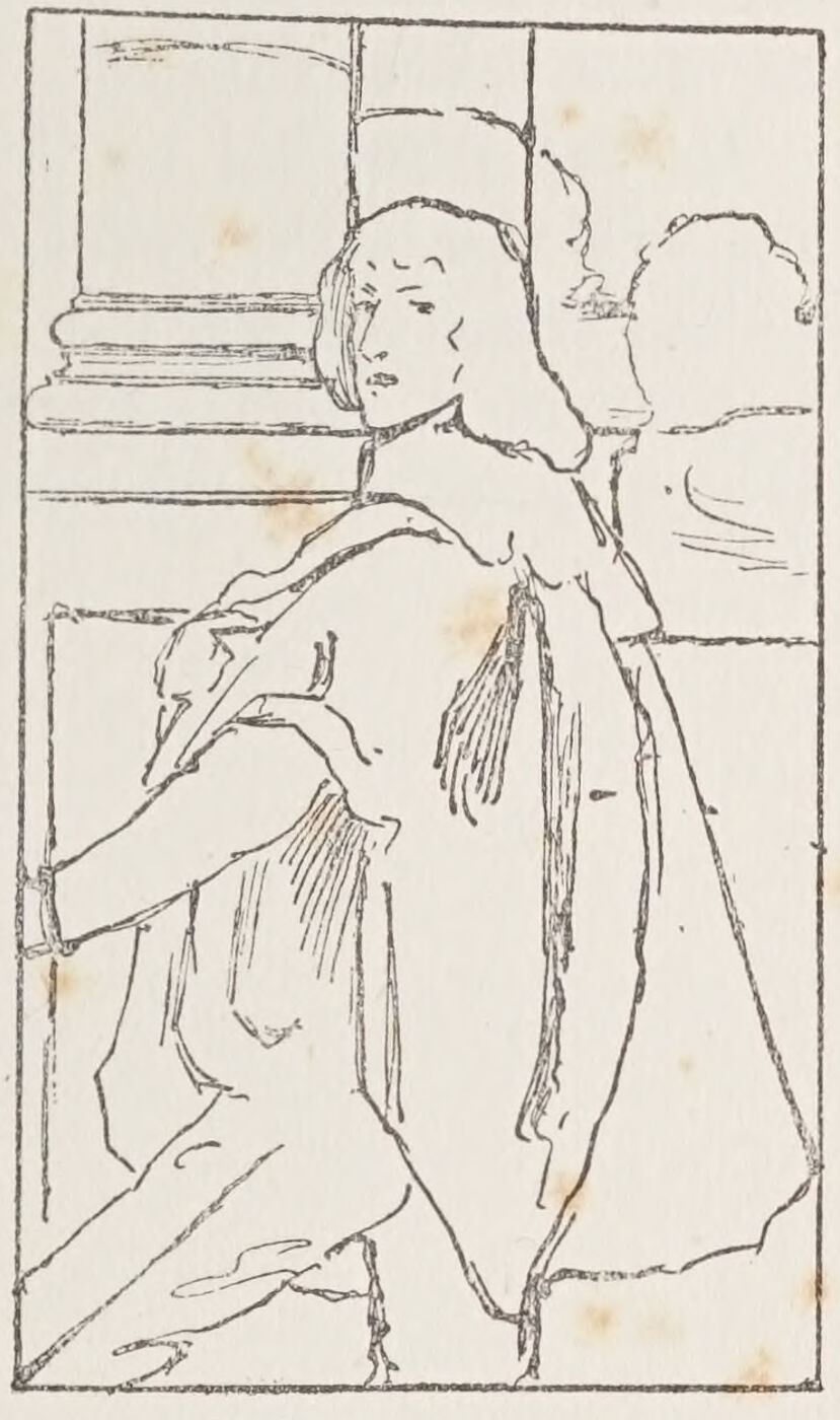
I have reserved, as a bonne-bouche, the accompanying Plate, reproduced from one of Velazquez’s portraits, which demonstrates pretty clearly that the greatest of draughtsmen did not disdain to keep his eye well fixed on the general silhouette of his subject, thus securing its inimitable action, characterisation, and breadth.
I have purposely refrained from giving you any advice about the kind of drawing that is to be done for its own sake.
Much as one appreciates the expression and grace of chalk or pencil line, the lessons in draughtsmanship which I desire to give you are of a kind that will, I hope, make your drawing a means to a definite end, and that end is an ability to paint; in which case knowledge and accuracy will be of more real service to you than the stylish use of the crayon or pencil.
THE NEED OF A STUDY OF ANATOMY
There is a class of advisers who try to flatter the student by maintaining that the study of anatomy is of little use to him. They tell him that pedantry lies that way, that the Greeks knew nothing of this science, and so on. If the Greeks ignored the science of anatomy as cultivated by the moderns, they had opportunities of studying the nude, both quiescent and active, which we are certainly denied. And as to becoming pedantic about anatomy, ill-advised teachers and the student should be reminded that the really strong man does not abuse his strength.
The better we understand the skeleton, and what is generally understood as “artists’ anatomy,” the greater will be our power of constructing the human figure, and realising the subtleties of form.
In our initial sketches for compositions, when memory has to take the place of the living model, we rely to a great extent on our anatomical knowledge for the suggestion of action and form generally. And again it adds materially to our faculties for self-criticism, which, like a sense of humour, is often, nearly always, our salvation.
There are good books and good lecturers to which, and to whom, the student must look for advice and knowledge in that very necessary branch of science.
The bones are your architectural beams. Study the skull, and look for the bone forms in every head you draw. You will feel that the skin is more tightly drawn, and therefore of a different texture, over bone foundations, and more “fleshy” where free.
Equally, the muscles over the framework of the ribs follow the inclination of that practically fixed “cage,” leaving the abdominal muscles freer play.
Note the shape and movements of the collar-bones and of the scapulae.
Compare always the inclination of the ilium with the cage of ribs, and study the knee-bones, which are so near the surface. Note that the outer ankle-bone is placed lower than the inner, and so forth.
To most of these points I shall have to direct your attention in the subsequent lessons on the construction of the human figure.
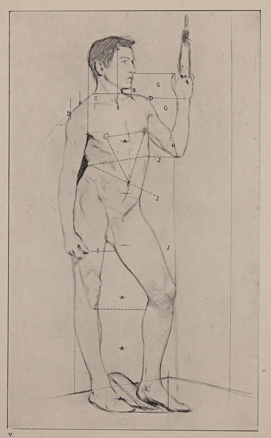
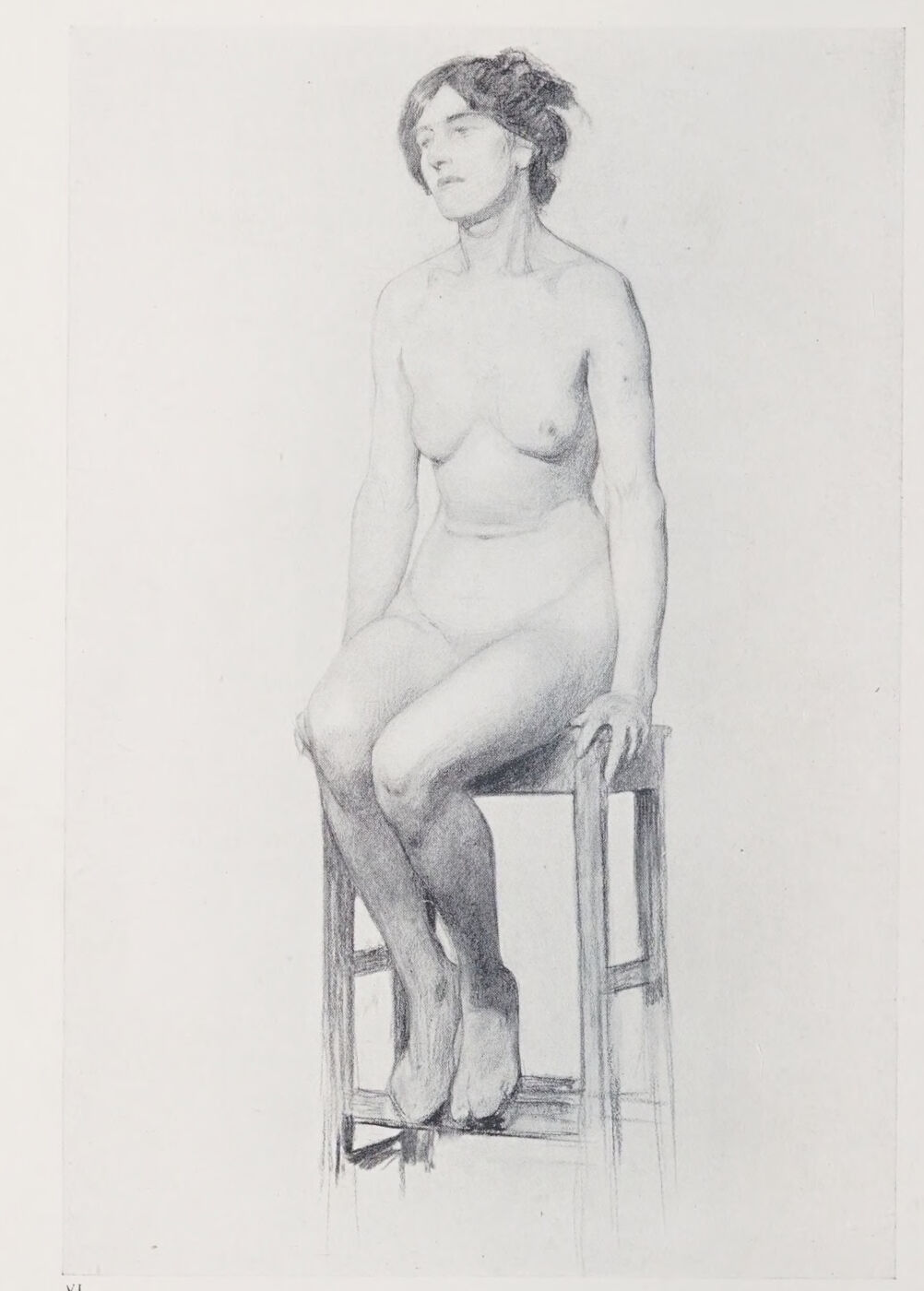
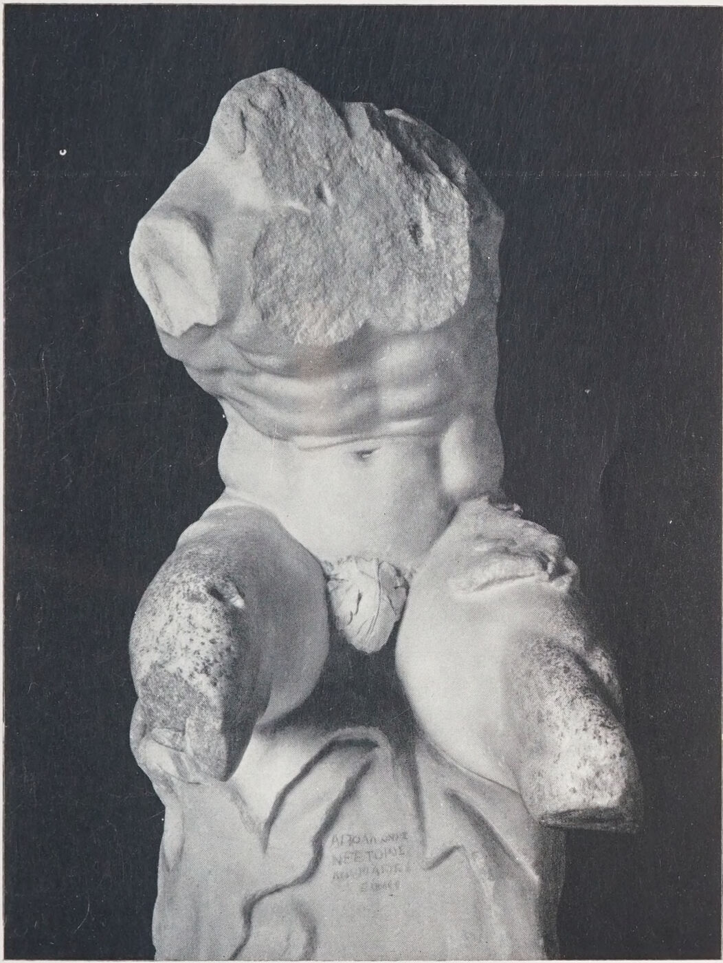
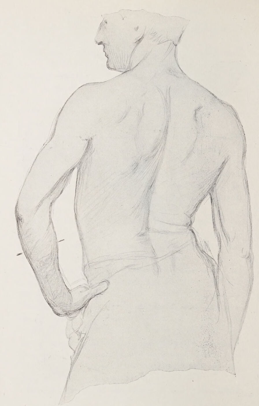
Plate V. Aids to Construction and Proportion.Fig. 4.Fig. 5.Fig. 6.Plate VI. Study to Show the “Shapes Left” between the Rigid Lines of the Seat, and how they Help in Drawing the Foreshortening of the Legs.Plate VII. The Torso Belvedere.
This Plate is reproduced from a study made with the object of demonstrating to a class of students the main principles of construction, and I hope it will serve a similar purpose here.
The original drawing is about twenty-four inches in length, which is about the size generally advisable for drawings from the nude.
It is a good discipline to make your study come within an inch of the top and bottom of your paper, so that you do not find when you are about to draw the feet that there is no room for them. All that you draw or paint should fill a definitely fixed space. Neglect of this precaution is a frequent source of trouble.
Proportion is the first thing to consider, and, by the way, always the most difficult to preserve.
We must therefore begin by creating a standard of measurement. In most instances the head from the top of the hair to the chin will best serve as a standard.
After having measured the number of head lengths contained in the entire length of the figure, proceed to mark off the given number of equal lengths on the paper (A on the plate).
This measuring is done by fully extending the arm in a direct line between one eye (the other closed) and the subject, marking off between the tip of the thumb-nail and the top of the charcoal the length of the head thus seen, and proceeding downwards till you have ascertained with the greatest care the number of head lengths on the figure.
If the number proves to be seven and a quarter as in the Plate, you will decide after a little experimenting how large in the drawing the head is to be, so that seven and a quarter head lengths will make up twenty-four inches. Once the head length has been decided upon, it will and must remain your standard of measurement for the figure in every part.
The head and features must now be not only indicated, but fairly carefully drawn, for many reasons. Firstly, because any serious subsequent changes in the head might result in an increasing or reducing of its size, and in the loss of the set standard of proportion. A good likeness of your model is one of the best tests of the correctness of the proportions of the features, and until these features have their definite position on your drawing, it is not possible to place the ears. It is from the ears that the lines of the neck begin.
Refer constantly to your hand-glass, holding it so that your drawing and the model’s head can be seen in it at the same time; for it is well-nigh impossible to get the character of your subject without almost constant reference to the glass. It is the best of masters, and will solve many a knotty problem throughout your artistic life.
When the head is satisfactory, and not till then, begin to draw the neck and shoulders, referring to the “background spaces” on either side, and calling to your aid any lines or markings in the background, wherewith to compare the direction of those of your drawing.
Note at which points under the chin the line of the neck starts; and be particularly careful that the little bay made by the outline of the chin, the neck, and the shoulder at B should be the counterpart of that space in Nature.
Then observe the sweep of the back line of the neck and its relation to the ear and jaw.
Find under which point of the jaw the centre-point of the neck falls (E).
Draw the collar-bones, and see that the nature of the triangle contained between the collar-bone, the mastoid muscle (which always falls from behind the ear to the centre of the body), and the shoulder line is like the model’s (that is, the trapezius muscles at C), and that the whole mass of the neck is just in its proportion to the head; and when you are satisfied that it is right in every respect, proceed to the rounding of the shoulders (D).
The success of your whole figure will depend upon the care you bestow on these parts.
They are the real key to its action and proportion. If these points of the shoulders (D) are too far from or too near to the centre line of the body, necessarily the whole figure will be either too wide or too narrow across.
To make sure of these points, divide up the line of the shoulder. On the right we have the end of the collar-bone plumbing under the chin to settle for us the length of the line from the neck. Now with it compare the length from B to D, and to make doubly sure see that the shape left on the background is satisfactory.
On the left compare the length of the sweep of the outline of the trapezius (C), from the point where it converges and meets the collar-bone (F), with the length of the line that curves from that point to D; then with the comparative height and relative positions and slope of the shoulders indicated by the horizontal line across the neck. Make sure, too, that the shape left is correct in form, and in proportion with the head and with the neck.
These detailed instructions may seem to you tedious, but I assure you, you will not regret getting them at your finger-ends.
When you have thoroughly grasped this part of the lesson and know how to apply it, you will have mastered what is considered one of the most difficult problems to contend with—the placing of the head on the shoulders.
In a subsequent lesson reference is made to this problem. I advise you to make a special study of it, not only when you are actually drawing, but at all times. Whenever you find a convenient opportunity of observing people, make a mental note of the setting of their heads on their shoulders, and accustom yourself to looking at the background shapes left between their face, neck, and shoulders; it will aid your memory, and increase your power of observation and your knowledge.
Let us now return to our drawing. Find under which points of the shoulders the armpits fall, and compare the depth of the passages between the collar-bones and the armpits.
Then indicate the pectoral markings in their places relative to the armpits. A line connecting them should run fairly parallel to the collar-bones. Ascertain and mark the position of the centre line of the body between the pectoral markings. Then measure the length of the space to the navel, taking the head and neck as your standard. The three markings, the two pectoral and the navel, make a triangle which varies in its nature according to the character and action of the torso, and is always the key to its movement. Sometimes acute when the body is upright or thrown back, it is more obtuse when the body is seated or bent forward, as in the torso Belvedere. Follow the central abdominal marking to its base, and take care that the curve of the whole central line from the neck to the base of the torso is closely followed.
Draw the inner line of the left arm; compare the length of the part of that line between the armpit and the highest point of the passage lying between the arm and the body. Compare the length of that background space and draw it in freehand; and it will leave for you the exact direction and form of the upper arm and the side of the torso, and will clearly indicate the position of the left hip.
Then pass on to the right side, making careful use of the shape of the background lying between the outline of the torso and the raised arm, and refer to the upright line on the background in seeking the exact direction of the outline.
Before going further, indicate all the internal markings.
Note that, the body being contracted on the left side and extended on the right, the lines radiate from the crease and the hip on the left, so that the pectoral marking and the edge of the fixed ribs on the right are higher than their counterparts on the left, but that the hip on the right is considerably lower than that on the left. The extended line of the torso on the right is the answering shape to the contracted side (on the left) in this position of the model.
Now the left arm. The tip of the thumb, which is in a line with the nose, and the wrist, which is opposite the point of the shoulder D, determine for us the length of the hand. The background shape lying between the face, shoulder, and arm will leave for us its relative position.
The pit of this background shape is on a horizontal line with the right pectoral marking. Then we find that the elbow is in a line with the angle of the ribs. That gives us the thickness of the arm, between those two points at H, and the correct proportion of the whole arm to the body.
We now draw the right arm, and with it the upper right leg, for the arm rests on the leg, and the outline of the one reacts on the other. We must see that the mass of the hip contained within the inner line of the arm and right base of the torso is of the shape and proportion of the model, and that the point of the thumb falls where indicated by the line I. We thus have the length of that arm.
The width of the deltoid is now easily found. The outer line will follow quite naturally, depending, of course, on your knowledge of its anatomy, and your grasp of the character of the model; for anatomy gives you the generalised form only. Your personal observations will help you to realise its specific character, and that again will be materially aided by a careful reference to the silhouette.
Draw the shape of the whole passage of background left between the legs, as a freehand drawing, in proportion to the parts already done. You need not hesitate to measure and plumb. This will help you to find that the left knee plumbs under the elbow. And in drawing the outer line of the left leg, be careful that the whole of the shape J on the background is realised.
The indications on the Plate will point out how to proceed with the legs.
Of the vertical lines on the Plate, only the one on the extreme right was actually to be seen in the background. The others are imaginary plumbed lines, the use of which you will always find of great help in establishing the exact relative positions of each part of the body.
Now the feet.
The perspective lines of the stage on which the model was posed are, and should always be, drawn, as well as the block on which the left heel is raised. These are rigid lines, and will indicate for you the relative positions of the feet. Wherever such lines or similar features occur on the ground or the background, make them an essential part of your drawing, and it will help you to get the feet planted.
It will be of some assistance to you while constructing your figure, and particularly in going over the ground a second time, to indicate all decided shadows, marked half-tones, and internal drawing, the better to judge your proportion and prove the correctness of your outline.
If you were drawing a map of England with all the counties, and found, when you had nearly completed it, that there was no room left for Rutlandshire, or that too great a space had been left over for Leicestershire, you would begin to look about for a fault in some other part of the map. So in your drawings everything must dovetail and fit.
In subsequent lessons detailed consideration will be given to the drawing of arms and legs, so that I need not go further with instructions on these points for the present, my main object being to indicate a method of construction on something like a scientific basis, a synthetic method reasoned carefully from beginning to end, where the element of chance is not allowed a place. And although I am aware that the system followed in this figure and its position cannot be rigidly applied in the case of figures differing totally in action, still on some such lines construction can, and should always be, synthetically considered; and if at first, and for a time, the method may seem tedious, it will repay you in the long run, and the mental process involved will become by degrees less and less fatiguing.
By way of practice, refer to the two other Plates of nude figures that are drawn without indicating lines; and try mentally to supply these lines and all the instructions given above.
The sketch of a female nude model was done more particularly to show how, by the use of the “spaces left” the figure can be firmly seated and the legs foreshortened in a drawing; and I should advise you when doing a seated figure always to draw the chair as though it were part of the figure. It will then sit at ease, and the rigid outlines of the seat will help you to overcome some of the difficulties of proportion.
You will find the cast of an antique statue an excellent subject on which to practise the foregoing hints on construction.
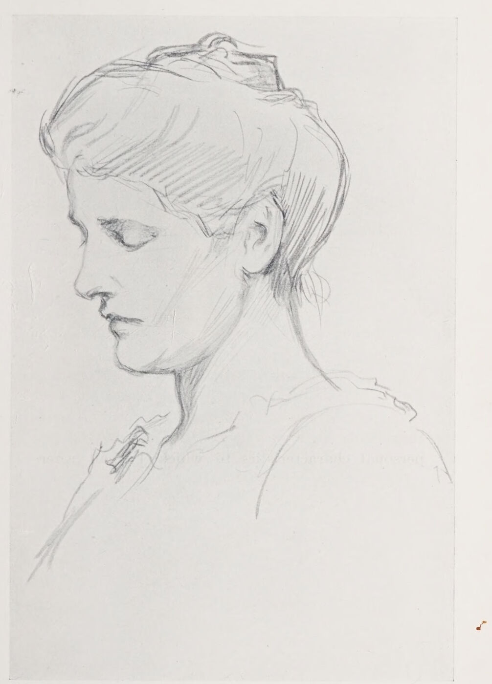
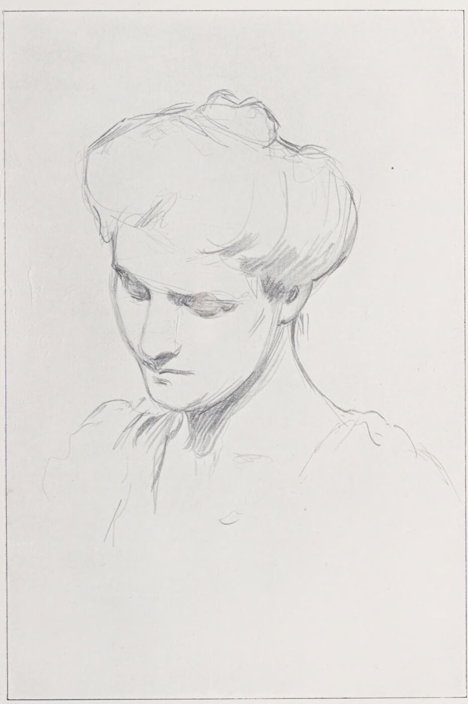
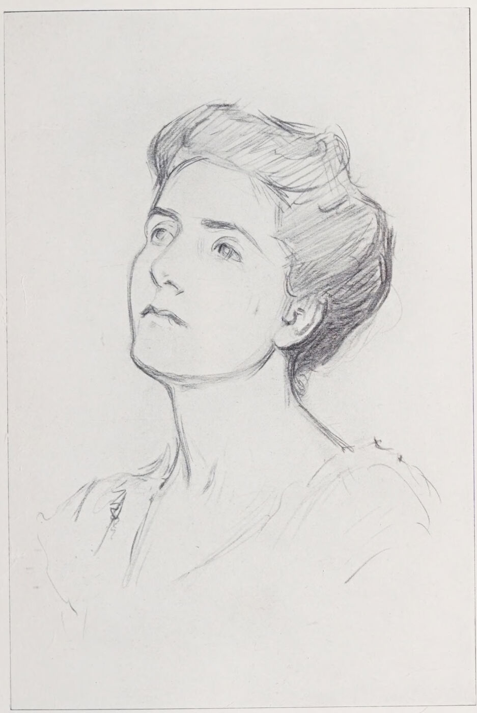
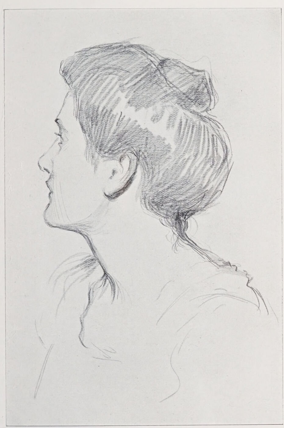
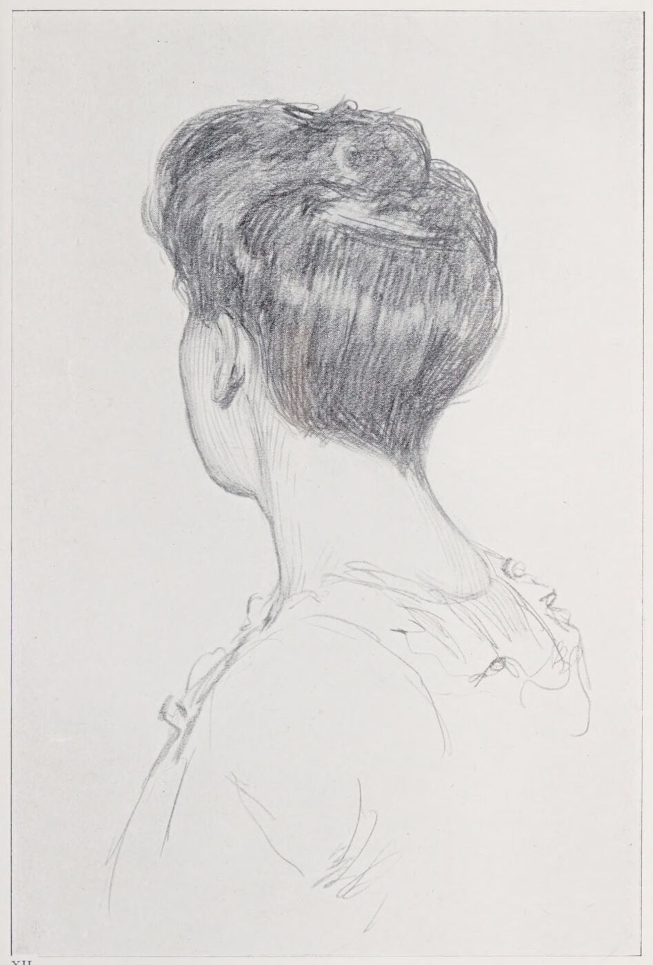
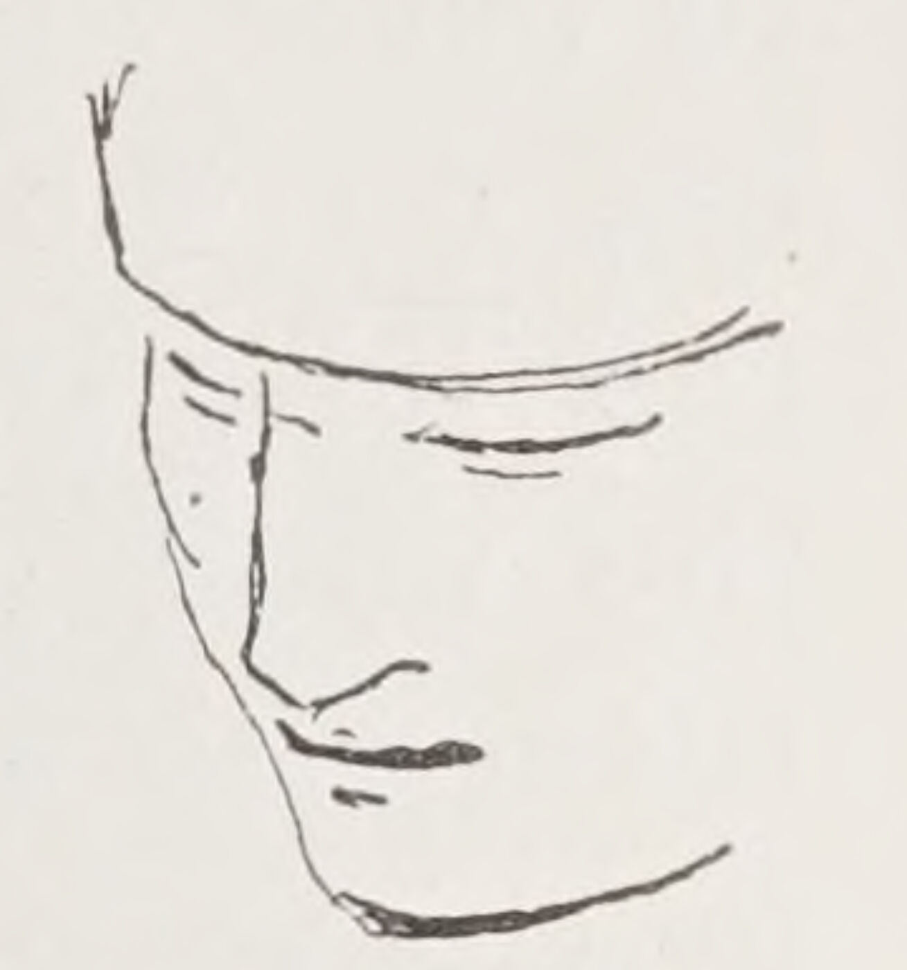
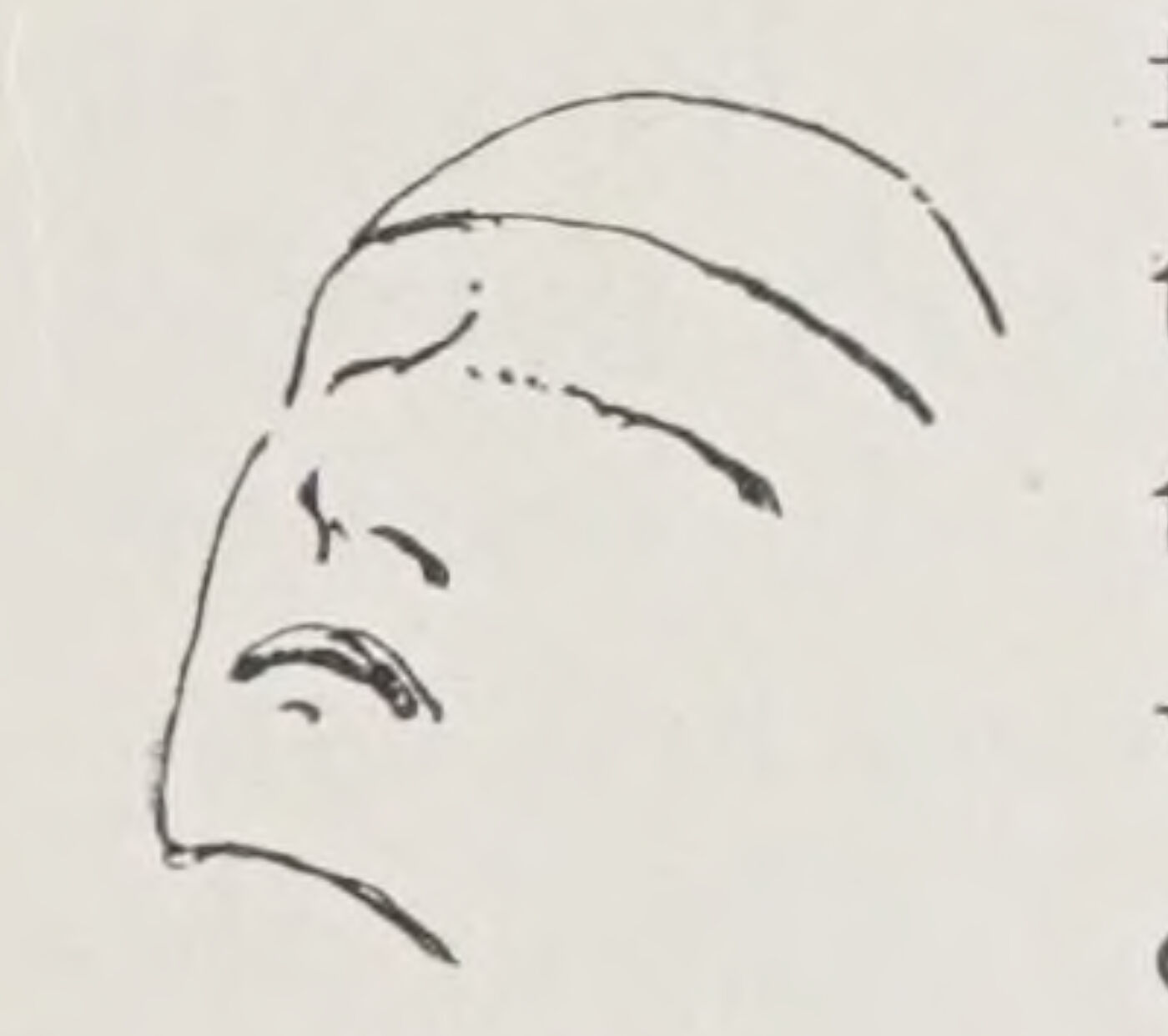
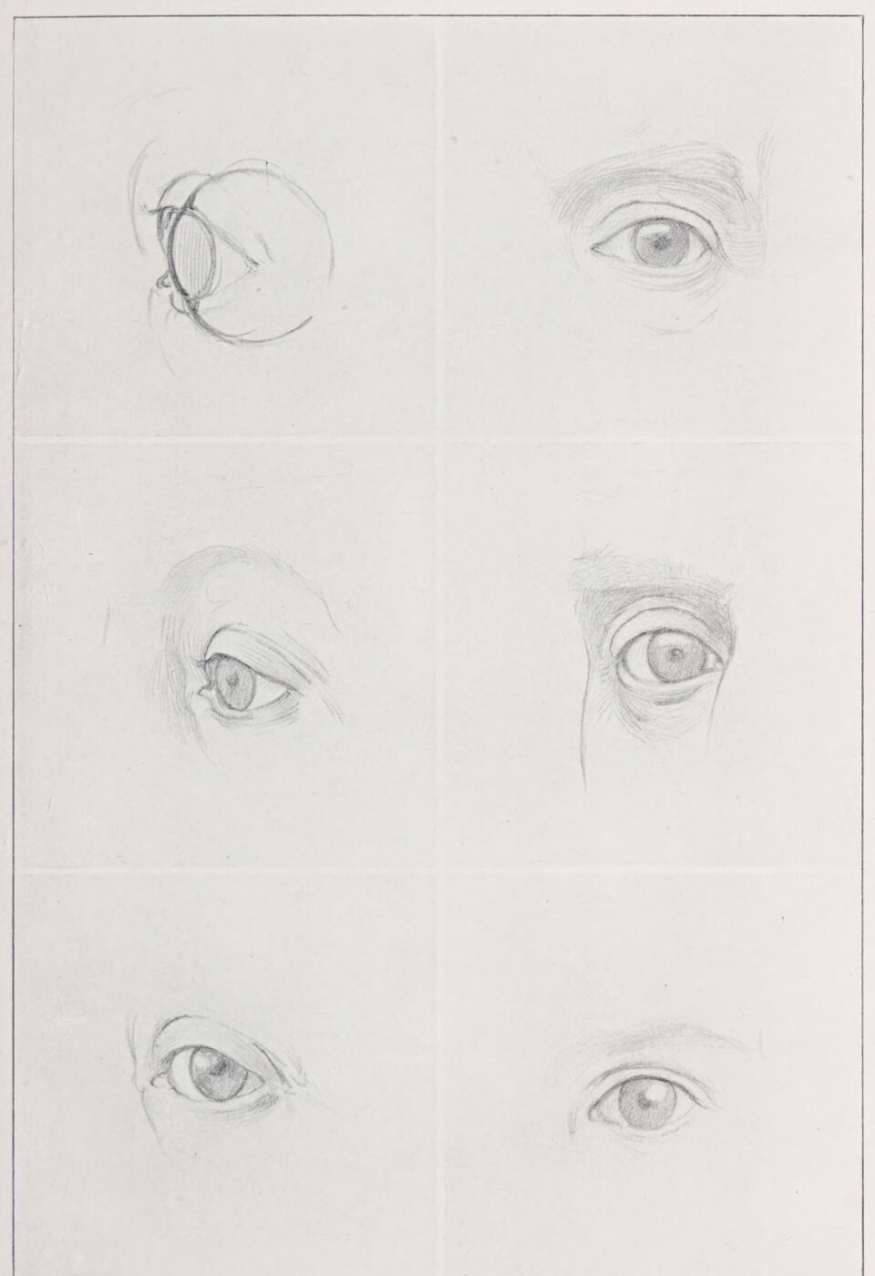
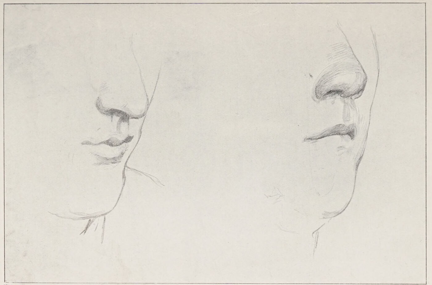
Plate VIII. Position of the Ear when the Face is Lowered.Plate IX. The Placing of the Ear with the Head in this Position.Plate X. Position of the Ear when the Head is Raised.Plate XI. Position of the Ear with the Face Turned Slightly Away.Plate XII. The Relative Position of the Ear and Mastoid Muscle.Fig. 7.Fig. 8.Plate XIII. 1. Construction of the Eye. 2 and 3. Two Eyes of a Woman. 4 and 5. Two Eyes of a Man. 6. A Child’s Eye.Plate XIV. Comparison with the Upright Edge of the Book, Facilitating the Drawing of the Silhouette, Opposed to it.Plate XV. The Foreshortened Mouth, its Relation to the Nose and Chin.Plate XVI. Intercepted Lines.
The best guide to the construction of the head is a thorough study of the skull. Obtain or borrow one, and draw it in as many positions as possible, so that you may readily trace the balance of the bone forms in every face and head you draw.
Note particularly those parts of the bone forms that are but thinly covered in the living model, the plane of the temple, the relative position of the teeth and frontal bones, the contour of the chin, jaw, &c.
Now let us consider some points to which sufficient attention is rarely paid.
One of the most important of these is the placing of the ear.
The accompanying drawings were made with this object mainly in view:—
Remember that the ear is the axis of the head.
In proportion it is about the length of the nose, the top in a line with the brows and the end of the lobe opposite the nostrils.
Since the ears, like all the other features, have their fixed place in the skull, they and these other features must be considered in relation to the movement of the head and to each other.
When the face is lowered, the ear is relatively raised and inclined with the direction of the face forward. Its base will be seen opposite the bridge of the nose, or in a line with the eyes, according to the inclination of the face. See Plates VIII. and IX. When the face is upturned the ear is lowered, and will be seen in a line with the chin (Plate X.) and inclined backwards.
When the face is turned slightly from you the width of the neck and head behind it is increased, and the space from the ear to the cheek-bone proportionately decreased (Plate XI.), and of course still more so, with the head turned away (XII.).
The placing of the ear determines most clearly for us the actions of raising and lowering the face.
The study of the skull will have taught you that (with slight variations only, due to marked personal characteristics to which I shall refer later) one side of the face must answer to the other. These answering shapes require attention. If, for instance, in the three-quarter face the modelling of the near cheek is rounded by a smile, see that your outline of the further cheek responds. When, again, for example, the head is inclined to the right, the left ear is higher up on the head than the other, and so on.
When the face is lowered, as in Plate IX., the space between the brow and the eye is shortened, the tip of the nose is nearer the mouth, and the chin cuts well into the neck; and as the ear is raised, the back line of the neck is thereby lengthened. The brows and mouth, overlaying somewhat convex surfaces, curve upwards, and a greater mass of hair is seen above the face.
The converse of all this is seen in Plate X. when the face is upturned.
The mass of hair is smaller above; the eye is further from the brow; the tip of the nose is nearer under the eye; the brows and mouth curve downwards. The ear is lowered; and consequently the neck is extended • in front and contracted behind, and one sees somewhat below the chin.
CONSTRUCTION AND PLACING OF THE EYE
The accompanying set will illustrate my points, but I would strongly advise you, after having considered this lesson, to copy whenever you can the beautiful drawings of heads by Holbein. Your knowledge of the drawing of the face and its features will be materially increased thereby.
The first in the set is a rough diagram of the construction of the eye; and I have made it because the student, judging by his average drawing and painting, seems to forget that the lids open and shut over a globe. Still less does he appear to perceive that the pupil is a superposed swelling on the ball of the eye, and that therefore the lids are widest apart at the point where the pupil is seen, except of course where it is turned to either corner of its setting. But even in the corners of the eye its fullness makes itself felt.
Be careful in drawing the eye in the full face that the inner corners are in a line with each other at their respective distances from the bridge of the nose, whatever inclination may be given to the head; and that they run in a fairly parallel line with the other features. I say fairly because, as I shall point out presently, few faces are symmetrical. But for the purpose of this part of the lesson we must imagine a certain regularity of the features we are considering.
A very common failing, not only on the part of the beginner, is to show too much of the further eye in the nearly profile and less-than-three-quarter faces, for foreshortened passages always appear wider than they actually are. Not enough is allowed for the setting back of the eyes behind the bridge of the nose. The way to correct this tendency is, first of all, to believe your own eyes (which is not so very easy when we think we know better); to remark the actual distance (if any) between the pupil and the part of the nose that cuts across the eye, the actual space between the nose and the outline of the cheek, and similarly by the mouth, not forgetting to nearly close your eyes, and thus reducing the whole of the side of the face beyond the nose to the flat.
But you will no doubt say the model moves, and this shifting of the face makes you uncertain. I can sympathise with you, but to make certain, let the space beyond the point of the nose be your guide.
Plate XIV. may help you to realise this aspect; but you should study this problem at first hand from nature. The upright edge of the book indicated assists one to fix the curves and tendency of the lines of the face.
It is well-nigh impossible to generalise about the form of so varying a feature as the nose; but after studying its anatomy it would be well to consider it in its relation to the mouth, noting particularly in the construction of that part of the face that the centre of the upper lip falls, whichever way the head is turned, under the centre of the nose, and that the central marking between the two cushions of the lower lip lies under the central dip of the upper.
Plate XV. shows two views of the mouth in what is usually a difficult foreshortened aspect of the feature to realise.
The beginner should take care to avoid the all too frequent error of drawing on the three-quarter face a nose seen too much in profile.
All solid masses have their “beyond.” The power to make one realise that there are planes unseen is of the very essence of good draughtsmanship, and in this connection I would draw your attention to the need of care to trace the flow of all lines that are intercepted.
Artistically speaking, it may be said that the perfectly symmetrical head is lacking in “character.”
The oval face; the dual features the counterpart of each other; the measurement from the top of the head to the brows, from the brows to the base of the nose, from the base of the nose to the end of the chin, which are all fairly equal in length; the bow-shaped mouth; the eyes parted by the length of one eye, and so on, would constitute a symmetrical head.
Although some such standard of measurement and regularity, both of the face and in a similar way of the body, might serve the ends of the painter and sculptor of cold classic figures and certain decorative schemes, they can only help the painter who is a student of nature as so many points of departure, for you will rarely find in real life anything approaching the regularity of the classic figures. Still, underlying all our personal observations, there is a consciousness more or less developed of the “perfect,” for when we talk of a man with a long nose, of a woman with a short aristocratic upper lip, of a lean person or a short-limbed one, we are, perhaps unconsciously but no less certainly, comparing these features and characteristics with a set symmetrical standard of which we are conscious, and it is the variations from the standard—let it be of a leaf, of a hand, or of a face—that make for character.
The characteristics here instanced are obvious to the least discerning, but it is not only with the obvious that the painter has to deal. There would be little need to draw attention to that which is observed without effort, even though it may be hard enough to reproduce; but there are subtle variations that escape the untrained eye, and others with which the uninitiated have become so familiar as to let them pass unnoticed.
It is a revelation to such, when looking in the glass at the same time as another person, to see how dreadfully distorted the apparently regular face of that other becomes in the reflection; and by glass I don’t mean a concave or convex looking-glass, but a perfectly level and true one. The fact is, we see that face in a new and unaccustomed aspect, reversed as it is in the mirror, which at the first blush makes it seem to be a caricature, but which in reality is not at all a caricature but the well-defined characteristics of that face.
It is well-nigh impossible, unaided by the glass, to discern, or reproduce, with any pretence at fidelity, the subtleties of a form which we wish to realise. Reference to the hand-glass through which the model and the drawing can be seen at the same glance cannot be made too frequently, and we must make certain that the characteristics of the one tally with those of the other.
There are portrait-painters who flatter their sitters by endeavouring to regularise their irregular features. Are those painters sufficiently conscious of the existing characteristics? For they certainly do not seem conscious of what might well be taken as an axiom, that in proportion as we depart from Nature we court a weakening of results.
A serious artist is not affected by a demand for the pretty-pretty.
Proportion is the chief factor in the making of individuality, and this is clearly seen in those large photographic groups of schools and crowded collections of people where the individual heads are sometimes not larger than a small pea and are still easily identified. Subtleties of drawing or light and shade can hardly affect the heads so reduced, so that obviously the individuality of each head is almost entirely due to the relative proportions of the features.
The study of Lavater or later physiognomists has its uses; but a short list of traits culled from personal observation may help you to recognise some of the signs that denote strength, weakness, &c., in a head or face.
The eyes set wide apart denote breadth of view. When close together they give a mean look to the face; and when deep set they are contemplative.
The ear will be seen set well back in the head in nearly all really intellectually strong men.
Great bulk of jaw, when matched with a well-developed forehead, implies imagination and constructive ability; but when not balanced by these signs of mental development it may indicate brutality and animalism.
Sweetness of character is to be discovered in the muscles running under the eye and over the cheek-bone; and the mouth, perhaps more than any other part of the face, is indicative of refinement or the reverse.
Personal observation will enable you to add to this short list of examples, for in these days of tube saloon carriages the student has endless opportunities of comparing types and adding to his store of the knowledge of human nature and the facial indices of character and expression. Sir Joshua Reynolds says so wisely “that the eye sees no more than it knows,” and we take no more from the world than we take into it. Accordingly, to discern the finer characteristics, we must ourselves reach a degree of refinement, or we shall fail to recognise it in others.
The expression of the intellectually strong or the sympathetically sweet will be, as it were, over our heads if we are unable to share with the intellectual some of their strength, with the sympathetic some of their sympathy.
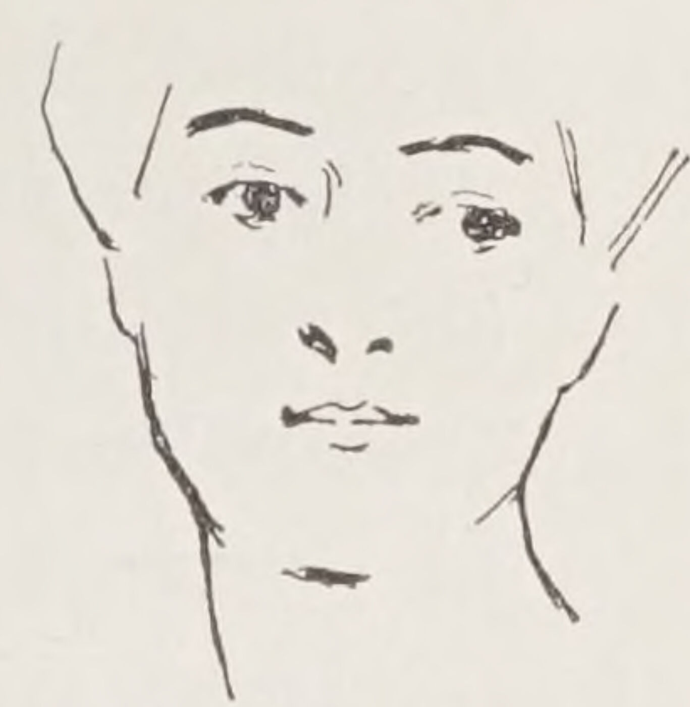
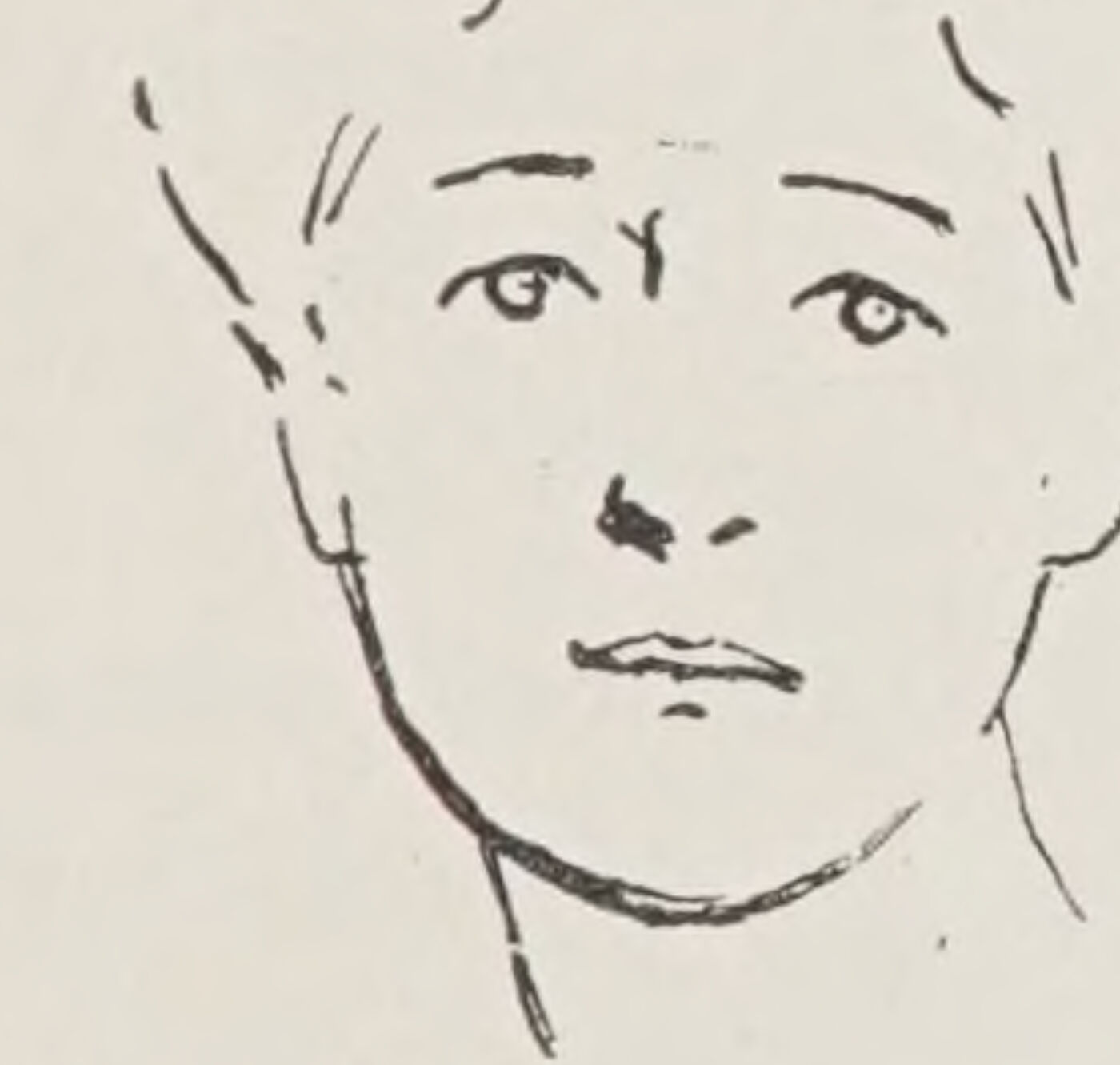
I have not seen it advanced elsewhere, but personally I have noticed this peculiarity in almost all faces—and even slightly marked in the faces of children: that the eyes run down either on the right or the left and that the mouth runs up towards the lower eye.
You will rarely see the eyes and mouth sloping the same way.
The converging of these features on one side seems somehow to restore the balance of the face.
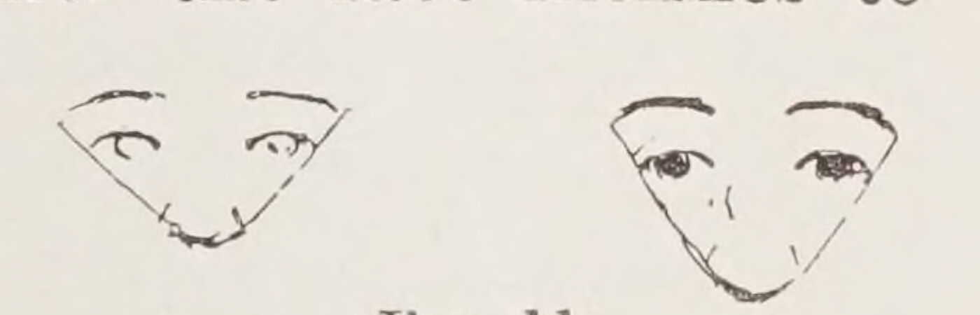
In the full face mark the nature of the triangle made of the ends of the brows and the tip of the nose, the distance between the eyes, the relative size of the chin and forehead to the nose; and ascertain whether the face inclines to the long, the round, or the square.
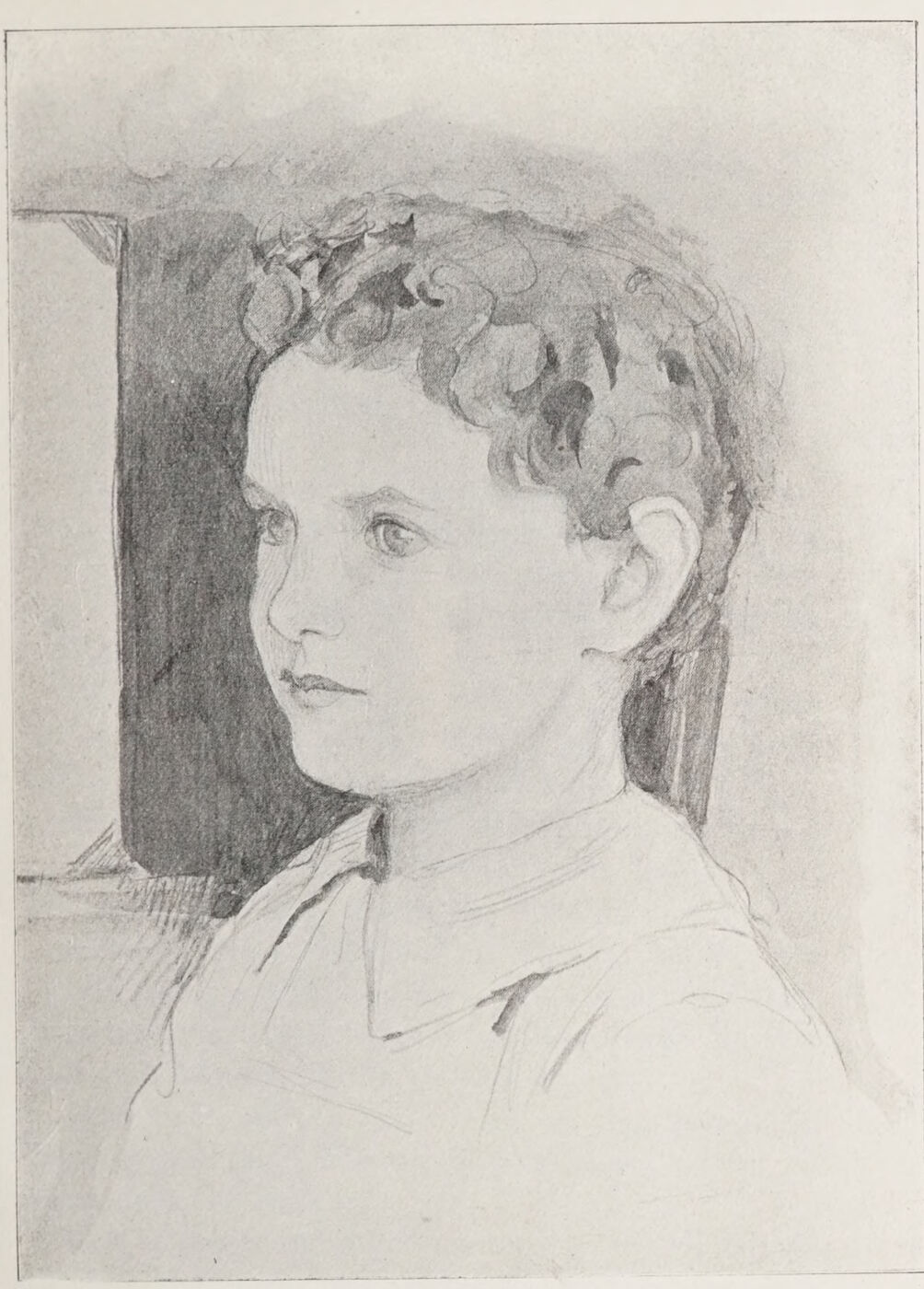
Further than this I can only advise you, when drawing a face, after having examined its characteristics in the hand-glass, to place your drawing—if it be of large size—by the side, or preferably when possible in a line under, the face, and to look at it with your eyes half closed. See that the masses—that is to say, the areas of light and shadow—tally with those of the sitter; and that the head is correctly placed on the shoulders, about which there need be no special difficulty, and no loss of the real character, if only the background spaces be your constant guide. To this it is necessary to give careful consideration, for the setting of the head on the shoulders is an important factor in the realisation of character.
The rest must depend on your own powers of discernment and draughtsmanship.
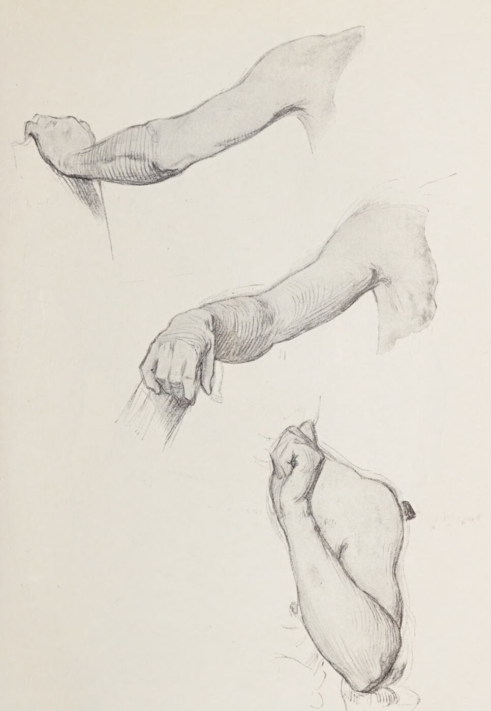
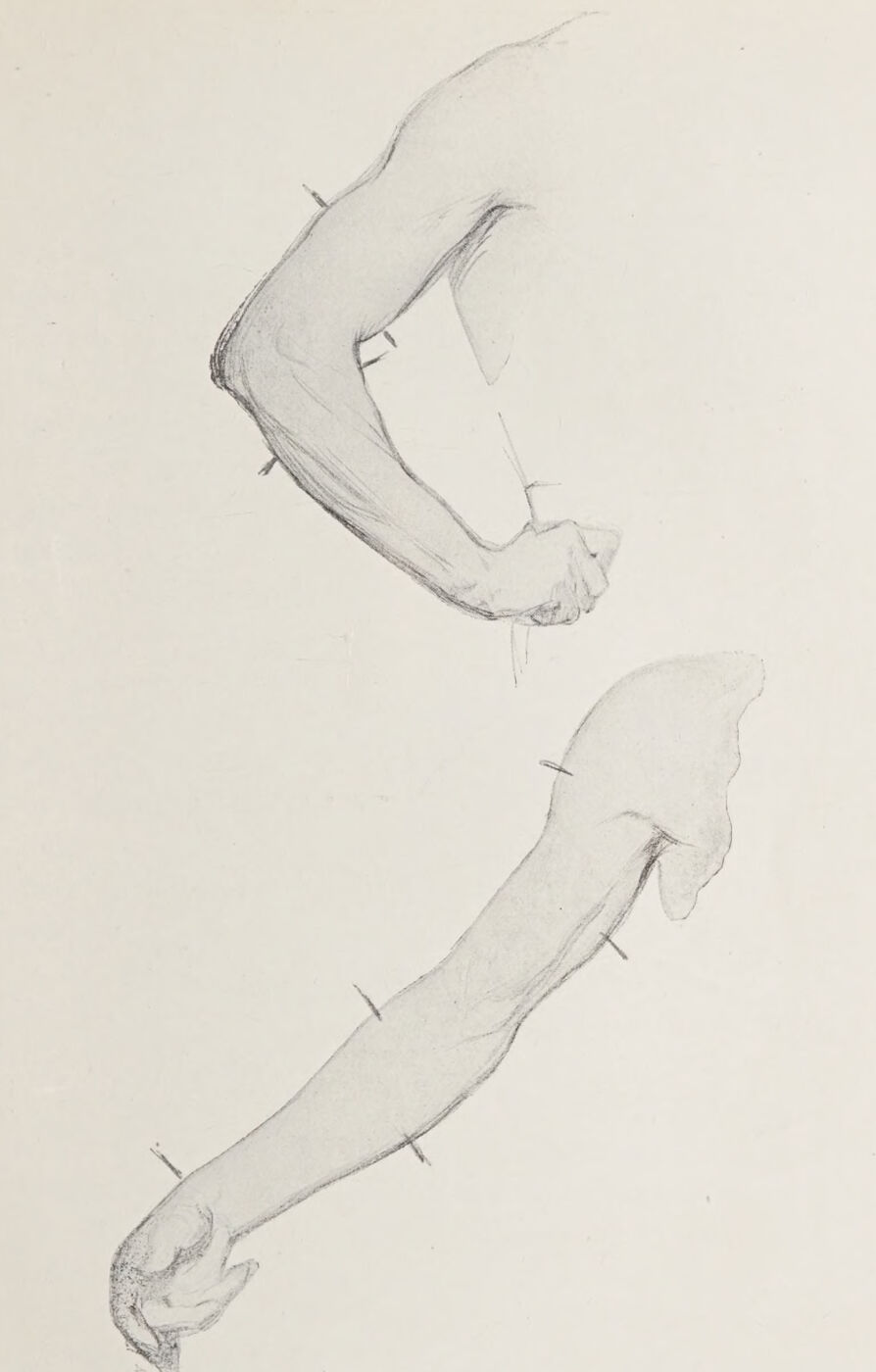
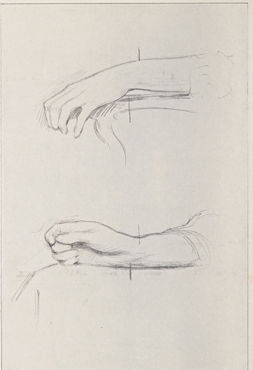
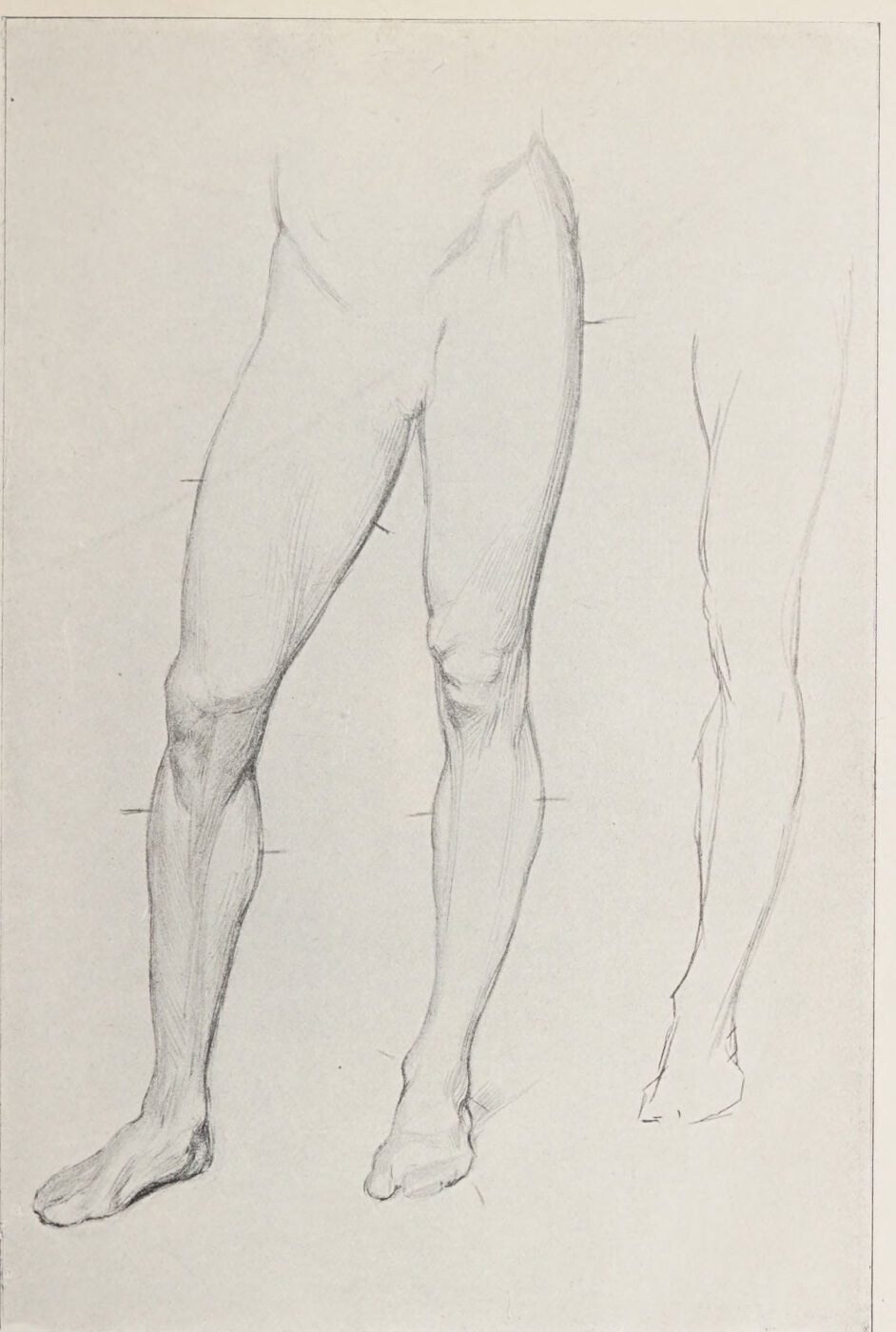
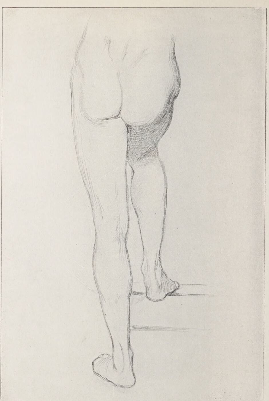
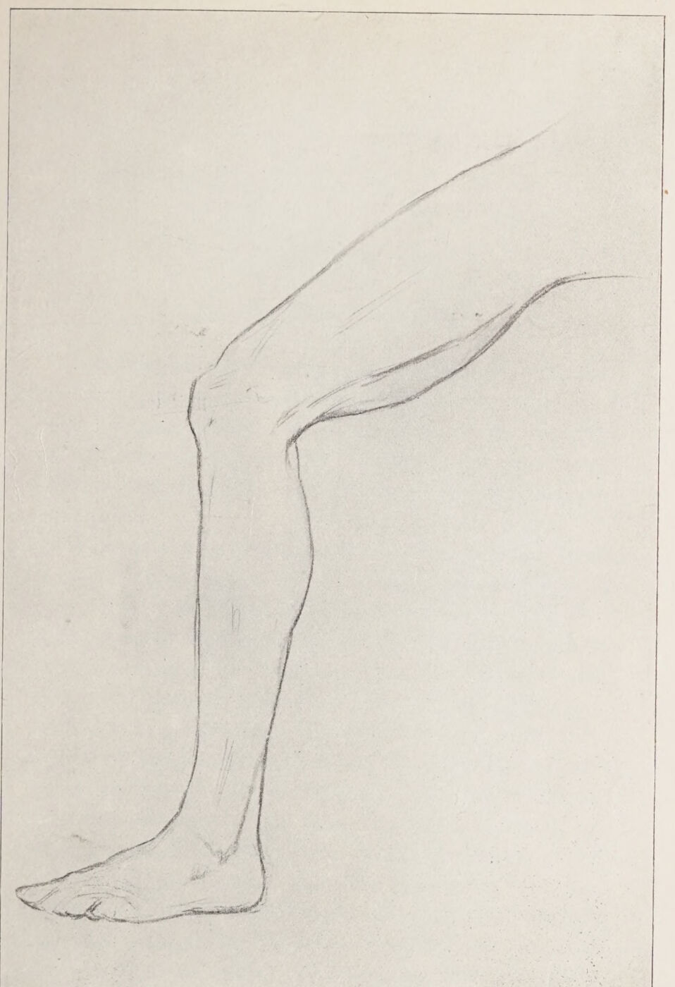
Plate XVII. Some Views of the Arm (Male).Plate XVIII. Back View of the Arm.Plate XIX. The Relative Positions of the Highest Points in the Outline of the Arms and Wrist, to assist in Realising the Subtle General Curves of the Limbs.Plate XX. The Relative Position of Concavities and Convexities of the Wrist, to be noted in the Fixing of the Hand on the Arm.Plate XXI. The Highest Swellings in the Outlines. Here the highest swellings in the outlines are indicated, so that the proper undulations following the bone forms may be secured.Plate XXII. The Attachment of the Foot in this View.Plate XXIII. Profile View of the Leg.
Make a special study of the arm in all its views. Nothing gives a poor draughtsman away more easily than poor drawing of the arm; for although in your ultimate practice you may not paint the nude, ability to draw the bare or partially clothed arm is part of the equipment of every figure or portrait painter, its form and undulations being felt under whatever covering it may have.
The fixing of the hands on the wrists presents exceptional difficulties. I shall therefore endeavour as briefly as possible to point out some means of overcoming them.
The anatomy of the arm should, of course, be mastered, but the rotary movements of this limb and of the hands, and the subtle changes that the slightest shifting of them gives rise to, make it impossible without the model to render the infinite variations of their lines and modelling.
Make it a rule never to draw one side of the arm without comparing it carefully with the other, so that the area contained within them coincides with the area under your eye in nature.
A capable writer on art matters makes use of this sentence:—
“We have seen that if the linear draughtsman made his lines right in length and direction, the areas enclosed by them must of necessity be the correct areas; although he may never have given them a thought.” I certainly join issue with the writer in his afterthought. You may take it for granted that neither the length nor the direction of the outline will be quite correct if thought be not given to the mass enclosed at the time of drawing the outlines. There are but few flukes to be counted on in drawing, and if the mind is not assisted by every possible consideration the chances are that at some point the drawing will suffer.
The unobservant student too often makes the lower arm look like the neck of a bottle, making it taper too suddenly towards the hand—the subtle curvatures of the arm are overlooked.
I have made a few drawings of the arm, just to show the general tendencies of the upper and the lower parts of the limb. The points to consider are indicated by the marks against the outlines in three of the drawings, where the highest swellings of the lines are to be found, on the opposing sides. In Nature these highest swellings are rarely seen exactly opposite each other, and this variation accounts for the curvatures already alluded to.
In the placing of the hand on the wrist, mark carefully the relative position of the protuberances on the one side and concavities on the other.
It would be well for you in your studies of the figure to take up the arm and hand, after having settled their proportions, during one complete sitting. They are rarely posed twice alike. Their capacity for movement is endless, and is responsible for most of the conscientious painter’s grey hairs.
No wonder Van Dyck told his friends with some glee that he had at last found a model with a good hand who could pose it well. While working in England as Charles I.’s Court painter, he obviously used this model for most of his hands. The graceful sitter, as he found, gives no great trouble, but the “stick” is hopeless. The awkward sitter’s hands are frequently hardly recognisable as hands. Still there is always something so individual about them that, when at all possible, you should let your hands be the hands of Esau, and not a substitute.
THE LEGS
The instructions given for the drawing of the arms apply equally to the legs, the main points being a comparison of the relative swellings and undulations of the lines on either side of the limb, which are rarely exactly opposite each other.
In the front view, follow closely the bone forms, particularly the tibia, from the inside of the knee to the inner ankle-bone. When the weight of the torso is thrown on either hip, see that the foot plumbs well under the head, and that the legs and feet are always firmly planted. For this your plumb-line will be found most useful.
In studying the foot you cannot do better than draw from a good cast. When working from nature you must draw all that you see, in spite of the imperfections of your model; but when you wish to idealise you will find the antique your safest guide. You will note that the Greek sculptors elongated the middle toes so that they project beyond the great toe; but do not look on antique sculptures as so many models from which to learn drawing and tone. They may serve such purposes in your early studentship, but far higher lessons are embodied in them—the perfection of human form, grace, and dignity, all that is most beautiful, simple, and inspiring.
My London readers would do well to study the Elgin marbles in the British Museum,¹ the seated figure of Demeter, the benevolent Mausolos, the Hermes, and many other figures and fragments, as well as the busts of Roman workmanship, and the shapely Greek vases with their decorative designs.
¹ Casts of these works are to be found in some of the chief art-galleries in the country.
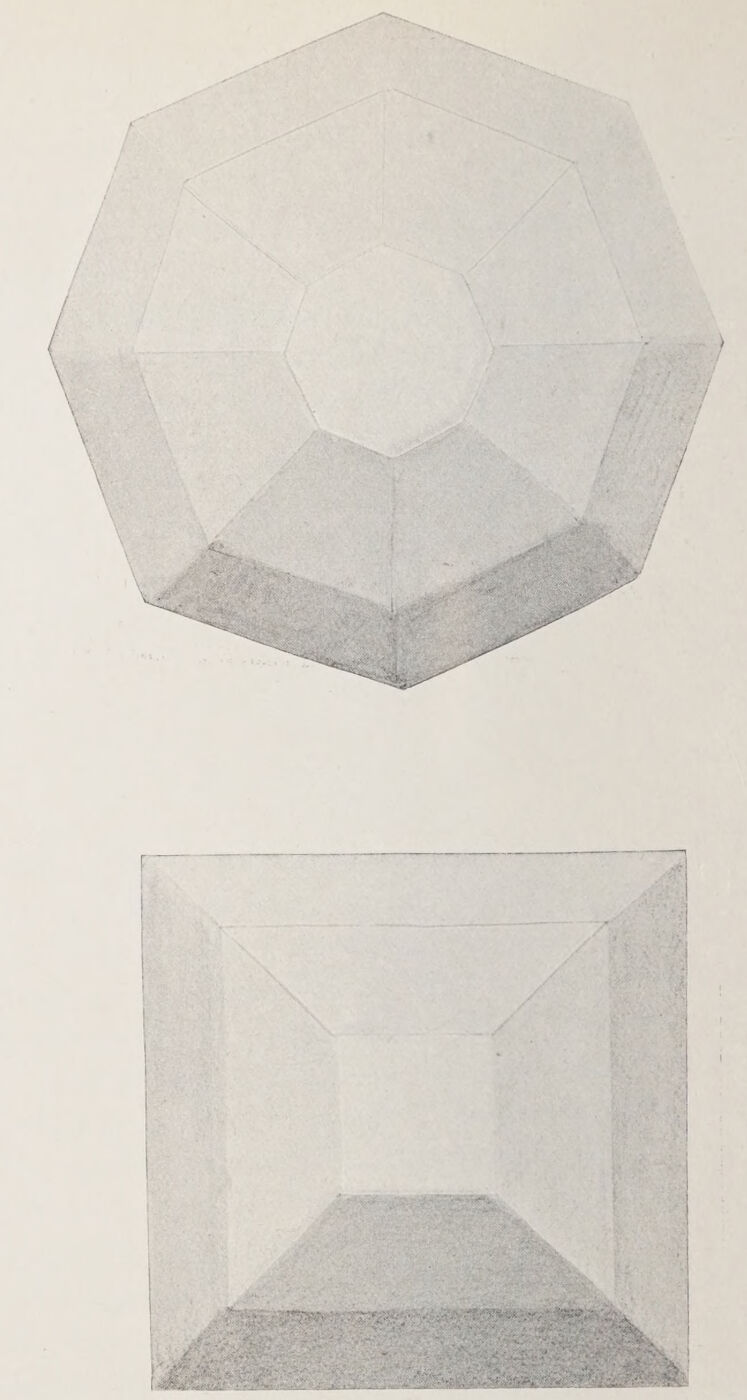
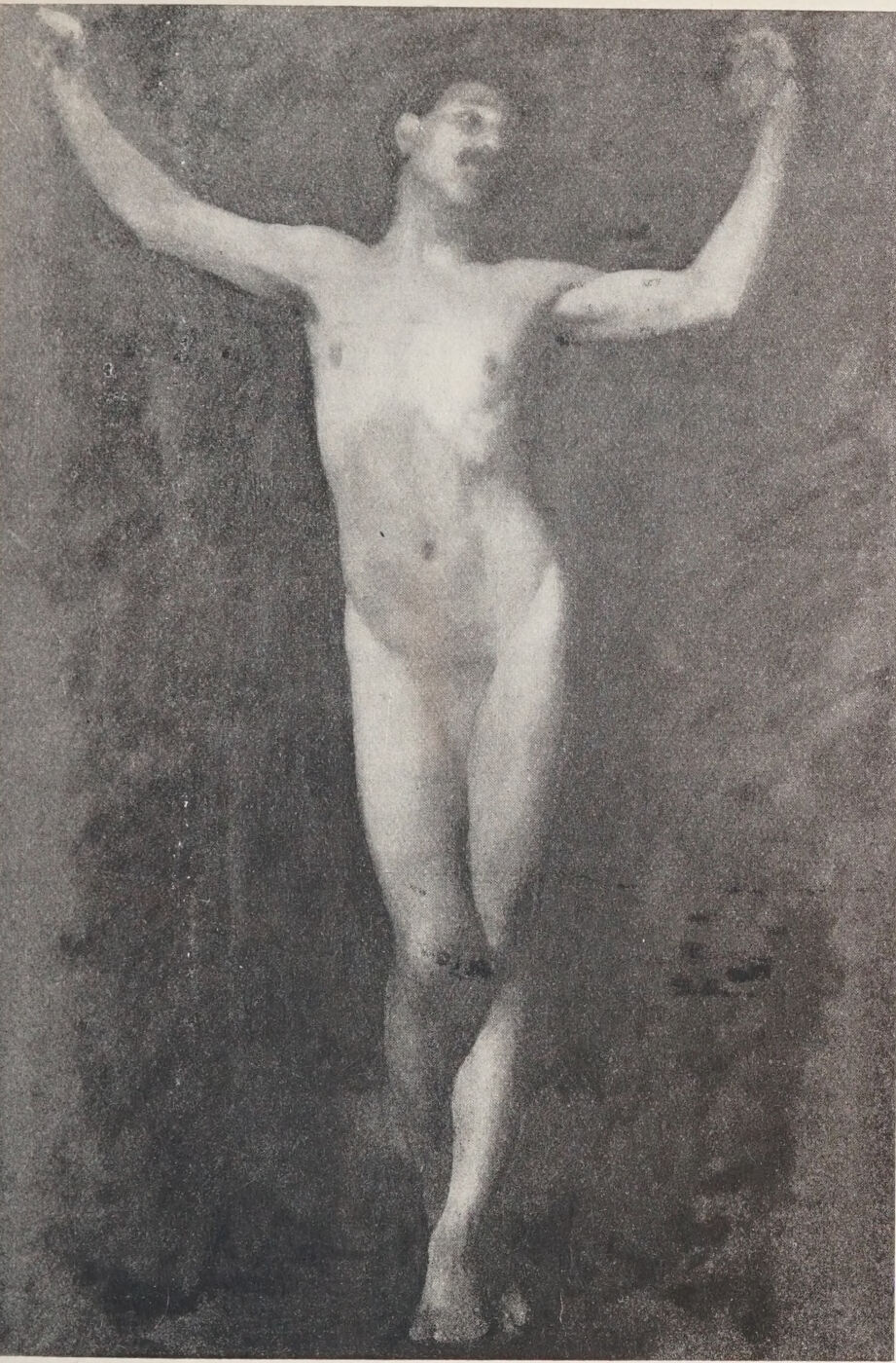
Fig. 12.Plate XXIV. Facet Models. The light facet parallel with the source of illumination, the toned facets receding from it.Plate XXV. Figure in a Lighting Similar to that of the Facet Models on the Opposite Page.
It is a curious phenomenon that although children and savages give evidences of an elementary sense of form, and are of course conscious of the solidity of objects, they are not conscious of the signs which convey that sense of the solid to the eye and mind.
Whether the pre-Raphaelite painters were ignorant of these signs or purposely ignored them is not certain, but Leonardo da Vinci blames his contemporaries for their ignorance in this respect; and we might conclude that he was amongst the first to discover the part played by light and shadow in producing this sense of the solid.
The elementary principles of chiaroscuro are now patent to all artistically cultivated minds, and my readers, I feel sure, understand them up to a point. The distinction between definite light and marked shadow is sufficiently obvious; but that a painter’s modelling is due almost entirely to the knowledge, and a capacity to use that knowledge, of tone relations, is not generally appreciated. Yet modelling is perfectly simple to understand when the main governing principles are grasped.
Plates XXIV. and XXV. should make the matter fairly clear.
Here we have objects, the surfaces of which are composed of a large number of planes or facets.
We shall see that the facet parallel with the source of light predominates, and that the others, in proportion as they recede from the source of light, are toned and shaded.
Objects are not all composed of angles and the planes made by them, as in these examples, but the underlying principle is the same whether it is applied to curves or angles, the tones being only more suavely merged in the former case. This I have endeavoured to demonstrate in the study of a man, here reproduced.
The lightest passage, on and above the arch of the ribs, is parallel to the light; the tone above marks the receding plane of the pectorals; and below, the general plane of the abdomen that falls in towards the legs. The upper part of the legs advances again to the light, toning as the legs curve slightly under towards the knees, the left lower leg protruding again and offering a surface to the light, so that the waves of surface are seen as it were to undulate from the head to the foot.
The relative values of light and tone are entirely responsible for this appearance of advancing and retiring facets.
We shall see by this study also that passages furthest removed from the light centre, although they offer some planes parallel to the light, are generally lowered in tone, partly because of their greater distance from the light centre, and partly because of their local tones. The head, the feet, the knees, and the lower part of the abdomen are generally richer in colour, and therefore lower in tone, than the rest of the figure.
With but few exceptions, every figure or solid object has one predominating light passage, and it stands to reason that every other passage must be lowered in relation to it, however delicately in some instances, to enable it to predominate; and the same applies to the tone value of shadows.
It is the realisation of the delicate differences of tone throughout the object painted, or throughout a picture containing many objects, that constitutes, in respect of light and shade, what is known as “breadth”—that is, au fond, that every part takes its right relative position, and its proper subordination to the main light or object lighted. There is a lesson in what Sir W. S. Gilbert, the playwright, says: “Where every one is somebody, then no one’s anybody.” To the uninitiated it is sometimes difficult to distinguish the predominating light from others that are to all appearance equal to it in brilliancy; but there is one unfailing method by which the relation of all the light and shaded surfaces can be so distinguished, and that is, by nearly closing the eyes when examining the model or subjects under observation. If, for instance, two light passages appear equal, the lids must be brought closer and closer together until one of these passages is almost lost to view. This will readily settle the claim of the lighter passage to distinction. The same method is applicable in arriving at a similar decision with regard to the relation of shadows, all intervening tones, and the general tonal aspect of the whole figure—in fact, of everything within range of the eye.
Once this method has been thoroughly grasped, there will be little more to learn about the theory of light and shade and tone values.
There are, however, some matters to be considered in connection with the rendering of these tone values in painting or tone drawing; for instance, where there is a light too brilliant to be rendered by pigment or clean white paper.
A bright sky, to say nothing of the sun itself, presents to us such a problem.
If, with our eyes half closed, we compare this sky with the earth, trees, and so on, we should reduce the earth to a tonality that would deprive it of all sense of the light that is playing over its surface. Here a compromise must be effected, the kind of compromise depending entirely on the temperament or the taste of the artist. He would not care to sacrifice the light on his landscape by way of conceding to his sky its approximate brilliancy. On the other hand, he may not see his landscape independent of its relation to the source of its lighting, as is so often done by those who are ignorant of the value of tone relations to their art. He must therefore settle the degree of lighting in his sky and of the tone of his ground which is imposed by the limitations of his materials.
Although as a general principle the value of tone relations must never be overlooked, we must be careful not to become pedantic about them.
There are some painters who, in painting a woman with brilliant diamonds about her, reduce the flesh tones and all others in endeavouring to give due value to the brilliancy of the jewels. In such a case the taste of the painter must decide the quality and the extent of the necessary compromise; but where the predominating light passage is obtainable without strain, be guided by it absolutely—the quality of your surfaces demands it: for example, the high light on a white porcelain vase reduces by contrast what would be a white surface without that shining light to a low-toned one. The quality of the glaze is thus seen in nature, and thus rendered in painting or drawing.
The reproducing of every kind of texture depends partly on drawing, but mainly on the tone value of their light, half-tone, and shadows. This will be clearly seen in a photograph of flesh, silk, satins, metals, and the like. Colour plays no part here, but tone alone is sufficient to render with the utmost fidelity such textures in the photographic print.
Photography is unwarrantably abused in our day by some painters, and I warn you most seriously about using the camera illegitimately, and so becoming the real camera fiend. But if you would learn the importance of tone value in your art, study photographs (not of your own making) from this point of view, and you will learn many a good lesson both about textures, modelling, and aerial perspective.
As an exercise in aerial perspective draw an interior, carefully contrasting (by the eye-closing method) the relative values of the objects in it, and be satisfied with your drawing (of course a toned one) only when you are, or rather when another person is, able to say that this chair is just so many feet away from the wall, or that other object so far from the chair, and so on.
I take it, of course, that your knowledge of linear perspective is adequate. If the room is lighted from behind you, you will find as a rule that the nearest lights and the nearest shadows are stronger both in tone and colour than the more distant ones, even though their surface colours are unequal.
Do not attempt to paint or draw a figure, or any object, except the setting be that which you wish ultimately to realise. The tone of the setting or background is as much affected by the main object as that object is affected in tone by its setting. They act and react on each other, and the subtle differences thus brought about make all the difference in the quality of your drawing or painting.
Except perhaps in decorative or in imaginary subjects, keep to this rule; and even in the carrying out of such work, be aided by nature’s tones wherever it is possible, or your surface quality, its weight (or solidity), will suffer.
To this subject I shall have reason to return in the chapters devoted mainly to painting.
When you have mastered the foregoing lessons and have learned how to apply them, then and then only would I advise you to take up your palette.
Colour has a fatal fascination for us all; it will not spoil for the keeping. Lay a sure foundation for your house, or the superstructure, which painting is, will be futile and of no avail.
By the system of apprenticeship that obtained during the Renaissance and in those now regretted days when the decorative arts flourished in Europe, the knowledge of our craft was handed on from master to pupil. Those valuable traditions are to-day but a faded memory; but such is the spirit of the age, that even did the unbroken chain of tradition reach back to the fifteenth century, when oil-painting first came into general use, its sanction would probably be questioned and its teaching neglected.
I shall have cause to refer throughout these pages to some of the many forces that are at work and have inspired this breaking away from all workman-like traditions.
Chief among these disintegrating influences are the modern cult of realism, the multiplicity of art exhibitions, the not unmixed blessing of the advance in chemical science, and the superstition that because of the opacity of pigments corrections can be ventured upon without due preparation. The thoughtful among us have for some time past felt anxious about the methods, or rather want of method, by which so much modern work is produced.
Teachers have been too superior, perhaps too uncertain themselves about their craft, to do aught but teach and criticise æsthetically, and have left the student to shift for himself and learn his trade as best he might.
No one about to take up painting as a profession should be left in ignorance of the dangers that beset him. He will be saved much heartburning and many futile experiments if he but know at the outset what is detrimental and what should be avoided.
Let us see how far the cult of realism has affected modern practice.
Painting is begun with little forethought as to the method to be pursued. A settled plan would hamper the painter who is willing to fall in with nature’s ever-varying and wayward moods, so that after an attempt partially to paint one aspect, he is induced to make the changes invited by the passing fascinations of another. Little harm might come to the work were each succeeding variation studied apart, and one of them eventually selected, put in something like artistic order, and completed. But no! with an utter carelessness of eventual results, one painting is imposed upon another, until the desired realistic feeling is achieved.
I have referred to the supposed advantages that oil-painting has over other mediums, insomuch as changes can be effected without erasing or making preparation for the passage over which the change is to occur. This fallacy ought to be exploded. The practice is most pernicious, the more so because the mischief is delayed and not apparent.
To begin with, it is almost impossible to get away from the moral influence either of the colour, tone, or drawing of the existing surface. And also, physically, in the course of time these make themselves felt through the superimposed layers of pigment. You may take it for granted that no sense of freshness can be preserved after three, or at the utmost four, coats of a similar tint have been laid solidly over each other on the canvas. Besides, the grain or texture of the canvas is your best friend, and when this is gone (that is to say, when the pores have been filled up with solid paint) all attempts to regain clearness or freshness are hopeless. If we resort to the scraping of the paint with a razor or knife the surface becomes slippery, and no tooth remains to help us with our modelling. I shall, however, add to the list of materials by advising you to use a scraping tool called steel plush mat. I know of nothing better to enable you to erase your painted errors and to renew a texture. But the wisest course, when a canvas is loaded in the wrong places, is to take up a fresh one, trace on to it whatever is worth preserving, and paint on it de novo. This really saves time, and gives you fresh hope.
Let us now inquire into the effect resulting from our oft-recurring exhibitions of painting, and see how they influence the painter. So many of the qualities considered essential by our masters are sacrificed for effect. An obtrusive coarseness is now preferred to the velvety surface of the Dutch masters. Scene painting, effective enough on the stage, and perhaps telling on the great walls of our exhibitions, is taking the place of precious workmanship; and, worst of all, these exhibitions engender a never-ending restlessness and love of change for the sake of change. Anything with which to astonish the native! Fashions in painting come and disappear like Paris hats, so that last year’s methods are as out of date as the headgear that went with them. Many bids for fame are made by men who, having nothing to say, invent a new language to say it in, and hope that their jargon may be mistaken for originality, as it not infrequently is by the immature critic and the modish amateur.
There is no end to the possibilities of what is known as imagination—that is, the power to make fresh combinations of existing facts and ideas. But there comes a time when the language, either literary or graphic, in which ideas are clothed may be considered fully developed, and the purity of it must suffer by the introduction of unsanctioned changes or a breaking away from its accepted law.
There is, however, ample scope for the manifestation of distinctive personality within its fairly defined boundaries.
Painting may now be said to have reached its full development.
From Van Eyck to Velazquez, from Titian to Gainsborough, from Rubens to Ingres, from Watteau to Bastien Lepage, is indeed an enormous field. There is little need to seek further for models on which to base artistic expression (that is the language of the artist). Abundance of scope is to be found within this field for every personality to assert itself, for every worker to preserve his identity. Gainsborough was buoyed up in his last moments by the thought that he would meet Van Dyck, his hero, face to face in another world. What could be more personal than Gainsborough’s delightful expression, in spite of his hero-worship and the inspiration he sought from the work of the master he loved? Why need we paint in imitation of Berlin wool needlework, put our colours down in marked variegated spots, try every trick hitherto untried, if not with the hope of augmenting the pages of the artistic slang dictionary, and writing large our name across them?
There is perhaps a curious fascination in novelty; but let us count the cost of “rushing in where angels fear to tread,” for we may be branded with the appropriate epithet. Leave the poseurs severely alone, and see to it that your methods are sane though modest. Your tether is a very liberal one; don’t strain it to snapping point by trying to realise effects that are beyond the limits of legitimate expression.
Remember too that the “modernity” so beloved by some of the critics is the last thing to strive for; it is of necessity the first thing to pass away.
This does not mean that you are to stand still. There must be signs of evolution in all art that is living; but surprising novelty is not necessarily a virtue. Originality is not affectation, but the frank expression of a personality.
MATERIALS
Grounds.—Your canvas should, except for work on a small scale, not be very highly primed; colour slips about on a smooth surface; it gets no hold; a distinct tooth is a necessity. Your choice of a canvas depends largely on your method, and frequently controls it; for instance, if you have a desire to paint fatly, a slight texture would be better than a rough surface, which absorbs too much colour to allow of an unctuous manner, at least until a later stage when the grain is partially lost under successive layers of paint.
I should advise you to try a variety of textures to find out by personal experience the most sympathetic ground. It is well to learn to feel “at home” under varying conditions, for a coarse canvas on which you might paint the head of an old man would hardly be suitable if a child’s face were your subject. However, it is wise for a student not to go to extremes in his selections. Except in the case of studies for more important work, do not paint on toned canvas, for the reason that it is difficult to evade the moral influence of a dull ground. It makes for dulness, while it flatters you that you are painting brilliantly; but for rapid studies it has its uses, the background being to a certain extent already indicated.
For this purpose I have found brown paper, stretched over common canvas and then sized, a delightful ground for studies in oil or guache.
The wood panels made to fit into the lid of the paint-box are of a pleasant warm tone, and are to be recommended both for landscape sketches or small figures.
If you find after some experience that your work inclines to soapiness, you may correct this objectionable tendency by using an absorbent canvas.
The thick wood panels used by the old masters are rarely painted on to-day, but for small, highly finished work they are preferable to canvas.
Let your palette be not less than eighteen inches in length; rather more is advisable. Personally I prefer the dark pear-wood to the light maple palette; for on the light yellow surface it is hard to recognise the real nature of the colour which you are mixing.
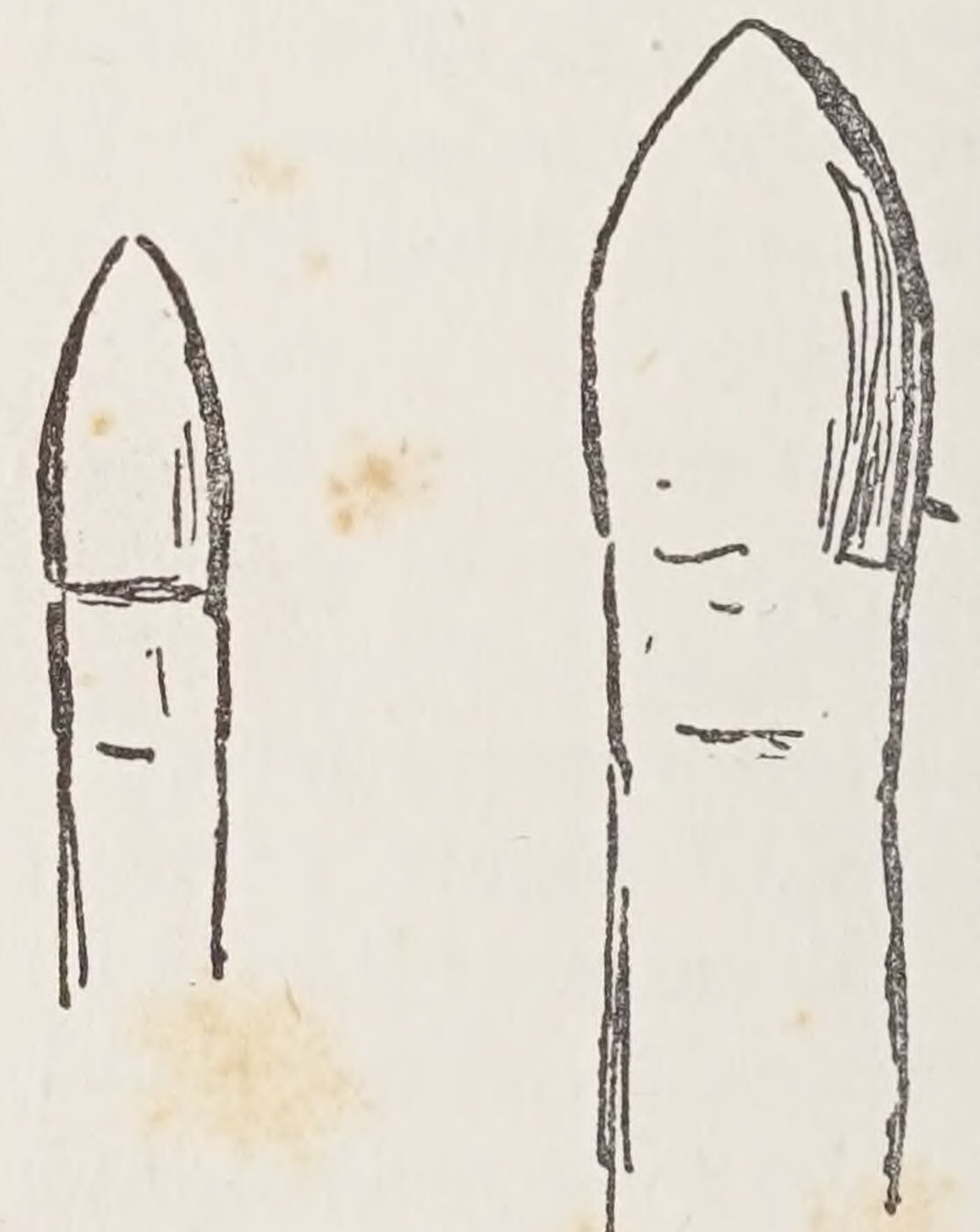
Among your brushes, have some of the shape shown on page 72.
These flatted round brushes, coming to a blunt point, are sometimes called Leighton brushes. With them, the drawing of detailed passages can be effected, and fewer small brushes will be needed. Avoid the use of many small brushes in life-size work, and get used to large ones of an inch or more across. Try all kinds—flat and round of a medium thickness. There is no resilience in a thinly haired hog-brush, and a fat one absorbs more colour than it places.
Let your palette knife be fairly long—you will see the reason for this recommendation later on—and let it be trowel-shaped.
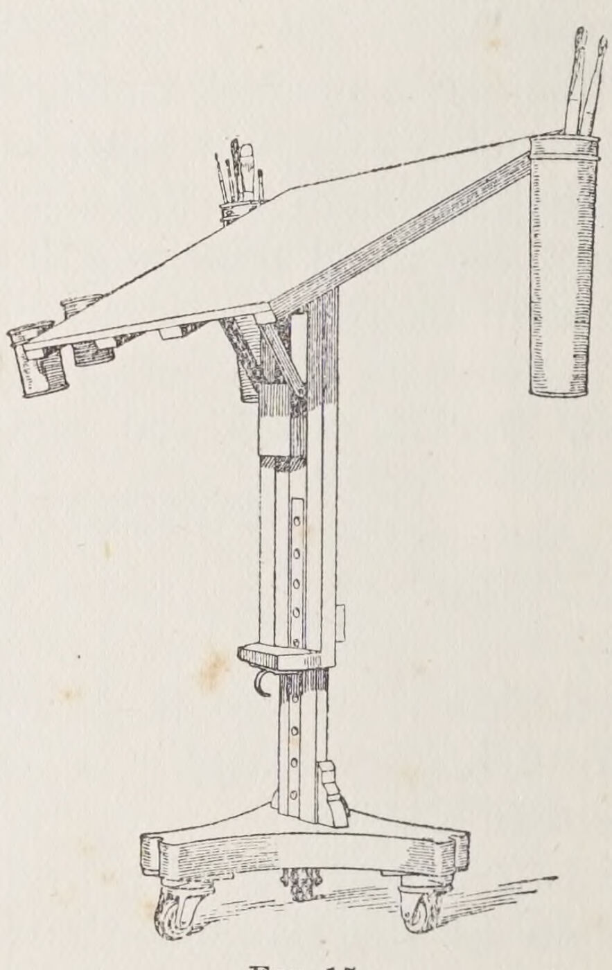
When painting large surfaces, you will find a painting table, like the one reproduced on page 74, very useful. It can be easily moved, lowered, or raised; and it offers a much larger area for the mixing of quantities of colour than any palette you could hold with comfort.
With the same object a number of shallow saucers, which can be filled with colours mixed to the approximate tones required with medium, are serviceable.
Charcoal is used for the initial drawing on canvas.
The wire plush mat which I have already mentioned is quite the best kind of scraper. With it you can erase the paint, particularly when dry, until the canvas is bared; and at any stage it can be used to restore a texture that may have been lost. The wire plush mat can be purchased at tool shops, and is sold in lengths. The shop assistant will cut up the lengths into shorter ones for you, a six-inch length being what you will find most handy.
This mat is used mostly by plumbers. Its use requires a little experience. I ought to caution you never to scrape your work until you have placed a stout cardboard between the canvas and the stretcher, for the pressure will otherwise force up ineradicable ridges in those parts of the canvas that lie over the edges of the woodwork behind. Good pictures are frequently spoilt because of the lack of this precaution.
Your easel should be the best you can afford. Let it be light and run on good castors.
COLOURS
There are two methods of painting I wish you to learn. The one is painting in “grisaille” or monochrome, and subsequent glazing and scumbling with colour; the other is direct colour reproduction. The former method needs but a very simple palette, the other a much richer one. I shall recommend a list from which the colours for either method may be selected, I think, with safety, avoiding inclusion in it of any pigments considered doubtful by the chemists, and including the least harmful among the evanescent ones, which however are essential:—
Kremser White or Blanc d’Argent.
Flake White, and Stiff Flake White.
Yellow Ochre.
Light Red, Extract of Vermilion.
Rose Madder, Indian Red, Cobalt.
Emerald Oxide of Chromium, Raw Umber.
Burnt Umber, Ivory Black.
These will be adequate for flesh painting and for most of the ordinary effects of colour.
I add a supplementary list which may be required for special purposes:—
Warm Naples Yellow, and Lemon Naples Yellow.
These colours must not be touched with a steel palette knife, or they will go black. If they are included in your palette, use a horn or ivory palette knife. The same applies to Orange Cadmium, a useful colour, of which the Naples Yellows are now made. Raw Siena you will sometimes find useful, but there is some danger of its separating itself after a time from the lighter mixtures in which it may form a part. It is therefore wiser to use it only when absolutely necessary. Yellow Ochre will answer most of the purposes for which the Siena is usually substituted. Burnt Siena is safe enough, but rarely needed. And then the various madders are perhaps necessary where rich reds are required; but remember all the madders are to some extent evanescent, since they are largely composed of water.
Beware of Chromes and Emerald Green; you will rarely require them. It is wiser in every respect to restrain your selection than to attempt extraordinary effects which are not likely to last, and which may tempt you to overstep the proper limitations of your medium. Sepia is a fine, rich, warm, and deep colour, but must not be used too thickly; for, like bitumen or asphaltum, it never dries in the mass—a skin forms over it, and it is sure to crack.
The excessive use of these bituminous pigments is responsible for the destruction of many of Reynolds’s and Wilkie’s works.
The Dutchmen, however, knew how to use them. Bituminous pigment formed the base of many of their works, particularly of the School of Teniers; but their pictures were generally small, and no great quantity of the dangerous pigment was needed.
I have advised the use of three kinds of white. Kremser or Blanc d’Argent has not much body, but is useful to mix with other colours, where impasto is not sought after.
Flake white and the stiff white have more body, so that more solid passages of light can be realised with them.
Use fresh colours each day. There are a few reds, like Rose Madder, Vermilion, Light Red, and Indian Red, as well as Black, which may be left on the palette for a few days. They do not dry as quickly as the others, which you will do well to remove at the end of the day’s work.
To avoid waste, you may transfer the paints from the palette to a sheet of glass, which does not absorb the oil like the wooden palette; and next morning remove the “skin” that has formed over night, and put the fresh pigment that will be found under the skin back again upon the palette.
Do not starve your palette. A little experience will enable you to guess the quantities you are likely to use in the day’s work. Stale or partially dry colours will hamper you. There are always enough technical difficulties to overcome.
Keep your palette scrupulously clean. It is impossible to obtain any brilliancy with a dirty palette, and luminosity is the rarest quality to attain—and one of the finest.
During the course of your work, when your sitter is resting, or at other intervals, collect with your palette knife the paint spread over the palette in painting, and make it up into two or three piles away from the centre.
These piles of colour will serve as the nuclei of greys that you may perhaps require. Then clean the centre of the palette with rag, of which a fair quantity should be at hand.
It is a good thing before actually painting to mix up a few masses of the light, half-tone, shadow, and background colours. They can be further mixed on the palette more closely to match the tones required as you proceed. This expedites the work, which is an important consideration. It encourages you also to work with a fuller brush. Such masses must not be mixed long before the work begins, or they may become partially dry and unworkable, particularly in summer time or in a very warm studio.
Good and fresh spirits of turpentine you would use as a rule for the first lay in of most work. About other mediums I shall advise you at the appropriate time.
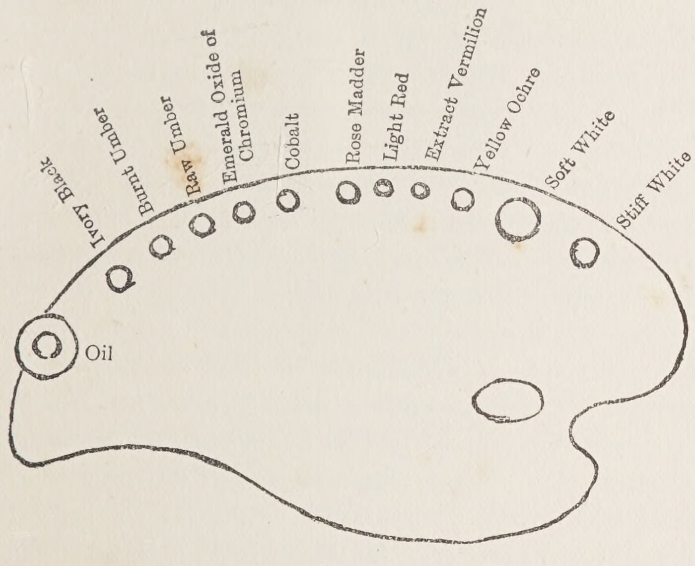
Lay your palette in this order when you are painting in full colour direct (for the monochrome method very few colours are required), beginning on the right hand with white, yellow ochre, and so on, and going from the light to the darker colours on the left.
It facilitates your work to have your colours arranged in a definite order.
The approximate quantities which you will ordinarily require are suggested by the proportionate sizes of the circles drawn on the diagram.
I should certainly not advise you to paint in full colour in the first instance.
Monochrome painting is by far the best initial practice; you will no doubt have to put some restraint on your longing to use colour, but you will be amply rewarded for not venturing to run before having learnt to walk erect and with a firm step. And since it is clearly seen that nearly all the great masters made something like a monochrome preparation for their pictures, and they knew what they were about, a knowledge of the use of monochrome will be invaluable to you in your after practice, besides enabling you to master most of the technical difficulties by degrees.
Get a cast of an antique head. If it is very white, tone it down with a thin solution of raw umber and oil to something like the colour of old ivory. It will then not take so many reflections in the shadows, and its general effect will be broader—that is to say, more simple. Place the cast in a fairly strong light, so that its shadows are definitely marked. Your canvas might be about 24 inches by 20 inches or a little larger. You will rarely need a canvas smaller than this.
Although little attention is usually paid to the lighting of your canvas, it is really very important that no glare of light be upon it; not only because the paint might shine, but for the reason that if the painting is more highly illuminated than the object to be painted, you will imagine that it is more brightly painted than it actually is.
Let me give you an example from my own experience—a somewhat extreme example, it is true, but the principle to be learned from it applies in all circumstances. I was sketching at Pompeii; the sun shone fully upon my canvas, and my sketch seemed to me to be bright and warm in colour. When I took it home I saw that it was both dull and cold. Out of doors the sketch was illuminated by the brilliant and warm light of the sun, and so appeared to partake of those qualities; but the normal light of the room showed me that I had made a great mistake to work in the sunlight. Similarly, if your painting is too brilliantly lighted, your study will suffer as my sketch suffered.
You cannot, of course, work in a dull light, but you can slightly moderate it with a screen or curtain. Where there is a top light, this precaution is not necessary, for your study will be equally lighted with the model; but with a side light, when you are working, as you probably will, nearer the window than your sitter is placed, some sort of screen is necessary.
It is well also to let the area of light be much smaller than obtains in most studios. It is the quality, not the quantity, of light that tells.
Now proceed to draw the cast in the manner I have endeavoured to impress upon you, in charcoal, and take some pains to place it well on the canvas. A good study is often spoilt by being badly placed. A few hints on the arrangement of your work will be found in a subsequent chapter, but as a general rule you might, when painting a head on the canvas of the size given, find the chin somewhere about the centre. When you are satisfied that the drawing is good, particularly in proportion, after having compared it throughout the various stages with the cast in your hand-glass, blow off all but the faintest indications of the line. You cannot expect to keep your picture clean and bright otherwise. Then with a sable brush go over the lines with a thin mixture of raw umber and turpentine.
Your palette need only be laid with Kremser or Flake White and Raw Umber. The study of a man in Chapter VI. was done in these two pigments. On the same lines proceed with your study. Use an oil-pot of the shape and size shown on page 84, containing some spirits of turpentine.
Mix up in fair quantities three tones—that of the background, the middle tint, and the general tone of the shadow.
Paint the background, not too solidly, in its tone relation to the cast, half closing your eyes to judge its depths; and cover all the canvas up to the outline of the cast.
Now take your middle tone—that is, the general aspect of the cast—the tone next in value to the higher lights, and paint fairly thinly with a good size brush over the whole surface of the drawing, leaving essential indications intact, and right up to the background, so that the edges melt. Now place your study beside, or in line under, the cast, referring to your glass, to see what you may have to do to get the relation of the general tone of the cast and background still nearer; for now that your canvas is completely covered, you are in a better position to judge these things.
This is an important stage and settles for you the key of tone that you will maintain throughout. Now paint the shadows and draw them in definite shapes (with a brush of moderate size, not by any means a small one), comparing their values either lighter or darker, or perhaps in places similar to the background. Ignore all marked passages of reflected light in the shadows, and let them merely be felt in the general tone where they come, but not outlined. Nothing gives a more commonplace or cut-up aspect than the marked reflections, on which the beginner insists. If you will only look at them, your eyes nearly closed, you will see how much less definite they really are than they look at first sight.
All light passages enclosed between darker ones appear lighter than they are; remember this throughout your practice. Now paint your half-tones, the tones coming midway between your middle tones and the shadows, in definite shapes and in definite planes, and then impose the lights more thickly so that the solidity of your cast becomes apparent; and see that the planes occupy their due areas in the map.
Now draw and model the features, and when this is done, brush together lightly the edges of the shadow and half-tones, taking care not to lose the drawing, but rather to correct and supplement it in the process, “lose and find” the outline against the background, and maintain in completing the work a sense of the “oneness” which is so essential—the nearest definition of “finish” I can think of.
Let me now explain to you my reasons for recommending this particular method of painting.
On a white ground you could not hope to realise your middle or general tone. Therefore it is well to lay in the background first, and then the general tone aspect of the subject, for the one reacts upon the other. Covering your drawing with a thin coat of the middle tone gives you a field of colour into which to paint.
The actual painting stage really only begins when you paint into paint. Only in this way can your shadows and half-tones melt one into the other. Only in this way can you model round your planes, fusing one into the other—that is, when all is wet together, so that the brushing can assert itself and help the sense of undulation.
Moreover, the laying in of the general tone aspect makes for simplicity and oneness, and enables you with the fewest possible touches to realise the varying planes, and the solidity of your work.
There will be little need to employ more than four or five tones, ranging from the shadows to the bright lights: all subtler shades can be modified in the final brushwork. Let breadth and simplicity be your watchwords.
Although in the foregoing instructions I spoke about your completing the study, you are not likely to be able to finish it to your satisfaction so early in your practice, and in all probability you will need and wish to take up the study again. Then how are we to proceed? To begin with, if towards the end of your first day’s work you see that it is hopeless to finish your attempt, boldly take your large palette knife and sweep off all the paint that will yield to this process, evenly, from top to bottom of your canvas, working from right to left across it. You will find that with the exception of the surface paint so lifted a faint indication of all the varying tones and the general drawing will be left intact for your guidance on the morrow; and what is equally important, the surface or grain of your canvas will be preserved. Moreover, by taking away the solid paint, the canvas, if placed near a stove or fire, will be dry enough to enable you to resume the work next day. It cannot be said that you are a capable painter until, with practice and all the necessary knowledge at your finger-ends, you are able to complete satisfactorily a passage of painting, such as this study and its background, at a single sitting, while the paint throughout is practically wet and malleable.
By going over, and again erasing, the painting, as I have instructed you, a few times, say three or four, before you are quite wearied with the effort, you will at least have mastered some of the technical difficulties; practised your hand; and seen how the paint behaves, and what you can do with a brush as distinguished from your handiwork in charcoal or chalk.
When you have made studies in different views of the cast, or between the making of these varying effects from it, arrange a silver teapot against a piece of coloured satin or other material, and paint it exactly in the same way in monochrome. You are not to seek to convey the sense of colour, except through the just realisation of the relative tones. As I have pointed out to you, a monochrome photograph enables you to distinguish metals and the texture of other materials quite independently of colour, although you may often be able to guess their actual colours by the justness of the tone relations. In this study use more of the stiff or solid white for the silver, for you have yet to get used to managing the stiffer pigments; and whatever you do, do not retouch the study with any colour when it is dry or tacky. It will be quite time enough to do this when you have had experience and have gained sufficient judgment to retouch your work without losing the sense of oneness; for although you may feel that a few corrections are necessary, you will do more harm than good. You are likely to lose the quality you will have realised by keeping the study all wet together, if you retouch the surface however slightly.
Now, we will imagine that you have neglected to scrape off your paint while the study was wet, and desire to continue with it although it has dried. If the work is only partly dry, and too set to be removed with the palette knife, you had best not continue with that study until it is thoroughly set. It is better to start something else meanwhile.
If, however, it is practically dry, how shall we proceed? First of all, take your “plush mat” and erase some of the dark colour from your shadows and background, right up to and even over the outline, not forgetting to place a thick cardboard immediately behind the canvas, between it and your stretcher. This will give you a firm ground to scrape upon, and will prevent abrasions. Repeated covering of already dark paint will lead to muddiness; but by erasing somewhat, you will be able to preserve the requisite transparent quality. If, at the same time, the light passages are over-encumbered, use your plush mat so that the scraping undulates across the modelling, from side to side of the study, pressing but slightly on the mat. Any uneven pressure may result in ugly ruts, in which eventuality you had best scrape till the immediately surrounding canvas is altogether bare.
After this preparation, begin again according to the instructions given in the early part of the chapter. I have told you that you may paint two or three times only over the lights without danger of losing freshness, and for this reason it is wise to paint thinly at the start, reserving your full brush until you arrive at what you hope may be the last painting, so as also to retain as long as possible the grain of your canvas.
Before recommending you to paint in monochrome from the living model, I should advise you at this stage to practise working with your full palette at some still-life subject, painting in direct colour à prima, of course after having carefully drawn your study.
I advise you thus because, although I wish you to prepare all your serious work in monochrome, there will be occasions when you will have no opportunity of returning to your work a second time, in which case a first monochrome painting will be of little use to you. You may have to make a rapid study in colour, perhaps of a passing effect in landscape, the study of a figure in the open, of certain flowers or other perishable objects—even a study for a portrait to be done at one sitting. And it may often occur that in your more serious work some change will be found advisable in a minor part for which you have no time to prepare except by scraping, as well as in other instances, to which I shall allude later, so that in any case à prima painting must be studied.
Arrange some fruit in a dish against an appropriate background; draw the subject most carefully in charcoal, and after having blown or brushed away all unnecessary blackness (for the black of the charcoal would destroy all freshness of colour), clean your canvas with bread—for with flowers, flesh, or any delicate subject, you cannot work too cleanly. Some of your contemporaries may tell you that you cannot get any quality in your colour by a clean method—dirt is so often mistaken for tone! Let, however, the quality you seek be under your own control, and not the result of a slovenly method. Let your dish of fruit consist of apples, an orange or two, bananas, and so on, as well as a few large leaves, all simple forms, not too intricate in drawing. Paint in your background tone, covering the canvas, all but the main subject. Mix up on your palette some of the general colours, the middle tones of the fruit, leaves, and dish, matching the colours and tones as you would match silks or wools, and so cover the rest of the canvas. This time use linseed oil in your pot, and brushes of fair size. Now match the tone of the varying coloured shadows, and paint them; then, the higher lights; and after that, the broken passages of colour. If, for instance, there is some red in the green or yellow apples, scrape off with your palette knife some of the middle tone colour, over which the clean red is to appear.
From time to time place your canvas against the subject, walk back as far as possible from your work, and compare it with the group in the hand-glass. See that the comparative tone values of the parts are just, and that the whole mass of fruit, &c., is in tone and in colour relation to the background. You will find that in contrast with the brilliant fruit the colour of the background will be considerably modified, as will also be the shadow colours of the fruits themselves by their juxtaposition. Be content only with your work when the apples look eatable, their polished surface not overdone. In other words, see that the high lights are exactly their right tone, and not too light, and that all other lights and light masses are subordinate to what happens to be the highest light or light passages. Make sure that each piece of fruit keeps its place in relation to the rest, and that the whole looks like a mass of fruit, and not a coloured list of separate items.
This general aspect you must try to get at the outset, and preserve, in spite of the finish you may bestow on the parts. The part must always be subordinate to the whole.
If at the end of the day’s work any portion is not satisfactory, scrape it away with the palette knife, evenly taking off the solid paint; the rest may perhaps be sufficiently wet to enable you to continue the next morning.
If it is winter, put your canvas in a cold place, outside your studio or room, if possible exposed to the air. Thus treated, paint often remains sufficiently wet to enable you to continue the following day.
In almost all instances the first painting on a new canvas dries very slowly, but it will frequently work up—that is, leave the canvas when worked over, and not settle. You might in such instances lay blotting-paper over it to absorb the superfluous oil; and if that does not answer—for it will largely depend on the texture of your canvas—take off the paint with your palette knife and clean it again with a rag. This being done, paint with greater solidity, with less oil; a little mastic or amber varnish with the colour may help you to steady it. Many such technical difficulties will require special treatment, and experience alone will enable you to overcome them.
I ought perhaps to tell you that, except for the background and shadows, you might paint all the more solid light passages without a medium, if you wish to complete your study at one sitting.
Now arrange a still-life group (similar to the one to be done in the monochrome) of silver and china on a white cloth, with any other objects that may help to compose the group, and, by way of getting accustomed to the different mediums, put some amber or mastic varnish in your oil-pot, adding to it a little linseed oil.
This makes a very fat medium, and may render your silver objects more effective.
In such a group the delicately contrasted whites should make a good study. Be careful to compare the varying qualities of the white and other delicate tints. Note the effect which the high lights on the silver have upon all other tones; and although the reflections in the shadows on the metal may appear very high in colour, let there be no mistake about their being reflections, both in the quality of their colour and their general tone. You must also look for the alternating warm and the cool tones that may occur throughout the group.
Keep your colour pure. Lay in the whole as before directed, and think less at the outset of the nature of the textures than of the patches of varying light and dark tones. If these are carefully followed, and a tone coloured map, as it were, of the whole mechanically reproduced, the textures will be at least partly realised. Having looked into the glass at your canvas, which is now completely covered and placed by the side of your group, seek to elaborate each object, and if by chance there is any sense of monotony in the work, you will find that by laying on the light of the silver very cleanly and very solidly, you may get greater contrast of tone. Leave your work at intervals, for ten minutes at a time, coming back to it with a fresh eye. It is important at all times, when you are working in colour, to interrupt the work with this object in view. You will more readily appreciate the delicate variations, and become aware of any false sense of colour that may permeate the study.
Try and make this group as finished as you can, even though it may look over-laboured. You are not likely to preserve a desirable freshness with completeness in your early practice, but you must learn to concentrate, and stick at it. You will get into messes often enough, and you must learn how to get out of them. You may be sure that without great determination nothing is achieved that is worth achieving.
If the study is at all promising, leave it intact, and take it up, if you can keep it wet, the next day; if not, let it dry thoroughly, and then take it up again. Many roads lead to Rome, so on another occasion try a different method. Take up the same group from the same view. Having done it as a whole, you will have learnt something of the relative value of the parts. Make your drawing, and on the bare white canvas complete absolutely each object separately, bearing in mind, while painting it, its relative value to the whole. This is excellent practice, and will best enable you to finish. Experience gained in this way is invaluable: you will see when the study is done whether you have over- or under-stated the value of the tone of any particular part. I should advise you to begin with the object strongest in light and shade, so as to set the key for the whole, and paint it up to full strength, or you will find most likely, when the surroundings and background are painted, that it may look weak.
It is quite possible to complete a picture bit by bit in this way. Many of the students in the École des Beaux Arts in my time began their studies from the nude at the head and worked down to the feet without retouching; and such studies, when completed, were often perfect in the relative value of the parts to the whole.
In this way freshness is preserved and completeness attained; and for the student who is beginning, it is far less distracting than what I might call the driving of a whole team. With a simple theme, it is better to keep the whole going together, but with a more complicated one, when the colour, tone, and drawing, and many subtleties demand consideration, it is wiser for the beginner to divide up his work in the way here suggested.
When the weather is favourable, go out into the open and paint some simple landscape studies. I shall leave it to others more capable to give you detailed instruction in landscape painting; but such work will be a pleasant change for you, and I more particularly want you to make value relation in landscape your main objective at this period of your studentship. A few studies of skies also will teach you the importance of a clean method, and will give you greater freedom of handling.
Fig. 18.Fig. 19.Plate XXVI. The Creation of Adam. By Michael Angelo.Plate XXVII. The Brazen Serpent. By Michael Angelo.
Before we take painting from the model, let me have a little chat with you about the necessity of training your imaginative faculties and cultivating your sense of arrangement.
Although we are concerned mainly here with painting as a craft, a knowledge of painting alone will not suffice to equip you for the profession of painter, which you may wish to adopt. There is much more to learn if you would be, as you should, many-sided. The student too often assumes that the power to compose or arrange with effect will come at his bidding, for to him it appears to be so easily done by others.
We do not get stronger by watching other men lift weights. Nor are weights lifted or pictures composed, either at the beginning or at any time, without effort.
Good composition calls for a far higher mental capacity than mere painting, which in itself is difficult enough. And by neglecting to cultivate our imaginative faculties whilst we are young, we incur some danger of losing them altogether.
When in the course of your reading you come across a pictorial episode, visualise it and sketch the scene as it strikes you. There are, nowadays, so many beautiful illustrations to be seen; you may well learn, from some of them, how figures are grouped, and how accessories are placed to complete the pictorial arrangement. Such mental notes, added to your unceasing practice, will greatly increase the facility with which you will be enabled to arrange and compose artistically.
When visiting a picture or sculpture gallery, take a sketch-book with you. Your memory will not suffice to recall the results of your analysis of compositions. Study particularly the placing of heads, half and full length portraits and figures, and the main structural lines and colour masses of decorative designs. Mark the arrangement of light and shade (chiaroscuro) in Dutch and Spanish pictures, which have such fine technical qualities, and when anything strikes you as particularly beautiful, draw it, and in drawing it search for the secret of its beauty.
Here are a few hints for your guidance in placing your own studies.
You have already been advised, when placing a head on a canvas about 24 inches by 20, to mark the chin about the centre of the canvas. When the head is facing you, it should be placed fairly centrally. When the face is looking either to the right or left, let there be a greater space in front than behind it; and keep your heads high up. There is distinct loss of dignity when a figure seems to be slipping down behind its frame; nor does one expect to chase the subject of a picture round the edges of the canvas. That modern trick has ceased either to surprise or fascinate, and it smacks much of the unsteady Kodak.
All pictures should be decorative—that quality need not be exclusively reserved for what are known as decorative pictures—and there should be just accident enough in their arrangement for them not to appear obviously arranged.
SOLECISMS IN COMPOSITION
The “Artistic inequalities” is an expression to remember. I will endeavour to explain it with a set of negative rules. No two quantities—where it is possible to avoid such repetitions, should be equal in value, either of groups, colour-masses, or spacing.
Figures or groups should not be the same width across as the spaces between them and the edges of the frame; nor should the horizon be centrally placed nor a figure, or any part of its outline, just touch another outline. It should either cut the other boldly through, or sensibly avoid it.
Figures should not be “haloed” by repeating forms above them either by cloud shapes, trees, hills, or other incidents or markings. Nor should they be placed back to back; nor be grouped in equal numbers.
The confusion which results from ignoring these simple rules is made evident in the accompanying diagram.
In architectural decoration, symmetry is not necessarily objectionable. The element of accident is rarely called for in formal designs.
In Fig. 19 we have the perpendicular lines of the columns running into the outline of the head and so enclosing it, carried on again by the drapery folds and the straight leg. We also see horizontals found in a line with the eyes, mouth, chin, and so on—limbs cut through at the joint—the bent leg, conducting the eye into the angle of the canvas—a curved marking in the columns, recalling the top line of the head—cloud forms echoing the head itself—the arm and leg making between them something in the nature of a parallelogram. Any one of these faults might well tend to confuse or check the sense of detachment and simplicity.
Many concavities should be avoided, as well as “double action,” such as the two hands of a figure separately occupied, unless the subject demands it.
Such difficulties as these will crop up repeatedly in the making of compositions, and where it becomes impossible to steer clear of them, a judicious use of light and shade may often help to render them harmless. But should your composition, or any part of it, appear weak, apply such negative laws to it. They may assist you in discovering the source of weakness.
I would draw your attention to two compositions of Michelangelo which form part of the ceiling decoration of the Sistine Chapel, that should make manifest to you the capacity of line and massing in the hands of a great master.
In the “Creation of Adam,” mark the sense of dawning life in the figure of Adam. The sweep forward of the Creator, supported by figures that foreshadow the creation of Eve and her children, and the great curves of the folds that enclose this on-moving group—how satisfying is the fulness of those convex forms!
In the “Raising of the Brazen Serpent” pendentive, the bodies and limbs fitted and dovetailed in the foreground group suggest, besides a writhing mass, a consummate orchestration of lines which has never been equalled or approached.
If now you feel that you can sit in your saddle and know how to hold your reins, you may begin to trot. Paint from the living model, at first in monochrome. It is wiser to attack your difficulties one by one, until you are accustomed to them.
There is always something disconcerting in painting from the living model, and since the sense of solidity, and subtle modelling, are due to the relation of tones, it is well to cultivate the habit of reducing every part and every colour to its equivalent tone value.
Induce a patient relation or friend to sit for you. A professional model will give you the least trouble, should no one be anxious to sacrifice himself for your welfare. The head of an old person will be less embarrassing than that of a young one.
Study the lighting of heads by Velazquez and Van Dyck. A reproduction of one of them pinned on your easel, above the canvas, might well serve you as a guide. Arrange your sitter in a similar lighting and position, for you could have no better mentor than a good example of either master.
Do not hesitate to hold your brush against your model’s face to ascertain its length, and make your study slightly smaller than life.
Draw and then shade in charcoal, and use a dry brush to model with. From time to time place your drawing alongside your sitter, on a level with, and as near as possible to, the face, and go back as far as you can to compare the drawing with nature, through the hand-glass.
My reason for advising you to keep your drawing in a line with the face is to obviate the doubt that often arises when the picture is nearer to one than the sitter, and, on examination in the glass, it appears to be on too large a scale, even though you know it to measure less than life.
Make all corrections while you can in the charcoal stage. Charcoal offers little resistance to a brush, and none whatever to bread. It is reckless in the extreme to put down paint with obvious errors in construction or drawing. Never fear! there will be perplexities enough to contend with, in every case; and much correcting in paint is fatal to lucidity.
Set the palette with raw umber, and the softer white, and use turpentine. One painting will not suffice to complete the study, so paint with the idea of going over it at least three or four times.
The instructions given for the painting from the cast will answer here, but the hair, eyes, and local colour¹ will require different treatment when you are working from life.
¹ By “local colour” is understood the actual colour of the part, unaffected by any modifying accidents—such as the red of the lips, the pink tones of the ear, &c.
The flesh and skin are pulpy and transparent, not at all like the plaster of the cast. But at the outset, think only of the main planes, painting the hair and eyes in their middle tones.
The raw umber may not give you all the depth you see, but the pure colour will be deep enough for your present purpose. Additional colours would hamper you. And it is good practice to make the best of restricted materials. When you have laid in the shadows and half-tone, the lighter and darker passages in the hair and eyes, and have translated the local colour of the cheeks, ears, mouth, and so on, into their corresponding tone value, look to the edges, against the background. Your half-closed eyes will discover for you the parts of the outline which tend to lose themselves in the background. Lose and find the outline to rid the edges of any sense of hardness, and so suggest the turning towards the planes beyond. Take care not to soften the outline away all through, or woolliness will result, and the light and solidity will suffer. While the paint of the setting as well as that of the flesh is wet, little softening of the lighter parts of the outline is necessary.
Let us take two extreme examples of the treatment of outline in paint. The work of Carlo Dolci is an instance of over-modelling. It therefore lacks solidity, is fluffy, and has no light playing over the surface of the planes which are no less over-graduated.
With Velazquez, on the other hand, the edges are not so completely lost; the planes are distinct; and light plays over the surfaces.
In the treatment of the hair against the forehead, the same discrimination is necessary, or the hair may look like a wig.
Mark the quality of the skin that covers the bones of the forehead and the bridge of the nose, and the contrasted pulpiness of the more mobile flesh that is free of the bone.
Should the sitter be wearing any white material round the neck or shoulders, see that the value of your flesh colours contiguous to such white passages is by contrast right in general tone. The lower planes of the cheek, as well as of the chin, receding as they sometimes do from the light, are more often than not quite low in tone. The white material itself varies also according to its being parallel to or receding from the source of light.
Be careful in modelling round the eyes to preserve the globular feeling beneath the lids, and to realise something of the liquid quality of the eyes themselves.
If your study appears, on examination in the glass, to be fairly well constructed and painted thinly enough to show the grain of the canvas, and you wish to take it up again, use your palette knife sparingly just to lighten the darks of the background, hair, and shadows. Should any objectionable hardness or thinness be apparent, soften with a large dry brush, and so prepare for the next sitting. Should this be the following day, place the canvas near the stove. Being thinly painted, it will, if kept warm, in all probability be sufficiently dry.
Before attempting to work again on the study, examine it carefully beside the model. Your fresh eye will detect any errors in the proportion or construction. Look to it that the map of light and shade be correct, and should you find it necessary to make alterations, such as increasing the width of the face, which should cut further into the background, or change any shadow passages into lighter ones, take your penknife and scrape away the dark paint before making corrections in colour. At this stage the penknife makes an excellent drawing instrument.
Some parts of the study may perhaps dry “dead.” Before oiling them out, breathe on the canvas; and afterwards wipe off the linseed or poppy oil with a rag. Poppy oil, by the way, dries more slowly than the other oils.
Now repeat the process of the first day, covering the whole with wet paint afresh, using the first painting merely as a guide, as so many points of departure. Do not be tempted to leave any of the underlying tones uncovered. The whole of the surface is to be a new one, otherwise there will be no scope for freedom of brushwork, and the general result will be thin, dry, and poor.
Endeavour to intensify the character, strengthen the drawing, and approach still more closely the tone values of the parts, while keeping the lights clear and the whole bathed in light.
When M. Léon Bonnat was asked by a pupil who thought he had completed his study what he was to do next, his reply was: “Make it more like.” “And then?” asked the pupil. “Then make it still more like!” was the retort.
It is given to few men, even accomplished masters, to be able to realise the character of their sitters in one, two, or even three attempts. And the student must be more exacting than the master, or he will never be a master.
Above all things, value your work in the making but lightly. Be bold to efface and renew, and take encouragement from the thought that you may learn more from honest failure than from mild success.
To avoid reiteration, I may as well go on to describe the method of preparing a monochrome for subsequent colouring. The preceding exercise represents the first stage. Briefly, then, the study or picture should, as far as it goes, be completed in raw umber and white, with turpentine as a vehicle—with this difference, that the whole is to be painted several tones lighter than nature, as a fully toned study such as you will have just done would appear if a semi-transparent paper were laid over it.
When that stage of the work is completed satisfactorily and is dry, the next will be to paint, with as much freedom as you can command, the highest lights with stiff white; the shadows with a mixture of Indian red and ivory black; the greys and half-tones with a combination of these colours and white, modified, as nature suggests, with cobalt or a very little emerald oxide of chromium, covering the whole of the first thin raw umber painting with a new skin of paint. Begin with a fluid mixture of the middle tone, always higher in tone than nature, yet relatively just; for you must bear in mind that in completing this preparation you are mentally extracting the red and yellow colours, and translating what would be left in nature, if these two colours were not present.
When this grisaille is quite dry, then glaze and scumble, with oil at first, and, when you have gained sufficient mastery, with varnish and oil mixed, the yellow and red tones as they occur, much as you would tint an engraving with water-colours. “Glazing” is a term which is applied in oil-painting to a transparent coat of colour. “Scumbling” is a semi-opaque painting through which the underlying painting makes itself felt. When employed over a darker ground it tends to coldness. Thus often a grey bloom is obtainable. Examples of its use are indicated later on in remarks on the work of Rubens and others.
There is much prejudice against this method of glazing and scumbling among modern painters; and yet some such process was, with but few exceptions, practised by the old masters far more generally than those who have not studied this matter imagine. But of this later; let it suffice for the moment that I quote the words written by Sir Joshua Reynolds when he was forty-seven. He says: “I am established in my method of painting. The first and second paintings are with oil of copavia (for a medium), the colours being black, ultramarine, and white. The second painting the same. The last with yellow ochre, lake, black, and ultramarine, without white, retouching with a little white and other colours.”
We have here on his authority the materials and general principles of their use, which in his hands produced such fine results. He obviously used his final colours with reference to the effect that was beneath them; and in the same way the monochrome ground, the underlying greys, with the idea before him of a subsequent fuller colouring to be superimposed, and on this account high enough in key to allow for the warmer tints, reducing the whole to the approximate tone of nature.
You might well ask why I have suggested a modification of Sir Joshua’s recipe. If my readers were Sir Joshuas, I would not dare; but I have repeatedly insisted on the extreme difficulty one has to overcome the moral influence of what is already under one’s eye. In most hands, the black and blue underground would lead to a cold blackness throughout. This is the main objection to “grisaille”; but it is to be overcome by approaching fuller colour by degrees. And when this trouble is mastered, the result is preferable to most direct colour paintings. Besides, the grisaille preparation varies with the temperament of the painter.
Pure glazing, when the lights are high in nature, may lower them overmuch. The addition of a little white with the warm colours, rendering them slightly opaque, obviates the loss of brilliancy, as well as the appearance of staininess sometimes left by a glaze.
Experience with this, as with all things, is a necessity.
It will be as well now to proceed to indicate to you the painting of flesh in direct colour (à prima); and that done I shall endeavour to compare the two systems. A better lesson may be learnt from a comparative criticism than from a separate elaboration of either.
There is indeed little to add to the instructions given in the chapter on painting from the life in monochrome. You have but to substitute toned colour for uncoloured tone.
Set your palette with two whites, yellow ochre, light red, vermilion, rose madder, cobalt, emerald, oxide of chromium, raw and burnt umber, and ivory black, with spirits of turpentine and linseed oil. For the first painting turpentine alone is perhaps preferable. I will explain why. Much oil darkens the colour and renders the surface after a few paintings somewhat soapy; turpentine dries “dead,” and leaves the paint slightly absorbent, so that subsequent paintings with oil or varnish are less apt to shine unduly.
After drawing and so on, and then outlining with a thin pencilling of raw umber, lay in the background thinly, but of the colour and tone of the existing setting in nature. This first layer you will scrape off with your palette knife, with perhaps all the rest, should the pores of the canvas be filled up and the study not to your satisfaction. You need not be disheartened if you are told that it is hardly likely to be completed, if a serious study, at a first attempt; knowledge of your sitter will have been gained, and the tone and colour approached more nearly with each succeeding day’s work. Now mix up on your palette the middle flesh colour. If slightly toned with grey—that is to say, something less pure than the clear carnation, as is so often the case—be careful not to overdo the greyness at the outset, or the purity of the colour will suffer. You will probably not “hit” this middle colour closely enough on the white canvas; it may be either too pink or too yellow. Persevere with it, and then leave it for a few minutes and come back to it with a fresh eye, the better to judge and correct any false note in it. It is the key to the whole colour scheme, and therefore of the utmost importance.
Next, or better still, about the same time, paint the mass in its general colour of the hair, and any white note that occurs about the neck, and very thinly over the rest of the canvas. Then take up the darkest shadows, thus securing the salient passages of the drawing and the higher lights. In doing this, think less of the fact that you are indicating features than that you are modelling the head as a whole in its protruding and receding planes. These three tone colours should roughly suggest the main modelling of the face. In taking the hair further do not attempt to separate hairs; treat the whole simply as you would silk or satin, just shapes of shadows, middle colour and lights, matching them in their absolute relation to the flesh. Then the lower flesh tones, preserving the shape of masses, and model the features, keeping all wet together.
Having thus covered the whole face, before elaborating, look to the colour-quality of each part. You may find some difficulty in deciding the colour tendency of the flesh shadows. Compare them with the shadows of the hair. The quality and tendency of colour, whether determined or undetermined, is but the outcome of proximity to others; or, to put it more simply, every colour mass is the complement of its neighbour.
Soften the hair into the forehead, the outline into the background, and so on, but very sparingly, or freshness and the character of the brushwork may go. The frank touches are of great value; they give vitality, and like ruts in a road are evidence of moving life.
The main thing to remember in painting is never to put down two touches where one would suffice. The student invariably loses valuable time and wastes his energy in looking for little nothings and subtleties that will not repay him, and which make for “smallness” and an over-laboured result. Use brushes that are awkwardly large; practice will enable you to manipulate them. They will sweep up the unnecessary detail and influence your selection of really telling touches. Above all, assure a homogeneous effect—the appearance of one skin.
In between the sittings, go and look at heads by Velazquez and Van Dyck; and from Frans Hals learn the force of shorthand strokes and vivacity of handling.
PREPARED AND DIRECT PAINTING COMPARED
In comparing the two methods of which I have just written, we must remember that the “grisaille” method has endured throughout the ages; that painting à prima is comparatively modern, and was rarely resorted to by painters of old for elaborate work.
A rich impasto, variety of texture, the beauty of underlying grey tones, a lasting luminosity, a sense of oneness, are the distinguishing characteristics of the “monochrome.” Vitality and spontaneity are perhaps more closely associated with direct painting.
Titian, in his portraiture, makes his appeal to the lovers of the reposeful and the dignified; Frans Hals’s portraits teem with vitality.
The qualities of each master, like their methods and their temperaments, are diametrically opposed.
Let us analyse the technical difficulties of the two manners.
The tendency in colouring the white and grey preparation is to under, rather than fully, colour the carnations.
Owing to this tendency, we see in many of Gainsborough’s finest portraits a certain lack of colour fulness. To avoid this effect, many masters in some way gilded their pictures finally with a glaze of rich yellow or coloured varnish. Titian is said to have warmed his flesh with asphaltum, which is of a golden hue when applied thinly.
The main difficulty in painting direct is just to “hit” the general colour which may tend to yellow or pink, or look chalky where the lights are not sufficiently warmed. Then, too, the greys, except in the ablest hands, cannot equal the transparent quality of prepared work. They are frequently either too violet or too green; and, when much insisted on, too leaden. The grey tones are by far the severest test of a colourist’s capacity. The one great advantage of monochrome is, that one may play with the warm glazes over the dry preparation until the desired general hue is obtained; and in case of failure the glazes can be removed, whilst the preparation is left intact for a more favourable opportunity. Moreover, should it be found necessary to paint solidly over it, the drawing and tone values are already found, and the body of white and light greys will help to keep the overpainting fresh and luminous. In such a case, varnish slightly diluted with linseed oil is effective as a medium.
Beautiful qualities are, of course, obtained by the direct method in capable hands. But these hands must be very capable, for any retouching will mar the essential characteristics of this method; and it is given to few to achieve a result which implies swiftness, dexterity, sureness, and just observation of colour, tone, and character in every touch. For this reason, among others, the student will be well advised to prepare for his final effort by stages, and to overcome by degrees the intricacies of his art.
There is no study more stimulating, more steadying, or more profitable to the practising student than a close and intelligent examination of the works of the masters, of the expanding of their individual powers, and the influence of each school of artistic thought on those that follow it.
Many learned and exhaustive treatises have been written, dealing mainly with art in its historic and philosophic aspects, and a few by craftsmen for craftsmen, with some of which all serious painters should be acquainted; but they are so encyclopedic, and often so diffuse, that the average student cannot find the necessary leisure to do more than consult them as books of reference.
There are, however, works of the nature of Mr. Hamerton’s “Graphic Arts,” Eastlake’s “Materials,” and Mrs. Merrifield’s “Ancient Practice of Painting,” to which I have reason to refer, and which are indispensable to a knowledge of the developments of the Arts; for they contain much trustworthy information on all questions relating to the materials and the methods of men whose works it shall be, I hope, our pleasant duty in the course of these few pages to discuss.
I propose that my reader, with this manual in hand, accompany me in imagination on a visit to the National Gallery.
Technical remarks and criticisms, to have any practical value, must be made “warm” with the picture or fragment of a work under one’s eye. So I may be pardoned for choosing a gallery to which repeated visits are possible to me, thus placing me in a position to select just those intimate passages of the particular works which are best calculated to illustrate the technical points to which attention is here called.
The ingenious student to whom this metropolis is but a name should have little difficulty in applying the observations made before works of any given artist to the examples of such masters accessible to him—observations which I trust will be sufficiently characteristic and representative as to be so applicable.
There are some pictures in the galleries which I should advise my students to copy, and the instructions given as to the method to be pursued embody some of the traditions which are preserved to us, and the result of a minute examination of the pictures themselves and the processes that appear, at least to me, to have been followed in their execution. One cannot, of course, dogmatise about methods of which the painter himself might not always in the heat of production have been conscious; but I shall give my reasons for the conclusions at which I arrive, which I trust may aid you in researches that should always be made before you attempt to copy any works of the kind.
Some years ago a literary friend who was about to write a story, the hero of which was to be a painter, proposed such a visit with me to the galleries.
It was no easy matter to discuss technical excellences with a writer who had but a layman’s knowledge of the pictorial; for the essential virtues of a work of art with a big “A” are just those which have no counterpart in any other medium of thought. Line, colour, technique, chiaroscuro have neither their exact literary nor musical parallels, and though in describing them we seek the aid of terms that more properly appertain to these other arts, the specific significance of such terms is adequately followed only by those conversant with the painter’s craft. The cultivated observer may be moved to admiration by a well-balanced composition, a fine flow of lines, without possessing the power to probe the secret of their appeal. A happy colour scheme is enjoyed by many, but the why and the wherefore are perceived by him alone who has attempted such harmonies; and so it is with the subtleties of tone, colour-modelling, freedom of handling, learned draughtsmanship, and with all the æsthetic accomplishments, in which the conceptions of the masters are clothed. You, my reader, will have some idea of these purely æsthetic qualities, gained by the practice of your craft; and by seeking models in which are revealed the highest expressions of which the simple materials are capable, in the hands of your great predecessors, you will increase your resources and augment the critical faculty inseparable from serious achievement.
The earliest and Gothic pictures are so far removed from modern practice that it will be advisable to concentrate our attention on the more developed forms; for, with the exception of a few obvious differences, the practice of the earlier oil-painters in Italy and elsewhere is borrowed from Flemish crafts, to the main principles of which allusion is made.
Plate XXVIII. Venus, Cupid, Folly, and Time. An Allegory. By Angelo Bronzino. National Gallery. Brilliancy, the outcome of a perfect technical method.Plate XXIX. Portrait of a Sculptor. By Andrea del Sarto. National Gallery. Remark the beautifully drawn foreshortened mouth, and the finely disposed arrangement of the figure in its setting.Plate XXX. The Virgin and Child, St. Jerome and St. Dominic, Adoring the Infant Christ. By Filippino Lippi. National Gallery. A beautiful decoration.Plate XXXI. Ecce Homo. By Guido Reni. National Gallery. An example of thin, rapid painting over a grisaille preparation.
ANGELO BRONZINO
“Venus, Love, and Folly.”—In the large Tuscan room at the National Gallery this picture detaches itself from its surroundings by reason of its extraordinary brilliancy.
You will no doubt be struck by the fulness of the panel. This amplitude, like the head on a fine Greek coin that practically fills its circle, is due to the influence of Michael Angelo, the painter’s master, two of whose unfinished works are among the treasures of the National Gallery.
When chaperoning my literary friend around these Galleries, I found myself, when asked why we stopped before certain works, using repeatedly the word “luminosity.” This luminosity is without doubt the supreme test of the painter’s craft. Age will give a “patina,” and enhance that glow of light in work that has been carefully wrought; on the other hand, it obliterates much of the original brightness when the method followed was ill-considered or careless. There is no caprice in Nature’s apparent favouritism.
The figure of Venus, being in full light, has no unnecessary accents to impair its largeness; for over-modelling is inimical to brilliancy and freshness, and that brilliancy is again enhanced by the subduing of all other incidents that might compete if lighted equally, such as the torso of the cherubic Folly, which is no less tenderly and broadly modelled than the principal figure.
One can only attribute the freshness of the flesh tones to a pure white under-painting in which there was little oil (for oil tends to darken), and to the very direct completion of each large passage. The unity of the whole aspect would not be preserved as it is had there been many succeeding re-paintings. The actual colour is glazed in some instances, and used with but slight opacity in others. The transparent drapery on the figure of Venus is thinly wrought over dry paint, as are the leaves that cut across the outline of the Cupid.
Its inexorable drawing is undoubtedly due to the use of a completed cartoon, as there are no signs of change in the original intention, which after so many centuries we should not fail to detect.
The making of a cartoon for every picture was a common practice with the masters of decorative design. Fresco-painting, on which most of them were engaged, exacted such a provision. It was well-nigh impossible to make changes in the original composition when working on the intonaca or wet plaster surface; and it is to the survival of this habit that the brightness of the earlier works owes so much.
ANDREA DEL SARTO
This is an exquisitely constructed portrait. The unerring precision of the mouth is a fine example of foreshortened drawing.
The tonal relation of the face and neck to the white shirt, the transparency of the shadows, the slightly impastoed touches following and accentuating the modelling under the near eye, are other technical points to note. In copying this picture, model it first in a cool “grisaille,” taking care to keep the shadows lighter than they appear; the subsequent glazes will bring them to the requisite depth, and so you will retain the translucent effect in them, so remarkable in the neck. Meanwhile, until you are prepared to make such a copy, draw it in your sketch-book, not only the head, but the whole arrangement, for the figure is placed in its setting with great artistry. An inch more on this side or that would upset its perfect balance, which fact is in itself a good test of the justness of design.
FILIPPINO LIPPI
In this altar-piece of the Virgin, Child, and Saints, the expression of religious sentiment in a material age may appear somewhat affected, but it indicates for us the painter’s spiritual attitude towards his sacred subject.
This composition is perhaps the most beautiful of its kind in the galleries. The painting is of the primitive order. The white gesso ground, as with the Flemish painters, is a passive agent, kept free for the lights, like white paper in water-colour painting. The darks are applied thickly with much varnish, so that they stand higher up on the surface of the panel than do the lights.
It is drawn with the resolute outline usual with the Gothic painters, and with later decorators, and is then prepared in a brown and black monochrome. The colours are glazed over the lighter passages, and, in the case of the St. Jerome, semi-opaquely modelled.
There are signs in the drapery at the right bottom corner of a change in its arrangement. Here it is of little importance, but it demonstrates the danger of such changes in any prominent part of a work. The oil dries out of the colour in the course of time, and the pigment is thereby so thinned as to become transparent.
GUIDO RENI
The “Ecce Homo!” of Guido is painted over a white and grey ground, very thinly and freshly, with every indication of having been accomplished at one sitting over the dry preparation, judging by the running paint of the shadows washed over the lighter ground, and by the frank little touches beside the tearful eye. A small Gainsborough head of his daughter in the British Section is very like this in execution, and it is interesting to compare them.
There are other works with great names in these first four galleries, which you will no doubt study at your leisure, but I prefer to take you now into the great Italian gallery, which contains mainly Venetian pictures.
Plate XXXII. St. Peter Martyr. By Giovanni Bellini. National Gallery. An example of the glowing light characteristic of Venetian interiors.Plate XXXIII. The Good Samaritan. By Jacopo Da Ponte. National Gallery. The scheme of colour throughout this picture is of great beauty, and the painting of the nude figure of rare distinction.Plate XXXIV. The Miracle of St. Mark. By Tintoretto. Academy, Venice.Plate XXXV. The Portrait of a Tailor. By Moroni. National Gallery. In this picture the use of a monochrome is evident.
“The Portrait of a Poet,” with a background of laurels, ascribed to Titian, is a most impressive rendering of a sensitive and thoughtful head.
There is no bravura in the handling of it, and except on the white shirt and the glove, no sign of paint. And how it gains by such masterly reticence!
Obtrusively clever brushwork, as with Frans Hals, infuses vitality, and may make of an uninteresting head an interesting picture; but with so sympathetic a subject as this poet, it would be unwise for the artist to distract from the full enjoyment of its innate delicacy by drawing attention to any obvious skill in its production. The Venetians knew how to import an unequalled gravity and nobility into their portraiture.
Apart from the conclusions to which the skilled Venetian restorers of the early part of the last century have arrived, we have some definite records of Titian’s manner of painting.
We shall not necessarily paint Titians because of this knowledge, but in making copies of his works such knowledge, as far as it goes, is indispensable. This applies equally to the copying of works of any master whose method has been handed on to us.
Presumably Titian, who lived nearly ninety years, deviated somewhat from the practice of his master Bellini. His is a more solid style; but on comparing the two we find that the main principles of their craft are identical, and, with the exception of Paolo Veronese and Tintoretto, constitute the basic conditions of Venetian oil-painting of the period.
TITIAN’S METHOD
It is found that the ground or first covering of the canvas was of gesso, sized, often of the colour of terra-rossa, possibly a pigment resembling our light red, the actual colour painted over being of a slightly reddish white. In a similar colour, very solidly, the flesh in the abozzo (equivalent to the French ébauche, or our “laying in”) was done, and the rest of the picture in a faint but firm rendering of the final local colouring.
The abozzo was placed in the dew and sun to dry often for months, until it was sufficiently hard to allow of a rubbing down of the flesh tints with pumice, or of a scraping perfectly even with a knife, for Titian’s flesh is smooth. If after this long interval a fresh eye detected faults or the need for change, adequate preparation was made.
The rich glazes and alternate scumblings were then applied with the fingers and thumb, and finally the whole was gilded either with a golden varnish or with asphaltum. In some instances the restorers have found indications of eight or nine separate applications of pigment more or less solid; and the toning of the flesh they attribute to the darkening action of the oil in the colours so frequently superposed.
The glowing effects favoured by the Venetians are to be seen any day in Venice, reflected from the marble-fronted buildings on to the people and objects in the houses. Giovanni Bellini’s “Peter the Martyr,” a fine delicate work by Titian’s master, recalls the glowing light of those interiors.
“Bacchus and Ariadne.”—Of the composition of this great picture I shall treat later.
The account of Titian’s method, as recorded, is consistent with the result. One cannot pretend to do full justice to a painting so rich in achievement and of such unending charms; let me try, however, to direct your attention to some of its technical excellences.
To begin with, in the figure of Ariadne, note the draughtsmanship and the subtle tone of the profile outlined against the outstretched hand; the texture of the loose hair; the modelling of the light on the shoulder above the band of red; and the warm greenish-grey tones against its lower edge. Note, again, the gracefully radiating folds of the blue drapery held around the figure by the left hand; the toning of the flesh and other colours by contrast with the white linen; and then the harmonising of the blue and red by means of a rich glaze of asphaltum.
Now remark the glitter and sparkle given to the whole scheme by those wonderful flying folds above the arm of the Bacchus, crowning and leading the eye across the whole composition. It is the keystone of the arch. Cover it out with your hand and you will realise the important part it plays here, with its rich glazes of lake on a golden ground against the warm blue of the sky. You will note that, unlike the more modern painters, Titian introduces no shining lights in his flesh, yet it suffers no loss of roundness or solidity. It is the bigger view.
Observe the joyous handling of the little satyr in the foreground; the realism of the silver timbrel against the blue and gold harmony; and, what is perhaps the most notable achievement of all, the underlying grey in the leg of the Bacchante. Such a quality of grey, seen in some form or other in the work of nearly all the great colourists, cannot be realised in direct painting. Only fine tones beneath a warm translucent covering will give it.
Then those majestic clouds tied together with long decorative horizontals, the blue hills and the middle distance broken with accidental sunlight and shadow in a landscape that has rarely been surpassed, and certainly not equalled by earlier painters.
The loading of pigment is reserved for draperies and accessories. It will be seen in the impastoed white cloth around the bronze vase, which is again warmed with asphaltum.
There are no signs of changes made, such as are evident in the small “Christ and Magdalene” picture by the same master; and its absolute completeness and maturity more than justify the long and patient processes of its production.
Pilgrimages to this picture cannot be too frequent, for what the French call trouvailles—fresh finds—will reward each succeeding visit to it.
SEBASTIANO DEL PIOMBO
“The Raising of Lazarus” appears to have been done in a similar method, except that the ground has little of Titian’s solid light, and is by contrast a heavy chocolate colour. In exaggeration of one of the master’s devices, everything has been sacrificed to the white of the draperies, by a too free use of asphaltum over most of its surface.
BASSANO
The student, when painting the nude from nature, should make an exhaustive study of “The Good Samaritan,” one of the gems of our collection; and remember in copying it that the method is that of Titian, although the greys are somewhat cooler in Bassano’s flesh. Nothing could be finer than the foreshortened torso, the modelling of the bent leg, the two heads, and the swing of the interwoven figures.
Much that has been said of the “Bacchus and Ariadne” is applicable to this canvas, and were it not for the more sparkling flesh impastos, it might well pass for a work of Titian himself.
TINTORETTO
“The Legend of the Milky Way,” possibly a ceiling panel.
This is by no means a representative example of that prolific and virile master. His “Miracle of St. Mark” and his “Crucifixion,” in Venice, are two of the great pictures of the world, brilliant and glowing in colour; and it is recorded of them that they were accomplished with almost incredible rapidity.
According to some experts, the “St. Mark” was painted in egg tempera—that is to say, the medium used was white of egg; but once such tempera is varnished there is nothing to distinguish it from oil-painting. We incline to take for granted much that is said about methods with insufficient proof. By a careful scrutiny of the external evidences, it is easy to prove that many of these assertions are without foundation.
One feature to which I desire to attract your attention in the picture before us is the nature of the cast shadow across the central nude, a transparent glaze over the solidly and more lightly modelled torso. Here it is obviously cast by the flying figures; but frequently the source of such shadows is not traceable in the design itself.
When Paolo Veronese was asked for the origin of such a shadow without apparent reason on a group that told dark against a light mass, he said, there is “a passing cloud.”
Titian was one, if not the first, to break up landscape masses with accidental light and shadow, as in the “Bacchus and Ariadne,” and its aid is resorted to by both landscape and figure painters in concentrating the light interest on a main incident, on the heads and shoulders of portraits, to obscure distracting detail, and to invest with mystery, when discreetly used, what might often be bald and unpicturesque without it.
In the corner of this picture there is a wonderful note of colour quality in the wing of the cherub.
“St. George and the Dragon.”—A daring harmony, made of the blue dress and the rose of the flying drapery of the running female figure, draws one to this picture. The madders, glazed over a white ground with touches of Naples yellow like golden threads interwoven, make of these folds a glorious chromatic scheme.
MORONI
Let us compare this master’s famous “Tailor” with his “Lawyer” and “Ecclesiastic.” In “The Tailor” the grey black of the under-painting asserts itself overmuch, and is an illustration of the difficulty a painter experiences in evading the influence of his underlying colours. Perhaps in this case the glazes have vanished. When oil and not varnish is used in glazing the carnations, they may evaporate as in this picture. It is, in fact, never wise to trust to one glazing to which a partial scumbling is not added.
There is an account in Mrs. Merrifield’s work of the removal of a glass from a picture by Titian, which, until the glass was taken from it, appeared to be fully coloured. It was found, however, that the glazes had flown from the canvas and had adhered to the glass. In a like manner, owing to evaporation or the ignorance of restorers, many of Sir Joshua Reynolds’s portraits are now colourless. For all that, the faded flesh of Moroni’s “Tailor” and Sir Joshua’s monochromes, notwithstanding the loss of their warm transparent hues, are finer pictures than many the colours of which are still in good condition; for a well-wrought grisaille is in itself a beautiful thing.
In spite of this very noticeable grey ground of the “Tailor’s” head, there are some who assert that Moroni painted in colour direct. Rarely is direct colour painting without an underlying preparation to be found in the earlier works, except with Frans Hals and a few others of less importance, and with Velazquez only in his latest stage, and then not often, as we understand direct painting to-day.
Walk round the galleries on Students’ Days and compare the opacity of the copies done in direct colour with the translucent quality of the originals, and a good lesson in methods can be taken to heart. Doubtless the other portraits of Moroni were prepared in the same way as the “Tailor,” but with more solid pigment added in the final stage.
The warmly toned face of the “Lawyer” is well contrasted with the solid white of the ruff. Such a tonality in the flesh is more frequent with the Italians than with the Flemish painters, the fairness of whose sitters often induced them to lower the white around the neck that the face might lose less of its brightness by the contrast. And as a rule there is more clear light, though not necessarily a greater luminosity, in the flesh of the Rubens school.
Plate XXXVI. St. Helena. Vision of the Invention of the Cross. By Paolo Veronese. National Gallery. An exquisite example of decorative line and broken colour in the draperies.Plate XXXVII. A View in Venice. By Canaletto. National Gallery. This work well illustrates the sense of solidity and the weight-giving effect of carefully contrasted tone values.Plate XXXVIII. Venus, Mercury, and Cupid. By Correggio. National Gallery. Sweetness and purity of colour that a perfect technical method has preserved for three centuries and a half.
PARIS BORDONE
“The Portrait of a Lady” has in it no white linen to dull the dazzling neck and bosom, or the scintillating crimson satin. When we consider that it was done about three and a half centuries ago, we may well wonder at the perfection of the craft in its execution.
There are few finer colourists than Bordone at his best. In this picture you will readily recognise the clear white ground with the rich madder glazes in the dress, and that oneness in the painting of the skin so characteristic of the best Italian work.
PAOLO VERONESE
“The Vision of St. Helena” may serve to illustrate Paolo Veronese’s method, although probably painted not by the master himself, but by his pupil Battista Zelotti. According to the reliable evidence of Boschini and the experience of the Venetian restorers, Paolo’s abozzo was in the middle tints—that is, he selected, much in the way I have endeavoured to impress on you in painting from the life direct, the tone and colour that stands midway between the lights and the deeper half-tones. On these he impastoed, not heavily but with a full brush, the highest lights, and then glazed the shadows, which with him were rarely deep; for he was above all a decorator, and the darks in pure decoration are made rather of the flat masses of coloured draperies than of the play of light and shade.
The “St. Helena” is on a rough unprimed canvas; probably a thin coat of size is all that lies between the paint and the threads. Paolo Veronese and his pupils favoured a coarse-textured ground, which enabled them to obtain a greater variety of surfaces. The sky and flesh here, unlike the draperies, are somewhat smooth. The skirt, an interesting study in broken colours, is treated with a full brush in the lights on it, the reddish glazes being caught in the deep interstices of the canvas.
One of Paolo Veronese’s finest works is “The Family of Darius at the Feet of Alexander.” On a close examination of this picture it will be seen that the damasked patterns are painted over the dry first colouring, and the lights on the folds worked over or into the colour glazes; and a distinct outline is drawn around the figures, which imparts a decorative value to the whole.
Besides this picture and “The Adoration of the Magi,” the National Gallery contains four ceiling panels, in which the figures are much foreshortened. A unity of colour is preserved throughout this series by what appears to be an under-painting of a greenish grey. The silveriness of Paolo’s colour, which distinguishes him from most other Venetians of his time, schemes well with the great gilt mouldings of Venetian ceilings and rich surroundings. With the prudence which distinguishes the great men, it was his wont to paint his mineral colours either in distemper or varnish, for oil discoloured them.
CANALETTO
Among the Canalettos of our gallery is a view of “Venice,” which is one of the master’s finest examples. In it, remark the nature of the great shadows cast by the house on the left and by the campanile on to the body of the church. Then, again, the tonality of the rest of the picture with the sunlit masonry and other white stone passages. The dark brick of the church, although in sunlight, is low in tone and has that sense of weight and body due to justly contrasted values. The liquidness of the water is superb.
Here are none of the ruled, upright, and perspective lines to be seen in the “Grand Canal” from the same master’s brush, which, to be hypercritical (for the painting is a fine one), detract from the solidity of the buildings and give an air of thinness and incompleteness to the work.
In mural decoration outlines are reasonable. The flatness felt by their use is desirable, for much relief is not to be sought when a picture is to be considered as part of the wall itself.
Of this I shall treat in the closing chapter, but I wish you to remember that artifices that have their proper functions to fulfil in one form of art may be hurtful when applied to another. We must seek for the origin and purpose of these conventions, and not use them indiscriminately.
CORREGGIO
Before leaving the Italians, let us look for the Correggios in the Lombard room, the “Mercury, Venus, and Cupid” and “La Vierge au Panier.”
If one were asked to date these pictures, knowing nothing of their history, one might place them well in the seventeenth century, so highly is the art in them developed. Still more extraordinary are they for the early sixteenth century when they were executed; and it says much for the perfection of their craft that they are still so fresh and luminous.
Leonardo da Vinci, whose art may be studied in the very beautiful “Virgin and the Rocks,” wrote that a painter’s line was a mathematical line and that it should nowhere be seen, for one colour began where the other ended. This fusion of the edges of the flesh with their setting is of the essence of Correggio’s technique, sometimes to a point overdone; for, although he displays enormous technical skill and great charm of colour, one often misses in his work a feeling of the bones beneath the flesh, and that human grip which one expects to find in the conceptions of the greatest masters. There is an excess of softness, amounting to prettiness, in his pictures of the “Vierge au Panier” type.
For this reason, when several of his rare works are seen together they are somewhat disappointing. As a colourist and a technician he is supreme, but his lack of vigour is distracting. Such I feel would be the criticisms levelled at his picture were they by a modern. And it is incomprehensible to me that different standards should obtain for any mature works, whether by deceased or living men.
Plate XXXIX. A Man’s Portrait. By Jan van Eyck. National Gallery. The eyes in this are worthy of the closest study; the head is thinly painted on the gesso ground.Plate XL. The Abduction of the Sabine Women. By Rubens. National Gallery. In the arms and hands of the woman bending forward this master’s rendering of flesh is seen at its best.Plate XLI. Portrait of Cornelius van der Geest. By Van Dyck. National Gallery. One of the finest examples of his art.
The pictures are not arranged in this order, but the Flemish and Italian arts are the nearest allied. The Italians developed their oil-painting on Flemish lines; and although oil frequently replaced tempera in Italy, the oil and varnish painting perfected by the Van Eycks is quite another thing. It was Antonello da Messina who made a journey to Flanders to learn the then new method, and several examples of his works are to be found in the great Venetian room, somewhat in Van Eyck’s manner, but far inferior in modelling.
If there is no truth in the legend which tells us that Andrea del Castagno murdered a brother artist through whom the Flemish secret had been imparted to him, to prevent the knowledge extending further, there can be little doubt that some painters were jealous of their technical secrets; and for this reason we have to reconstruct from external evidence what appears to have been the methods pursued.
To what degree of perfection Jan Van Eyck carried his new-found art can be seen in the portrait-group of “Jan Arnolfini and his Wife.” It enabled him to realise a fulness of tone, a variety of textures, and a microscopic completeness that had not been possible in the fresco tempera, or other methods in use prior to the discovery of his varnish oil medium.
The white of the ground shines through the semi-opaque light passages, and the draperies and accessories only are solidly covered. The head of a man in a red head-dress by the same master is a gem unapproached. Note the liquid eye and the subtlety of the flesh colouring quite thinly painted. There is probably nothing between the gesso ground and the semi-opaque colour over it. It was to these pictures that the English Pre-Raphaelites turned for inspiration and guidance.
There are just two methods for the painting of light which are technically perfect. One is the translucent process of Van Eyck, the other the manner taught in the school of Rubens.
RUBENS
Rubens broke through the traditions of the earlier Flemings; his vigorous temperament made him impatient of the constraints imposed by the saving at all hazards of the white negative ground. White pigment becomes with him a very active agent, and he reserves the white and sometimes light-grey ground to secure transparency in his shadows.
We are told on good authority that “Everything at first under the pencil of Rubens had the appearance of a glaze only.”
One of his leading maxims respecting colour, which he repeated often in his school, was that “it was very dangerous to use white and black. Begin painting your shadows thinly, and be careful not to let white insinuate itself into them, as it is poison for a picture except in the lights. If white is ever allowed to dull the perfect transparency and golden warmth of your shadows, your colouring will be no longer glowing, but heavy and grey. The case was different in regard to the lights; in them the colour may be loaded as much as may be thought requisite. They have substance; it is necessary, however, to keep them pure. This is effected by laying each tint in its place, and the various tints next each other, so that by a slight blending with the brush they may be softened, passing one into the other without stirring them.”
Few masters of the overpowering vigour of Rubens preserve the same methods throughout their career, and perforce adapt their process to the special demands of varying effects; but there are certain guiding principles to which they remain faithful, and we may conclude that his brilliancy, and the luminosity that belongs equally to the work of his pupils Van Dyck and Jordaens, who was rather an assistant than a pupil, was largely due to the clear under-painting and the separate superposing of more or less transparent colours.
“Chapeau de Paille.” Looking carefully at this, we shall find that the flesh was laid in in a high key; for the head, delicately shaded by the hat, is toned in thin washes over the brighter ground,
“The Chateau de Stein” was first prepared in a warm brown monochrome, the distance in blue and white.
The Triumph “Silenus” is in his earlier manner, with much vermilion in the first ébauche. I have a Jordaens similar in colour to this, and there is one head in it, from which the glazes have been rubbed off in the cleaning, showing a white modelling beneath. So solid is the general effect that one would never suspect, save for the white ground discovered, that its rich colour was due to scumbling and glazes. Vermilion is freely used in the extremities.
The “Venus and Mars” on the adjoining wall is on an unusually rough canvas for Rubens. The flesh in it is brilliant, but not much loaded. Its handling can best be studied in the back of the cupid in the foreground and the festoons of fruit.
The influence of Titian is evident here, and there is little use of the fresh reds of his earlier work.
Rubens returned from Italy, to which country he made repeated and long journeys, with many copies of Venetian pictures and several original paintings by Titian. And, while in Spain, he made replicas of the Venetian master’s works which had a distinctly chastening effect on his colour.
What, however, I wish you particularly to examine and study is a passage in the “Abduction of the Sabine Women,” in which is concentrated Rubens’s mastery in the painting of flesh. It is in the arms and hands clasped of the woman bending forward near the centre of the picture, which, by the way, is in surface much smoother than the “Venus and Mars,” and so allowing of a greater measure of fatness in the handling. Note the warm brown shadows on these arms, the broken touches of light, and then the liquid melting of the scumble over the warmer ground. In this passage are summed up the master’s highest powers as a painter of the nude. This liquid opalescence is seen throughout his work, but rarely to such advantage as in these arms and hands.
The cool grey under the breast of the central woman in black and loaded gold satin is notable, as is also the obvious imitation of Veronese in the architecture and faintly indicated figures in the background.
VAN DYCK
Now let us go straight to the Van Dyck portrait of “Van der Geest,” and we shall see the identical use of this scumble, liquidly and smoothly worked over the modelling of the right cheek and near the eye. The head is one of the greatest achievements of painting and characterisation in existence, and to appreciate thoroughly its beauties it should be copied, in the first instance in brown grisaille, the shadows kept warm. In the second painting, load the impasto on the forehead, nose, and other places where it occurs, with stiff white and a varnish medium; and when this is dry, or nearly dry, paint thinly the colour of the whole, glazing the mouth and separately drawing some of the hair.
Note in the grisaille stage how the cheek is lost and found in the white of the ruff, how the blue in the pupil is fused in places into the white of the eye, how in the thin colour stage the scumble is dragged into the dry shadows above and below the brow.
There is more to be learnt in the painting of flesh from this picture than from almost any other I know, so luminous is this masterpiece, so rich, so complete. No lips ever breathed in a picture like these. Nor eyes more liquid, except perhaps in the Van Eyck head with the red turban, to which these are not unlike in many respects. No wonder Van Dyck carried this portrait from Court to Court as an example of his power.
“The Marchese Cattaneo” has no marked impasto, but was probably prepared much in the same manner. The warm colour is too evenly toned to have been done in any other way than glazing, which can be seen in the interstices of the canvas in the neighbourhood of the chin.
In the “Marchesa” the ruff is painted thinly over the dark ground, with solid pigment at its laced edge, and the red of the hair floated into the final glazes of the face.
In the small room, which contains some extraordinary drawings by Rubens, is a grisaille composition by Van Dyck of “Rinaldo and Armida” done in asphaltum, black, and white. This is squared off for enlarging. There are similar monochrome studies for portraits in Munich. The whole arrangement for the larger pictures is thought out in these small studies.
Plate XLII. Woman Bathing. By Rembrandt. National Gallery. The rich and unctuous properties of oil paint have rarely, have perhaps never, been so thoroughly exploited as in this picture.Plate XLIII. A Jewish Merchant. By Rembrandt. National Gallery. A perfect example of solid modelling produced by subtle variations of tone.
REMBRANDT
A painter with so marked a personality as Rembrandt, with his warmth of golden colour, would be less safe for the student to attempt to approach than the more sober-hued Van Dyck and Velazquez, where departures from the silver light of nature are less perceptible. But underlying the golden hue there is a mighty resourcefulness that will repay no end of research.
We are for the moment less concerned with the overflowing human sympathy with which this greatest of poetic painters has invested every being he has portrayed, than with an analysis of his workmanship; but as his every touch, every shade, every gesture, is impregnated with humanity, we should do well, while investigating his means of expression, to keep in touch with the spirit inherent in his work.
The portrait of himself as a youngish man is smooth, almost polished in surface, for him, tight and detailed in the drawing, fine in colour, but has no signs of daring use of pigment seen in his later work. Nor is it possible with so much completeness of detail to combine absolute freedom of brushwork. On the other hand, the sureness and vigour he exhibits later in life is the outcome of the knowledge gained by this close application in his earlier studies; and it is well to remember that to attempt to begin where he left off would result in those pretentious daubs that expose all their weaknesses, including the pretensions.
The “Portrait of an Old Lady,” in the white cap and ruff, is executed in the Rubens manner. Look closely into it and you will find that the burnt siena shadows of the first ébauche are here and there left transparent. The warm over-painting with liquid scumbling is very like that of the Flemish master. It is freely and rapidly executed, and with small brushes the varnish impasto is touched solidly in the lights.
The cap, so exquisitely modelled, is in a like manner thinly floated over the dark of the ground and the white of the ruff.
Now turn to the “Woman Bathing” and examine the consummate rendering of flesh in the bosom, head, and legs, the riot of fat paint in the chemise, and the rich glazes in the coloured draperies on the bank by the pool.
This is certainly a study to copy some day, not so much with the idea of making an exact replica—that would have too restraining an effect—but rather with the purpose of rendering its unctuous properties.
The grisaille composition of “Christ before Pilate” gives a clue to the first laying in. We have now to consider for the following stage the nature of the grey in the legs and head. Extract from them the warm tones and we shall get it. There is a cooler note in the half-tone under the breasts; with such a grey, and a loaded varnish white, in a full brush, we should paint the shoulders and breast, and the chemise with a very liquid white played wet into a greyer ground, aided with touches of the palette knife; and then the shadows of the background fairly transparently. Over the whole, when dry, float a golden glaze which should give us some of the qualities of this gem. It is to the varnish glazes that much of its liquidity is due.
The small monochrome of a “Crucifixion” has great charm. “The Flight into Egypt” is a slightly tinted monochrome, like several small religious subjects in Munich, which are practically monochromes, with but a few positive colour glazes.
“The Jewish Merchant” is of the firmer type of workmanship, with a rare subtlety of modelling in the head. With your half-closed eyes, see how the undulations of its surface are effected by the delicate variations of its tones.
An enthusiastic sculptor, when an old man and blind, was often led to that wonderful fragment “The Torso Belvedere” in the Vatican, the beauties of which, denied to his eyes, he would enjoy by caressing with his hands. So with this portrait of Rembrandt one longs to feel with one’s fingers to test the apparent solidity of its planes, which were always the chief object of the painter’s care; in itself an excellent lesson, for in this way a comprehensive and large outlook is attained and preserved. Ever keep the big things in view. Simplicity is the greatest virtue, and the last achieved in any art.
“The Head of a Rabbi” is again in a more liquid manner. The transparent shadow on the forehead cast by the cap, the blue-grey touches beside the eye, the varnish impasto on the nose and cheek, the cool boundary of the beard against the face, the shadow of the nostril fused wet into the upper lip, are, among many others, qualities of this masterpiece to revel in.
The virility of Rembrandt, with his full loadings and broken colour, was something of a shock to his contemporaries, who prized most the suave surfaces to which they were habituated. This looseness became accentuated as he advanced in years, and to a criticism of it the master retorted that he was a painter, not a dyer. At this stage the portrait of an old man with a grey beard and his own with a turban were done.
The foreheads are in full light, for he is striving now for greater brilliancy. We see the hard, stiff white through which the firm brush is ploughed; and always the luscious silver-grey of the underground, which is sometimes, as in the beard of the old man with the red cap, liquidly scumbled in the after stage, the broken glazes finding their way in and around the furrows made by the brush. But the craftsmanship in these is so fine, the modelling so just, the hand so assured, and the surface actually so beautiful, that the centuries have enhanced rather than detracted from their ripeness. Only in the hands of a transcendent genius is such free use of material, backed as it is with vast experience, made possible. The raw white loadings that are thrown at us now, as a make-believe for sunshine, and trowelled over the whole of a canvas, are not of the stuff that Rembrandts are made of. Nor do impastos answer their legitimate end, except as accents or rare variations from the general level, and then only in fitting proportion to the scale of a work in which they are used. When wisely and discreetly left, the deposits of a real, not assumed enthusiasm, fired spontaneously in the warmth of production—then and then only, like the moving passion of the orator, they move us to a real admiration.
Plate XLIV. The Painter and his Wife. By Frans Hals. Rijksmuseum, Amsterdam. Frans Hals at his best.Plate XLV. The Idle Servant. By Nicholas Maes. National Gallery. A brilliant example of effective lighting.Plate XLVI. The Guitar Lesson. By Terburg. National Gallery. Dutch genre at its best. In this picture the prepared grey ground referred to in the text will be seen.
FRANS HALS
The newly acquired Family Group by Frans Hals is, except for its vitality, not particularly fine. The confused moving group, like so many of Hals’s, is intensely bourgeois. There is a delightful note in the little maid’s sparkling face in the foreground, which saves the picture, painted as it is with much Batavian courage.
The very dark ground on which it is done, and done thinly, has sobered the tones and induced a blue coldness in the whites. Liveliness there always is in Hals’s treatment, with his frank telling lights, separate and undisturbed by any softening process, leaving a masterly and big impression that subtler modelling might well belittle. Remarkable qualities, such as his, bear with them their defects. We may not look for Venetian or Spanish dignity allied to his vivacity—the one is the negation of the other—so we must be thankful for the temperament that could make painted people well-nigh move and talk, and spread around some of the gaiety they had imbibed. That he was at times even grave, we may judge from his picture at Haarlem, where most of his important works are collected, in a large pathetic group of old women.
There also is the great canvas of the “Guild of Archers,” so brilliant and full of colour and so spirited that it is one of the great portrait groups of the world. But perhaps the most thoroughly enjoyable of his pictures is a portrait of himself and his wife, which for expression and frankness is in its way unequalled.
The head of an “Old Woman” here is free, but dulled by its heavy ground.
“The Smiling Man,” on a lighter background, is fuller, but not well modelled for a Hals; and you will note that the ground without any covering supplies the middle tones of the hair.
There is a small canvas in this gallery by de Keyser, high-toned in the flesh and pure in lighting throughout. Rembrandt owed much to de Keyser, who deserves to be better appreciated.
NICOLAS MAES
Nicolas Maes was a pupil of Rembrandt whose methods are strongly reflected in the life-size group of a woman in red and a man playing at cards; but his real métier is seen to greater advantage in several small pictures at the National Gallery—interiors lighted from an exceptionally small high window, from which only the chief actors are illuminated. The mystery of the shadow melting away from this concentrated light is telling in the extreme.
TERBURG AND METSU
If, as I pointed out, the freedom of Rembrandt’s later expression was not compatible with the finish of his earlier portrait, such freedom is certainly not consistent with the polished and minute completeness of a Terburg or a Metsu.
“The Guitar Lesson.”—The warm harmonious setting of this well-balanced composition, its deliciously manipulated textures, and the suavity of the surfaces gain for this panel the highest place among the works of Dutch genre. With Terburg, Metsu, de Keyser, Hals, and occasionally with Velazquez and many others, the grounds were prepared with varying tones of warm or cool grey evenly laid, graduating to a lighter ochre colour in the lower part, which is to represent the floor, and on this ground incidents, and accidents of light and shade, are thinly indicated, such as the blacks and dark draperies generally. Where this preparation is not much darker than the half-tones of the scheme, the light of the picture does not suffer; but where it is considerably darker, we find that the tonality of a work is affected throughout, and most strikingly in the less solidly touched parts.
Look carefully at the head of the lady with the guitar. It is completely modelled and drawn in white and grey, then thinly coloured, the chin and neck almost left, the warmer nose semi-opaquely brushed. It is a key to the master’s method. How the finish which we see on the white satin dress was accomplished is inconceivable to any one who knows the practical difficulties involved. It is too well modelled to have been done with a lay figure, so we must conclude that the patient lady sat from early morn till the late evening of a long summer’s day without moving; for, apart from the flat underlying pigment, it must have been painted direct at a sitting—such folds do not fall twice alike. In any case it is a remarkable feat.
Metsu probably began much as Terburg did, but finished with rather more solid colour, for Terburg’s is a thin manner, and because of this in the latter’s “Portrait of a Gentleman” the background tones blacken the flesh. The pigment is not strong enough to resist this dulling action.
The tone quality of the black silk over the boots, and the leather of the boots themselves, is altogether admirable, a fine lesson in the management of soft light on black textures.
JAN STEEN
The little Jan Steen of the girl in yellow and blue at a harpsichord, is another perfect performance. The slightly larger panel is by no means representative of the master’s best work.
There is little need to enlarge on his practice, for in the same room as the Van Dyck grisaille you will have seen a black-and-white¹ by Jan Steen. Although blacker than the monochromes of other Dutchmen—for his greys are a little more metallic than most—this preparation gives a fair idea of the way his contemporaries also set about their work.
¹ This grisaille is so black, that it may possibly have been done for the use of an engraver.
PETER DE HOOCH
Peter de Hooch’s interiors and courtyards are crisp exercises in glowing light, but are fine pictures at the same time.
“The Vermeer of Delft” is another example of subtle lighting. The flesh tints of the girl are over grey. Possibly the glazes have flown, but the play of light on the flat wall is a successful achievement, for it is an extremely difficult task to preserve such flatness in tones receding from a centre of light. The firm “touch” throughout is an excellent example of brushwork. It is the velvety surface of these pictures to which I would particularly draw your attention. The present neglect of the easel picture is without doubt due to the surface coarseness of much modern work, and in the few instances where high finish is attempted there is a lack, except in the hands of very few, of that freshness so fascinating in the best Dutch pieces.
We are in too great a hurry, and careless about preliminary preparations both in the direction of the necessary studies and of what should be the predetermined grounds over which the final painting is done.
If genre subjects are to find renewed favour, these Dutchmen, I feel certain, will show the way, and the raw empirical luminists will be left in the impasse to which they have attracted the unthinking. The means should never be more evident than the ability to use them with discrimination and with purpose. Of this the Dutch were conscious, and of this too many moderns are oblivious.
The Dutch landscapists evince with the figure painters the same exquisite surface, and although in some instances their conceptions resemble less the light of nature than do more modern landscapes, the general quality is more satisfying and better fitted to be seen on the walls of a room. Their excessive brownness is due to the brown under-painting; and their depth to a common use of the Flemish glass with a black reflector which replaces the quicksilver of the ordinary hand-glass.
There is an interesting letter in Mr. Hamerton’s “Graphic Arts,” from the late Sir John Gilbert to the author, which explains the methods of the Dutch landscapists as well as of Rubens, Teniers, and others, from which I shall make a few extracts. He writes:—
“The system of monochrome foundation is that of the Flemish and Dutch Schools, and it is as applicable to landscapes as to figure pictures. Rubens got his landscapes in brown all over, so did Teniers, so did the Dutch landscape and marine painters.
“They put in all the forms, clouds, distant hill, middle distance, and figures with brown, raw umber, burnt sienna, raw umber and black. Some used warmer browns than others. This work dry, they went all over the canvas with raw sienna, or raw sienna cooled to a kind of dun colour.
“The blues of the sky were thinly painted over this ground after it was thoroughly dry. By looking carefully into the landscapes you will see the ground shining through the blue. This gives air and prevents coldness. You will see it in the clouds, and you will not fail to see it all through the rest of the picture.
“It is more apparent as it comes to the foreground, which is, in fact, almost left as at first prepared.
“See Teniers, and Rubens, and indeed all of them.”
Then among other observations he writes:—
“In all cases and all their landscapes the monochrome system prevails. You can get the most lovely variety of greys in this way. Scumbling lightly a cool tint over the warm preparation,” and so on.
Sir John Gilbert worked in this method, which he had so exhaustively studied, and of which he thoroughly understood the possibilities. He so well explains the processes of the Dutchmen of the Teniers type that there is little need to add more than to observe that, in favouring a warm general tone, they were more concerned with their simple harmonies, than with a faithful transcript of the hues of nature. Nature is, after all, not the only standard by which a picture is to be judged. Although psychologically the painter may not stray far from her—and he must be assured of his power to reproduce her telle qu’elle est before attempting any fantasies on the theme she suggests, technical or moral—allowances must be made for the temperament of the artist, even for his limitations; and we must be equally tolerant of his mannerisms, which I suppose we should define as departures, as subtle variations, from what is actually seen, in favour of a purely personal expression.
Plate XLVII. Philip IV., King of Spain. By Velazquez. National Gallery. This exquisite portrait and the Rokeby Venus appear to show the influence of Rubens on Velazquez.Plate XLVIII. The Sculptor. By Velazquez. Gall. del Prado, Madrid. Extreme breadth and subtle modelling combined.Plate XLIX. The Dwarf. By Velazquez. Gall. del Prado, Madrid. One of the finest examples of big though subtle modelling.
VELAZQUEZ
These considerations naturally lead us on to Velazquez, of all masters the least mannered, in some aspects nearer to nature in his interpretations than any other. In every sense a realist, he stated the large facts with the broadest touch, and boiled them down to their utmost simplicity. This breadth of view was the goal he reached only in his mature years; and in following his development, which is fairly illustrated by the small collection of his works in these galleries, we shall see that he shed one by one the shackles that constrained his earlier manner—constraints, however, which prepared his hand and his mind to understand and to execute, with an unerring draughtsmanship and a just appreciation of values, the masterly painting which places him high up in the first rank of the masters. “Christ in the House of Martha” is an early example of his naive composition and harsh and heavy treatment; only in the still life do we realise his promise.
“Christ at the Column” is little more than a grisaille on a dark canvas with a light base. Breadth there is in it, but none of the light of his riper efforts.
An earlier work than this, I imagine, is the full length of Philip IV., which to an extent recalls the less developed painting of the sixteenth century, when the prejudice against positive shadows in the flesh prevailed. I turn to this, for, hanging as it does as a pendant to the “Admiral Pulido-Pareja,” we are able to compare his early with his fully matured outlook and accomplishment—the flatness and thinness of the Philip with the roundness and solidity of the other.
The Admiral is bathed in air. The solidifying force of finely contrasted values and subtle colour-contrasts is now the master’s secret, which henceforth is to be a model throughout the generations. He now knows that a living illusion is not enhanced by rigid draperies accentuated equally throughout, but that movement is imparted by free handling, that real texture of surfaces was more perfectly suggested by colour and tone-relations than by minute imitation of the passages detached from the general envelopment.
The Admiral is a living character whose pose is as determined as his face, which is rendered in very definite planes, and is “flesh and bone,” by force of that justness of tone and the weight-giving truth of colour. Let us examine more closely its execution. The ground, as with some of the Dutch masters, is grey, subsequently warmed, graduating to the ochre-coloured floor, over which the whole figure appears to have been painted; for the blacks are thinly imposed on it, and the baton in the gloved hand is again so meagrely touched in as to show the background and the black drapery through it. The cast shadow on the floor is a mere wash of dark over the prepared ground, but nothing can exceed the fascination such qualities have for the craftsman, the full-brushed light on the sleeves, with the few deliberate high-standing impastos resolutely laid on them, and the liquid treatment of the gloves.
The picture is a masterpiece of construction, bigness, and tonal relief, a fine example of Velazquez’s later direct or nearly direct manner, and this in spite of the doubts expressed by certain critics with regard to its authorship.
Those who assert—and there are many—that Rubens, who spent nine months in Madrid with Velazquez at the impressionable age of twenty-nine, exerted no influence on the younger man, cannot have examined with any care either the “Venus and Cupid” or the small “Philip IV.” They are distinctly in the Rubens manner, or adaptations of it in the hands of a realist, who very possibly had little sympathy with what he would have considered the mannerisms of the Flemish master.
We shall find, on looking closely at it, that the Venus, like the Admiral, is on a toned canvas. The figure is first prepared in white, and probably Indian red and black. In few places is the canvas really lost under the whites. In one place—behind the knees—it is, however, filled—a very wonderful and supple rendering of flesh, completed in the thin glazes and semi-opaque manner of Rubens. This is clearly shown by the subsequent widening of the shoulder through which the background asserts itself. The colour and the glazes on the Cupid are somewhat red, for such a red curtain as his setting usually influences the greys of the flesh towards its complement green. The small “Philip IV.” is one of our treasures, and should be copied. It is also painted over a preparation that appears to have been made in white and Indian red, and finished in the Rubens manner. The eyelids, which Velazquez did not at this stage outline as with Van Dyck, show a thin painting over the dark of the pupils, and the pink greys of the flesh point to a use of Indian red both in the ground and the last painting.
The “Betrothal” is, of course, a direct colour sketch over a dark canvas, and although very spirited, has none of the brilliancy of the Philip or the Venus, which are better calculated, because of their pure white preparations, to resist the darkening action of Time.
In “The Boar Hunt,” the landscape seems to have been laid in in brown over a warm ground, which, by the way, shows through the half-tones of the horses. The more solid lights have resisted its influence. The most interesting portions of this fine picture are the foreground groups of men and hounds, where the beauty of impasto is brought home to us as in few other works.
To be thoroughly understood and appreciated, Velazquez must be seen in Madrid at the Prado Gallery, in which magnificent collection are the two portraits accompanying these notes.
“The Sculptor” is in a similar light to the Admiral, and has much in common with it, but the colour is fairer. The oneness of the head, the perfect construction of the forehead and the planes of the temple, the eye so absolutely in its setting, the complete finish of the ear, and the freely touched beard, are among a few of its excellences.
The “Dwarf” in the original is highly and smoothly finished, not detail finish, but of a homogeneous surface, which is the higher order of completeness. It is soft and pulpy. Note the part played in the roundness of its modelling by the delicate tone running down by the nose, on the shadow side, the local colour of the tip of the nose, and the solidity and learned drawing of the lighted eyelid. Nothing could well be finer than the rotundity of this head or its fleshiness, to which the melting edges of the shadows into the lights contribute so much.
RIBERA
“The Dead Christ” by Ribera is, like all this master’s work, a fine technical achievement, if somewhat heavy in the shadows. His vigorous use of solid pigment in the lights has in it great virility.
ZURBARAN
Another Spaniard of great distinction. The cowled head of “The Monk at Prayer” is broad and big in feeling. The shadowed face, with its firmly modelled nose, is a superb study, and the gown fine in texture and large in arrangement.
“The Nativity” was at one time ascribed to Velazquez. The draperies are certainly not unlike his, but whoever did it produced a work of great merit. The lighting is beautiful, and the final painting is solid and direct.
EL GRECO
“Christ at the Temple” bears a curious resemblance in colour to Bassano. The figures are attenuated and the heads very tiny. El Greco is said to have much influenced Velazquez.
MURILLO
“The Infant St. John and the Lamb” is one of his best works—solid, if bituminous. “The Beggar Boy” is good in character, but lacking in substance. His other pictures here are not of the first rank.
GOYA
In his portrait of a gentleman he is not unlike Gainsborough, whose work he admired.
The Bacchanalian pictures are inspired by Titian. Like the painters of the so-called “Eclectic” school, Poussin has selected from the Italian master ideas, forms, landscape setting, and colour. But although a good technician, very prolific, and at times more personal than in these pictures, he falls far short of his model. One loses interest in rechauffés of a bigger man’s work.
The French school is poorly seen at this gallery. Watteau, the finest product of French art, is not represented. An excursion to the Dulwich Gallery should be made to see him at his best, and there are a few choice pictures of his at the Wallace Collection, where Lancret is better seen than here. In his “Four Ages of Man” series, there is a charming panel, “Manhood,” with the gracefully posed youths shooting arrows at a high mark; but with the artificiality characteristic of the Frenchmen of the period, the amoureux spread around appear to be totally oblivious of the spent arrows which might well put an end to their amours.
Nor is Chardin to be judged by the two little pictures in these galleries.
Claude is fine and clear in his stately and serene landscapes, but I prefer the “Dido building Carthage,” by Turner, between two of them. What technically is so extraordinary in the Turner is the heated, sun-suffused atmosphere; which is attained by a scumble of warm colour across the sky, the hills, and the middle distance—a very interesting point to study. See behind this transparent scumble the boat, the builders, and incidents well defined in the first instance, and then fogged by this semi-opaque wash. A truly wonderful effect is here produced out of the endless resources of his genius.
GREUZE
Merimée tells us that “Greuze was fond of dead colouring in full impasto, which he glazed all over; afterwards painting upon the glaze when it was dry, beginning with the lights and proceeding gradually to the shadows.” Though somewhat artificial and over sweet, he has a tender grey in his flesh, which is often admirable.
The few examples which we have discussed should serve to awaken an interest in the material side of a work of art, as distinct from those aspects of it which belong to the realms of æsthetic thought. Viewed broadly, they cover, I think, sufficiently for our purpose, the ground of acknowledged legitimate technique. A canvas or panel, a few colours, brushes, vehicles, and a palette knife are the comparatively simple materials with which an oil-painting is done, and three or four main methods, with subtle variants, constitute the limits within which the painter is forced to work; so that in describing the apparent practice of the leaders among the craftsmen, my constant repetitions are due not only to a lack of phraseology, of which failing I am conscious, but rather to the fact that the notes are very few on which the illimitable combinations and imaginings are rung.
But now that in my poor way I have sought to show you how to extract and detach from a work of art some of its constituents, you might try your hand unaided to seek a similar lesson, and profitable pleasure, on the remaining works in these galleries, or among others elsewhere.
In any case, do not attempt more than about two rooms on any one day, on one occasion making a technical quest, on others, quite separately, notes on the linear construction of composition, the scale of figures to their setting, colour arrangements, and the massing of light and shade. It may even be instructive to join the crowd and look for subjective points of interest.
And now let us make our way to the British section of these galleries.
Plate L. Portraits of Two Gentlemen. By Reynolds. National Gallery. The bigly seen and broadly handled head of the man in black should help the student to realise and distinguish essentials from non-essentials in painting.
SIR JOSHUA REYNOLDS
The words written by Reynolds on the established method of his maturity have already been quoted. It was his habit at one period to jot down in Italian the colours, mediums, and processes of which he made use, in each successive portrait, notes which are to be found in Eastlake’s “Materials.” He was a great experimentalist, and methodically made these memoranda, eventually to confine himself to the combinations which furnished him with the best results. So we may take it that when he refers to his “established method,” with it his best work was accomplished. Wax, I believe, is not mentioned at the time, but a solution of it, dissolved in spike oil or turpentine, was a favourite medium about which he told an amateur friend, asking him at the same time not to tell any one. The amateur tried the vehicle, and complained that it cracked. Reynolds’s only answer was, “All good pictures crack.” Now you will understand how it is that “The Age of Innocence” and many others that are of a thick pasty consistence have cracked: but not all of them; much depended on the nature of the other oils and varnishes used with the wax.
There is always danger of pictures suffering that are done with a thick paste of colour entirely concealing the grain of the canvas.
His heavy use of bitumen is also responsible for other fissures. Bitumen is liquefied when heated by the sun. A story is told how a Reynolds picture with much bitumen, which had been exposed to the sun, was found with the eyes run down into the cheeks of the portrait. The only cure for this displacement was to leave the picture in the sun, and reverse it, till those features found a resting-place in their sockets again.¹ Reynolds made many copies of the Venetian, Flemish, Dutch, and Spanish works, and embodied in his own painting what he admired in their methods; and he was critical enough also to know what to avoid. His “gilded” final colouring is doubtless inspired by Titian and Rembrandt; his more silvery schemes, such as the “Two Gentlemen,” by Velazquez. But for all his researches into the practices of other men, he is very personal, and there is no mistaking him for the masters from whom he did not disdain to learn.
¹ This is the fact about the Hilton in the Chantrey collection. I remember when the wandering eye was fixed.
The “Portraits of Two Gentlemen” is one of his best works here, done on a canvas covered entirely with the grey of its background, an idea evidently borrowed from Velazquez; for, like the “Admiral Pulido-Pareja,” the figures are superposed on its dry surface. In most modern portraits the background is painted wet with the head, but Sir Joshua managed to do more than a hundred in a year, and would find it facilitate matters to have some of his grounds nearly completed for him except for a final warming glaze. The more elaborate backgrounds were done by assistants, the master superintending and completing them while they were still wet, or by glazes and retouchings when dry.
The breadth and oneness in these two heads is admirable, and there are no small accents to detract from their simplicity.
The hair of the near man, the better of the two, is thinly suggested on the grey ground; the flesh and hands are first prepared with a cool monochrome, and then scumbled and glazed.
The foreshortened hand against the black satin is a real pleasure to the craftsman, as is also the silveriness of the harmony. There is a frankness and freshness about this work rarely found in his pictures, many of which he juggled with, rubbing asphaltum and other glazes into them, so that now little light remains. Examples of this we have in a small lost profile at the National Gallery, “The Banished Lord,” and in the “Snake in the Grass” with its heavy accidental shadows, in which the breast of the semi-nude figure is fine in colour and modelling. No doubt by these means he achieved a rich colour-quality; but they are dangerous, and more often than not leave destruction in their wake.
The “Admiral Keppel,” painted with wax as a medium, has been so enriched, but is in good condition. The tone of the head against the splash of white on the neckcloth has the substance that such tonality gives. Its apparent brilliancy is heightened by the cast shadow on the crimson coat and the cloud of Antwerp blue for a background. It is finely drawn and boldly handled.
There is little else but Indian red and black in the flesh of “Lord Heathfield,” which is altogether a splendid performance, both in its modelling and telling character: a dignified old soldier.
“The Countess of Albemarle” is but a slightly tinted monochrome like many of his portraits. No doubt the black tendency of the greys prompted him to force the colour in his other pictures. His black and blue under-painting helped the flesh greys, but when overdone destroyed the glow that Rubens held so dear.
“The Age of Innocence” has all the charm of Reynolds’s child pictures, and in spite of its fissures is simplicity itself. Only a strong concentrated light imparts such breadth, and only a “dilated” eye can seize it. If we have here the solidity that wax establishes, we must take the defects of the qualities of wax and be grateful.
In “The Holy Family,” cleanly done at first with a cold monochrome, we have a fine composition effective in light and shade. But the head of the Virgin, otherwise beautiful, has about it a hard tinniness, for the edges are too clearly cut and not lost and found enough against its dark background. The pink of the dress is solidly painted into a glaze; and on the Child some dry draggings of colour are visible.
“The Graces” do not belie their name. Here the great cast shadows are used so wisely that they save a composition which without them would be too markedly arranged. The quality of toned colour in sunlight is delightfully suggested.
In the confused and poorly drawn “Lady Cockburn and her Children,” the parrot against a fluted column is a colour passage of real beauty, a delicious harmony.
“George IV. as Prince of Wales” is another frank and well-constructed head, and everything else by the master is worthy of the closest study.
Plate LI. Portrait of Mrs. Siddons. By Gainsborough. National Gallery. A fine example of the lightness of handling so characteristic of the master’s manner.Plate LII. The Valley Farm. By Constable. National Gallery. A sparkling richness due to the use of the palette knife.Plate LIII. Portrait of Mrs. Siddons. By Sir Thomas Lawrence. National Gallery.Plate LIV. Calais Pier. By J. M. W. Turner. National Gallery. Both this and the Shipwreck are great and dramatic compositions. The weight and the whirl of the water are superb.Plate LV. Crossing the Brook. By J. M. W. Turner. National Gallery. The fine preservation of this superb work, so rare with Turner’s pictures, is undoubtedly due to careful preparation of the grounds.
GAINSBOROUGH, CONSTABLE, LAWRENCE,
TURNER, AND OTHERS
The charm of Gainsborough lies in his intense personality. Except those paintings which are directly inspired by him, there are few that resemble his style; and this individuality, combined with his faculty to seize sweet and elusive expression, make him one of the most lovable of our painters, in spite of seemingly puerile lapses—for often his drawing could not well be weaker, nor could his composition. But he could draw, and when he is careless about it and about his construction, he gives us at least something to compensate for their loss in all he did. The colour scheme of “Mrs. Siddons” first attracts us. There is an absence of positive shadow in the flesh. Let us see how it is done.
The picture was evidently laid in in a cool monochrome, the flesh very sparingly glazed, and then accents, such as the black of the pupils, the nostril, the red of the mouth, a few streaks in the powdered hair, and the black velvet riband on the neck, just drawn with a small brush in their respective places over the dry or nearly dry ground. And, curiously enough, the effect is not hard, although a trifle thin.
In Gainsborough’s paintings there is rarely any decided impasto. Perhaps because of their thinness his pictures do not crack; but they are often chalky in their whiteness.
The blue and golden brown, with the black hat on the red setting, is a striking harmony; and all these are but thinly stated. There was an old superstition that no picture was durable that was not loaded. Gainsborough settles that point for us, and we see that his meagre but clean white grounds uphold his light and freshness.
In the “Parish Clerk” the exquisite hand on the book is fine in the quality of its shadow, and is in direct contrast to “Mrs. Siddons.” The light and shade of this picture are fused together in wet state, and very subtly.
The “Musidora” is somewhat patchy with its overglazed colour.
“The Duke of Bedford’s” head is brimful of nature. There is also a portrait of a dignified old man, and a tenderly coloured group of “The Baillie Family.”
The best technical lesson to be learnt from this artist’s manner is the safeguarding of the fascinating freshness, and looseness of the sketch in the finished work. Why is the sketch often preferable to work completed from it? For one reason mainly: it is done in one painting, and therefore the light of the ground is not lost.
What, when our pictures are overloaded, are we to do to restore something of this looseness? Firstly, we should scrape away the heavily loaded passages with the “plush mat,” and then, if necessary, scumble a little light opaque colour over them. When this is thoroughly dry, we have a new ground over which the paint should no longer suffer from the want of transparency. This process gives little trouble, and will regain for our work what over-labouring will have lost for us.
Gainsborough’s later landscapes are somewhat summary, dark, and scratchy. The earlier wood scene, “Village Cornard,” more Dutch in feeling, has none of these faults; it is juicy in colour, and more solidly handled.
ROMNEY
There are Romneys in our gallery that have their charm, but there is a flat emptiness about them. The flesh is rarely flesh for the want of greys, and his red shadows are monotonously mannered. It is hardly fair to judge him by examples that are in many respects not his best.
CONSTABLE
Constable broke new ground; and so strong was the prejudice against the greenness of his work that he was requested to brown his pictures in the early days. For all that, he has had more influence on modern art than perhaps any other painter.
The “Flatford Mill,” if seen alone, in spite of its hardness and lack of unity would appeal to lovers of light and nature, but by the side of his richer and more sparkling trio, next to be mentioned, it seems tame and uninspired. Such free use of the palette knife, as in his three notable canvases (“The Corn Field,” “The Valley Farm,” and “The Hay-Wain”), has always a taming effect on surrounding pictures that are painted without its aid, and, as with the craving for narcotics the doses of the reckless who are bitten with the craze, are gradually increased till the scintillations play havoc with a whole wall of neighbours. But there is a day of reckoning with these dust-traps, when all the glory is for ever departed. Constable could use his palette knife, but even with him the surfaces are sometimes a wee bit mechanical, as in the stag and tomb picture on the east wall, known as “The Cenotaph.”
“The Valley Farm” is finely dramatic. The accidental shadows and the concentrated light on the white house are conceived and executed with real mastery.
CROME
Crome had a singularly broad outlook. His “Household Heath” and “Slate Quarries” claim consideration. The “Quarries” is done on a rough canvas similar to those on which Paolo Veronese worked, and in touch recalls the great Venetian. Such is the effect of surface on style.
SIR THOMAS LAWRENCE
The half-length of “Miss Fry” is well painted, if small in treatment. Larger in manner is “Mrs. Siddons,” whose eyes, partly shaded by the overhanging fringe, are a fine study. The liquid play on the white draperies considerably enhances the attractions of this portrait, one of Lawrence’s chef-d’œuvres.
The unfinished “Portrait of the Princess Lieven” shows clearly his direct method.
HOPPNER
This artist is not seen to advantage in “The Countess of Oxford.” The cast shadow is inevitable in his silvery portraits. The whiteness in this is exaggerated; one longs for a little more warmth.
RAEBURN
The lady in a white dress by Raeburn is undersized. The question of scale is a perennial subject of controversy.
Portraits should not exceed, and be rather under life size, but only slightly so.
There is a loss of dignity and a certain meanness in a portrait that is too large to be considered half life size and is plainly intended to be full in scale. An irreverent friend calls it “monkey size.”
A really big head in nature suffers by much reduction in the portrait. Everything depends on the space around. An 8½-inch man’s head would be quite big enough for a small canvas, and may perhaps swim in a large area.
JAMES WARD
Some cattle by Ward in a picture entitled “Regent’s Park in 1807,” at which most Londoners will be surprised, are treated vigorously with a full brush in the lights.
LANDSEER
His facility is extraordinary—quite a conjurer with his materials; but for all its ease, the work is superficial rather than great.
TURNER
Now let us turn to the work of one of the greatest men of genius England has produced—perhaps the strongest landscape painter of any age. He may be equalled in some of his themes, but he has so many that his versatility appears truly phenomenal.
Who ever painted the sea with all the depth and heaviness of its volumes, as in “The Calais Pier” and “The Shipwreck”?—to say nothing of the dramatic intensity, of the whirl and boil of the waters, and of their light and shade. Mark, too, the juiciness of colour in his active life-giving little figures. Then think of his ingeniously constructive invention in the “Garden of Hesperides,” with its mass of rock and its fearful dragon, and of the piecing together of innumerable studies into a homogeneous whole in the “Childe Harold’s Pilgrimage, Italy,” “The Bay of Baiæ,” and many others. For technical soundness, which is not Turner’s forte—for he often fights the impossible with impossible agents—note the freshness of one of the finest of all his productions, “Crossing the Brook.” This, like his other “inventions,” required careful thought in its preparation and, unlike his more impetuous efforts, remains fine in surface and colour. We shall see that the foliage in the middle distance has under it a substratum of solid white pigment, and we may surmise that the light passages throughout are done over a solid under-painting. The velvety tree against the sky is thick in its darks, and thinly drawn over the sky, and so its softness and roundness are felt. Look around and appreciate how varied are his resources and his ability to command his material in a hundred ways, to fit in with his mood and his wishes.
You may perhaps wonder that but scant allusion has been made to other than technical expression in the works reviewed.
Firstly, there are innumerable and able writers who have dealt with the historical and intellectual aspects of these and kindred works. The most elegant litterateurs of the last century have spent their lives, not without effect, in such analyses of the arts, and to quote them here would confuse the issues and force me to overstep the necessary limits of a manual which, to be fully useful, should be portable.
Our visit to these galleries is but a sequel to the preceding lessons, in which an attempt has been made to explain without elaboration two separate ways of working with an oil-painter’s materials. In the galleries we have an opportunity of learning how, with the given processes and with variants on them, great results have been produced, or, I should say, appear to me to have been produced, by men who have mastered most of their possibilities.
However imaginative or otherwise gifted the painter may be, he has first of all to be a painter, a sound craftsman. The knowledge of his medium of expression and its capacities are his first essential requirement; without it he is dumb—dumb as a thinker who is incapable of properly reducing his thoughts to words.
To teach the alphabet of our art and a few useful expressions, is the primary object attempted.
Advice has been given you during our visit to make copies of certain works. These should be begun after about a year’s painting from the life; and the experience gained in the making of such copies should be applied to the painting of succeeding studies from nature.
The order in which they are done should be decided by your weaknesses, and works should be selected as correctives. If, for instance, you are able to deal with broad masses and fail in finish, copy such a work as Van Eyck’s small head of a man with the red head-dress. If, on the other hand, you are too much tied down to your outline and are too timid to depart from it, or are inclined to over-model, try “The Age of Innocence,” or the dark head in Reynolds’s “Portraits of Two Gentlemen.” They should certainly check any tendency to smallness. Later on you may attempt Van Dyck’s “Van der Geest,” and the small “Philip IV.” by Velazquez. While painting the nude, first make a study of the two arms in “The Abduction of the Sabine Women” by Rubens, later “The Good Samaritan” by Bassano, and last of all Rembrandt’s “Woman Bathing.”
In every case select the picture which in your opinion, or, better still, in the opinion of others competent to advise you, is best calculated to counteract any obvious weakness to which your work leans.
The student invariably follows his strength, which, until he is many-sided, is the last thing to do. You may neglect for a time what comes easiest to you, and turn to fortify the weaker links in the chain of your accomplishments. Do not lack the moral courage to exhibit your failings before your fellows, and do not let a childish vanity urge you on to a constant repetition of what you think your forte, or you will end in strengthening one set of muscles at the expense of all the others. Your performances will be lopsided and unequal. Value as nothing the praise of the incompetent, and value your studies in the making even less.
AIDS TO COMPOSITION
You will, of course, need to consider many things besides the manipulation of your materials—things to which, in the course of a little chat with you, references may occur.
What I have just said with regard to a partiality in your painting study applies with even greater force to a neglect of composition.
You probably have, even if you are not conscious of it, some constructive ability, like the man who, on being asked if he could play the fiddle, replied that he didn’t know, he never tried. You may not know. Anyhow, try! I remember well that in a class of students whose work I supervised, and whose sketch compositions I criticised, there were some who mistrusted their capacity for artistic arrangement, and who with a little persuasion were induced to make an attempt in this direction. They gained in the course of time much facility, and developed in some instances undoubted power.
You may desire to make natural effects your chief aim, and if there lies your strength, by all means do; but do not forget at the same time to make them decorative. They will be studies, and not pictures, if within the four corners of their frame they are ill-balanced.
The first demand one makes of a work of art is that it be satisfactorily disposed, not necessarily on worn conventional lines, but that its pattern or “blot” be adjusted conformably to the shape and proportion of its setting, and that it obeys the laws of what is called decorative effect. These laws are very wide, for a good Japanese print is as decorative as a fine Titian, a complete Dutch genre picture, a Turner landscape, or a Velazquez portrait group. There are no actual limits to decorative laws; you may even make new ones for yourself. An industrious striving to create and record impressions you will find the best schooling.
A knowledge of modelling in wax or clay is helpful in composing figures that are in action or that might be sculpturesquely interwoven. Nothing is more suggestive than some such plastic material. Lord Leighton, the grace of whose line is rarely equalled, modelled most of the groups for his classic compositions; and for flying or clinging draperies a fairly modelled clay figure, on which the material used has been previously dipped in a mixture of clay and water, and is arranged in folds which will remain in condition for an indefinite period, is hard to improve upon.
Then there is a little secret of my own which I will now divulge to you.
You have probably heard of a smoked plate—that is, a common white plate held over a lighted candle to blacken its surface. With the finger lights are touched out, and can be made often to suggest effective arrangements and fancies. It is a favourite pastime with students. But I think I have improved on this practice; for china is fragile, to say nothing of the difficulty of storing piles of it; the regrettable alternative is to efface what might one day prove a useful design. You should always keep your sketch compositions; the best pictures are frequently done from sketches made many years before the final painting from them.
With the assistance of an old friend I developed this substitute for a smoked plate. We took a millboard about 20 by 16 inches—a convenient size—and covered it with Aspinall’s enamel. When this dried, as it does in a day or so, we had an excellent surface for experiments. A wash of water-colour ivory black replaced the candle smoke, and with a wetted brush we amused ourselves making all sorts of fantasies. A few such prepared millboards are now to me indispensable, and I advise you to make some in the same way. They will greatly facilitate your management of line, grouping, and light and shade. In the same manner you can work in colour with water-colours, and you will find it the most fascinating thing possible.
Fig. 20.Plate LVI. Bacchus and Ariadne. By Titian. National Gallery.Fig. 21.Plate LVII. A Bacchanalian Dance. By Poussin. National Gallery.Plate LVIII. A Greek Vintage. By Thomas Stothard. National Gallery. (See Analysis of Composition.)
I feel that after advising you to set about analysing compositions I ought perhaps to give you some idea what to look for, and how to look for it, so that you may learn to follow the working out of the problems which the artist has set himself to solve.
I have selected for this purpose Titian’s “Bacchus and Ariadne,” a very complicated design; and if I succeed in bringing home to you the main points in its construction, simpler themes should present to you few difficulties.
The canvas is an unusually square one. The main upper line of the groups is convex—an arc—which in the rough outline sketch is indicated by the arrow-heads, which describe also the general convexity of the base line.
The secondary lines flow to the curves of the crowning drapery. The dots indicate their course, on the one hand starting from the folds of the flying drapery, curving through the right arm of Bacchus, along the arm of the satyr with the snakes, towards the centre, through his upper leg, to the lighted foot of the Bacchante, and so on to the dog. This line is picked up through the arms and back of the hinder satyr, taken through the upheld leg of the calf; it then descends across the small Silenus, and again up through the curved arm with the tambourine.
On the Ariadne side there is a moral connection between the crowning lines and the folds of the blue dress, which are turned the reverse way and upwards, to the hand that gathers them.
The central group as a mass—detached from the Ariadne and the back figures—is shaded in the sketch, and is pyramidal in its generalised outline, and within that mass is another beautiful shape marked by the oblique shaded lines, of the group made up of the snake-charmer, the Bacchante with the timbrels, the little satyr, and the dog; extended towards the bronze vase.
Let us try to appreciate the part the little satyr plays. Firstly, without him the picture would be cut in two, and the perpendicular made by the tree, the uplifted arm with the timbrel, and the lighted leg of the central Bacchante, would check the forward movement into the picture, and there would be a somewhat objectionable block contained within its boundary and the upright of the frame.
Now what does our little friend do? He conducts this recalcitrant group across the Rubicon, and, aided by the light fold of the golden drapery that flaps out behind his little head, he becomes part of the foreground group of three, amplifying and thereby beautifying its form.
And again, without his assistance and that of his adjuncts, the base of the picture would be concave, which at all hazards had to be avoided. You will see in diagram B, sketched without him, that not only is such concavity weak, but that here it repeats throughout the arc of the upper line—which is still more objectionable! The little fellow, however, comes along with his calf s head and his barking dog, and the difficulty of the base line is removed; and then he cuts through the chariot wheel, which, were he not in front of it, would be an almost isolated curve too near the centre of the composition.
Titian was no doubt jubilant when the inspiration of the little imp came to him; and that must account for its joyous handling.
The satyr with the raised calf s hock and the fat Silenus against his head, made beautiful by his pattern, not only lift up the line that would otherwise descend too symmetrically, but add the note of accident which makes for the gaiety and movement of the picture. When a figure in a composition moves as the Bacchus does, everything has to move. One unresponsive figurant would be enough to spoil the party.
The foreshortened pointing arm of Bacchus conducts all the lines into the picture—a subtle and satisfying factor. His descending foot cuts well through the wheel. Were this foot only to meet the upper curve, its owner would never alight, but would appear to be standing on it.
Apart from helping to distract attention from the arc of the main group, let us see what is the function of the Bacchante with the tambourine. Her arm doubles the line of the group in front of her, thus enriching it. She is a connecting link that takes the eye on to the distant Silenus, thereby adding fresh planes to the grouping; and her echoing of the timbrels gives to the picture the music that is in it, for one musician would hardly impress us as a very full orchestra.
The trees are finely disposed; the foliage against the sky directs the eye towards Ariadne, and the doubling of the stems imparts a fulness. One alone, like the single musician, would not be satisfying. The cumulus cloud on the left carries over in a similar manner to the foliage the interest from the other side of the canvas.
All shapes should make a pleasant pattern, whether in their silhouettes or in the masses left between them. See how beautiful is the passage of sky between the arm of Bacchus and the tree.
By comparing the half-tone reproduction with the outline sketch, you will see more clearly the importance of the arbitrary shadows and tones—those, for instance, across the leopards whose forms are merged into the shadowed background; and with reason, for had they been fully lighted and clearly outlined, they would have arrested attention and spoilt the tête-à-tête between the chief actors.
Just those passages in the picture have been illuminated where the eye is asked to wander, the rest being discreetly shaded.
The little isolated white cloud aids the arc and the agitation, and the sweeping horizontals divide up into a decorative pattern the otherwise heavy mass of blue sky.
These are a few of the thoughts that have been at work in the construction of this masterpiece; and I hope the analysis is not too confusing for you to realise some of the enormous difficulties that the making of so perfect a work entails.
By contrasting the “Bacchanalian Dance” of Nicolas Poussin and Stothard’s “Greek Vintage” with the Titian, we shall see how the theme has degenerated in less skilful hands. There are enough good points in the Poussin to redeem it, in spite of the lack of science displayed, but to those I shall not allude. There are many weaknesses in it, and they equally demand attention at the hand of the student; although a final judgment on any work should be invariably formed on the good, and not the bad, which is there, for few of the finest pictures are faultless.
To the solecisms already demonstrated, this composition will afford a fresh stock, and drive home more completely the earlier examples. Like in the Titian, the main upper line describes an arc, and so does unfortunately the base line, and it is not corrected by a little satyr or any solid mass. The group is the same width and value practically throughout. Remember what I am here insisting on are the weaknesses, so that I need not repeat with every sentence, “This is a thing to avoid.” The arc is too symmetrical; its sides are too equally inclined. The terminal figure of Pan, put where he is to raise the line, is only partially effective. The top row of heads runs parallel to the horizontal of the frame, and is further depressed by the hole of light under the foliage. The raised arm with the jug comes too late, and, if anything, accentuates the rectangular feeling brought about by the horizontal line of heads and the perpendicular Pan. The space above the figures is too equal in width to the mass of those figures contained between their upper and lower convex and concave limits.
In the Titian picture the hinder satyr with the calf hock is cut off by the frame, and we imagine that the procession continues beyond it. Here the one group that constitutes the whole of the human interest is silhouetted, and it lacks accident thereby. True, the head of the struggling babe is cut by the upright, but we are certain there are no more wine-seeking infants than we see before us. He is cut off in the wrong place to convey the impression that more are to follow. The line of arms fails in its intended rhythm—they are too equal in length, too tied on one level, and repeat too closely each other’s movement; and so it is with the dancing legs, one right angle repeating or just reversing the other.
The outline of the grape-juice dispensing lady runs along with the line of the man’s back and leg next to her; and her own left leg supports that man’s, which weighs on it at an awkward angle. Together they almost make a T-square. Her outstretched arm, too, runs parallel with her raised leg, and so appears to hold it up with a cord; and the space left between those limbs and the body is an ugly square. The flying drapery designed to fill up this gap fails of its purpose, for the insisted rectangular line of her figure renders the drapery useless for the purpose of its design. The open spaces between the three dancers are too similar in value.
Perhaps the most unfortunate passage is the profile view of the central man. The left half of the group ends with him, and with the assistance of the trees and the outline of the woman’s leg beyond, which is attached to his elbow, effectively cuts the picture into equal halves. The trees also weigh down on the dancers, and take the eye in too direct a line to the corner of the picture.
There are other weak points, when considered thus hypercritically, which you may find for yourself. This work of destruction is not pleasant, but Poussin is big enough to suffer little by these dissections. It goes to show that the arranging of a complicated design is no easy matter; there are pits at every turn, into which even the masters stumble at times.
The “Greek Vintage” by Stothard has nothing of the science of composition in it—only the nescience that makes confusion worse confounded—but just one little word apropos of it: beginners who would introduce some nude in their compositions do what Stothard has done, and cover all but the arms and legs. These nude arms and nude legs offer so many equal masses that the novice’s picture looks more like a game of spelicans than a coherent design. I need not now add, avoid this peculiarity.
What I have just written is only sanctioned when looked at educationally, like the cautionary stories that are told to children. I should dislike to encourage a carping spirit in the student. Take these remarks as warnings for your own benefit, but make the search for the beautiful in all things your real pilgrimage through life.
It is important for a figure painter to acquire some acquaintance with architecture. The made-up architecture of painters who are ignorant of its principles is a frequent subject of ridicule among professional architects. Such lapses are perhaps not quite so humorous or tragic as the average seaside memorial to a departed sovereign; but in days when archaeological accuracy and correctness of detail generally are exacted, no man of taste can afford to ignore the principles of ornament and construction, or any other subject that is at the base of the science of æsthetics, which most of us unfortunately have, as best we may, to acquire late in life. At school we should have been taught its elements, for it should form part of the curriculum in every school, high or low.
The Minister of Education who desires to leave a solid contribution to the country’s material and intellectual welfare might, I respectfully submit, consider this suggestion. The study of æsthetics is a refining factor, and might react beneficially on all art productions. Nor will a general level of excellence in these productions be reached till the people are able to take more than a subjective interest in works of the independent arts, and see in applied artistic output the difference, for instance, between a Greek vase of the best period and the often hideous ware that is expected to beautify their homes.
You are not likely to find in any one volume an introduction to the rudiments of æsthetics, a textbook, by the way, that is sorely needed. Meanwhile, till such a work is compiled, there are to be found in most libraries treatises on architecture, the potter’s art, and some estimates of the artistic crafts as a whole. Specimens, or good casts, of antique sculpture are to be found in most towns, and the museums are filled with choice products of the skilled craftsmen of all ages. On these things feast your eyes and your brains. A knowledge, however intimate, of one craft alone is but a poor equipment for a painter, to whom a critical taste in all things is of the highest importance.
A FEW WORDS ON MURAL PAINTING
This leads me on to the consideration of a branch of our art, to which reference has already been made—namely, mural painting—which can now very properly come under the heading of oil-painting. Pure fresco may or may not regain its old ascendency, but since the invention of the system of “Maroflage,” or a fixing of the painted canvas in such a way as to resist damp, and to make it practically a part of the wall itself, decorations can be painted in the studio with pigments that are analogous to oil-paints.
The chief distinction to be borne in mind is, that a mat or dull surface which will not shine at any angle from which the decoration is viewed must be safeguarded.
Colours for such work are mixed with but little oil or wax. Petroleum, spike oil, or turpentine as vehicles ensure the all-important dulness of surface.
Although many attempt it, one can hardly dogmatise on the forms of design admissible. The pedant, if he had his way, would rule out of court even the great works of Raphael, Paolo Veronese, and Titian themselves; for by him the law is laid down that only figures or groups on one plane are orthodox. This would confine all decorations to processional or kindred subjects that could be treated in this manner. Fortunately, however, these purists do not always get their way. Theorists may go to extremes, but the man who does the work will be wise to digest the theories and take a middle course of his own choosing. Designs should undoubtedly harmonise with the architectural character of their setting, and in appearance be sufficiently flat, or unrelieved, and not detach themselves from the wall or make a hole or holes in it. There are no rules that will guide us with regard to scale, which only the size and nature of a panel can determine; but the pattern should be so decoratively disposed as to make its intention clear at a glance, even from a distance, and be made up of dark flat masses of drapery or other incidents, and not depend overmuch on chiaroscuro for its blots of light and dark.
A running frieze simplifies for us the question of scale. Generally, in such cases, the heads should approach very nearly the upper limits, as with the Parthenon frieze, the most perfect example of the kind.
Realism is entirely incongruous. Rather is a degree of conventionalism and severity to be favoured; for what is fitting in an easel picture should not be looked for in mural work. In a classic building, a classic spirit and calm is called for; in a Gothic, something of the quaintness of Gothic forms; in a Renaissance, an echo of the age.
The point of sight chosen should in almost all cases be placed longitudinally in the centre of the panel; the height of the horizon high or low according to the level of the panel with the eye.
By the time, however, that you are commissioned to decorate a public building, you will have gone further than this manual can take you. In the meantime these few hints may smooth your way and advance you one step in the direction of decorative designing, and emphasise the significance of the study of architectural forms.
Apropos of mural decoration and constructive composition in general, I would remark, unfortunately in these days there are painters who, lacking the imaginative faculty—partly because of the neglect to use it—like the tailless fox in the fable, endeavour to impress on the over-credulous student the futility of attempting any forms of painting that may soar beyond a lively representation of Nature as she is arranged and unadorned. There are, or should be, as many kinds of art as there are temperaments; and the highest is not beneath you. Greece and Italy stand intellectually and æsthetically pre-eminent among the nations by reason of the great monumental outcome of their genius. What, you might well ask, would be their real place in the hierarchy of art had their great masters stopped short at the empirical gleanings so characteristic of the soulless realist? This is not said to belittle sincere attempts to discover, for the enjoyment of the uninitiated, the beauties, great or modest, that abound, and for the reproduction of which some men are endowed with special ability.
Born experimentalists like Monet or Sorolla y Bastida—I regret having to name living painters, but their efforts are so typical of the newer schools of thought that my remarks would be pointless without such aid—evince an extraordinary insight and analytical power; but an unrelieved army of experimentalists in paint, like the locusts in Egypt, would too easily exhaust the already narrowing field; and, moreover, many of these attempts at the impossible are technically unsound. Their problems appear to be solved while their paint is fresh, and when that goes nothing worthy remains; for these solutions are in the nature of studies, with no real æsthetic foundation. Indeed, there is little more of this essential, which should form the base of every true picture, than is to be found in the average snapshot photograph.
The narrowing of artistic effort into a single groove is the outcome of a reaction from sentimentality, and an abuse of subjective interest divorced from those æsthetic purposes to which every other should be subsidiary in the conceiving of a work of art. But this violent reaction, like all that is revolutionary, tends to exaggeration. There is little discrimination, and far too much iconoclasm, in the revolting spirit who rushes headlong to the other side. Time invariably sobers the spirit that ostentatiously dissociates itself from the powers that were, and proclaims in its every constituent that henceforth it has no connection with them, and is blind to the lesson of history. Time finds for us a middle course, which it had been wiser for us to steer for from the first. Your hat will be longer serviceable in a fast-moving age, if it is not built on the lines of the latest mode in hats; and provided you keep yourself green, which you may do by laying for yourself a thorough foundation and a varied resourcefulness, you will not fail to move quietly along with the flowing current.
If you are born to be a pioneer and can direct the ebb and flow of artistic thought, advice is unnecessary; but make sure that nature, and not the fashion, has made you one.
There are few things more depressing than the sight that meets one on the walls of some continental exhibitions, where the decadent spirit of revolt—anarchy is the fitter word—excites the would-be famous to make little fireworks of their own with their private and special brand of matches, on the chance that the fermenting critic may be impressed by the glare; unfortunately he not rarely is, and so the contagion rages, and sanity is voted commonplace.
Should you ever be fascinated by what appears “over-strange,” first ask and assure yourself that what is there is technically sound and workman-like. There may be to you no ordinary criterion by which to judge it. It may be none the worse for that. But in its way is it decorative? Has no one of its qualities been bought at the expense of any other essential quality? If it deal with humanity, does its humanity tally with the experiences of observant human beings? Then, however strange the work may seem to you, it deserves serious consideration. A narrow judgment is a right-of-way with fields, blooming and rich with prejudices on either side, and there is no limit to their acreage if the judgment be only narrow enough.
This brings one to the question at which I hinted in discussing the Correggio pictures: the proclivity to apply to modern work a standard of criticism or appreciation totally different from that applied to the works of the older masters.
With a man of catholic judgment who is not a propagandist for his own or any particular school, all is equally considered. His knowledge of the history of art, of the spirit of the ages, of the influences of environment, is naturally bound up in his criticisms; but even these adjuncts are little needed, except in the case of works that mark the developing of artistic effort. All others stand or fall by reason of their merit or want of it, irrespective of extrinsic reflections. Even the respectful awe that bids us be reticent before the works of the greatest, cannot prevent a feeling of preference for one or other among several products of a master’s hand, for no man’s works are all equal in merit. One is more happily conceived, better drawn or handled, more harmonious in colour, and so on; and, as the French say, Le mieux est l’ennemi du bien, the greater excellency of the one points to the relative weaknesses in the others. And with the craftsman this selecting need not, as with the “man in the street” or the inexperienced, be due to bias or mood, but to a grasp of the varied attainments that go to the making of a work of art.
Be on your guard against the petty-minded, who would have you admire one type at the cost of others. His is a sort of narrow exclusiveness—“blinkers” worn by the half learned in the presence of what is modern, and taken off before the works of the past. Young people who are carried off their feet by the enthusiasm of the moment feel sure that what they are enthusing over is right, and the rest, of course, wrong—and not only wrong, but a negligible quantity. Quaintly enough, these same men can run from a Holbein to a Rembrandt, from a Velazquez to a Titian, from a Van Eyck to a Watteau, and are perfectly content that an old mansion can have many windows letting in the light, but a new house only one at a time; the others must have their shutters closed. Nor are the young the only sinners. There is an able book written on Velazquez which no doubt you will and should read, and you will better understand the aims of that master. But the writer was fired with a desire to explain through the work of Velazquez the aims of a certain school of impressionists. He was perfectly at liberty to espouse any appealing cause, and with all the more force when that cause was little understood and was attacked by those accustomed to the old, and chary about accepting the new. But there was small need for this writer himself to belittle the old that is sincere and fine, by way of lauding the attributes of another, however great that other is. To make a bonfire of the Venetians and Flemings, wherewith to light up with a brighter light the achievement of Velazquez and lesser men who sought inspiration from him, is not justifiable. Velazquez gains nothing by such special pleading, and the advocate of a cause loses the sympathy of his tribunal.
A want of the sense of proportion is one to which we are all prone, and I cite this merely as an instance of what you may be tempted to do in your partisanship for the last of your discoveries. As you proceed you will find that there is no finality for many years of these last and only loves. Successive periods of such infidelities are but a phase of your evolutionary growth, from the grub to the chrysalis stage, out of which you may fly with wings of your own. Let this thought make you tolerant. Know beforehand that your fancy of to-day will give place to a new one to-morrow, and that a wide outlook is not achieved or expected without long experience, and then only with improving practice, “a rubbing of minds” with the most capable advisers, a reading of all upon which you can lay your hands that is written by acknowledged judges, a cultivating of the broadest sympathies, and then perhaps, after an apprenticeship to such training and influence for about twenty years, you may arrive at what may be called an independent judgment. Meanwhile, look askance at the verdicts pronounced by the immature who, like yourself, are yet to pass through the stress and storm inseparable from intellectual growth.